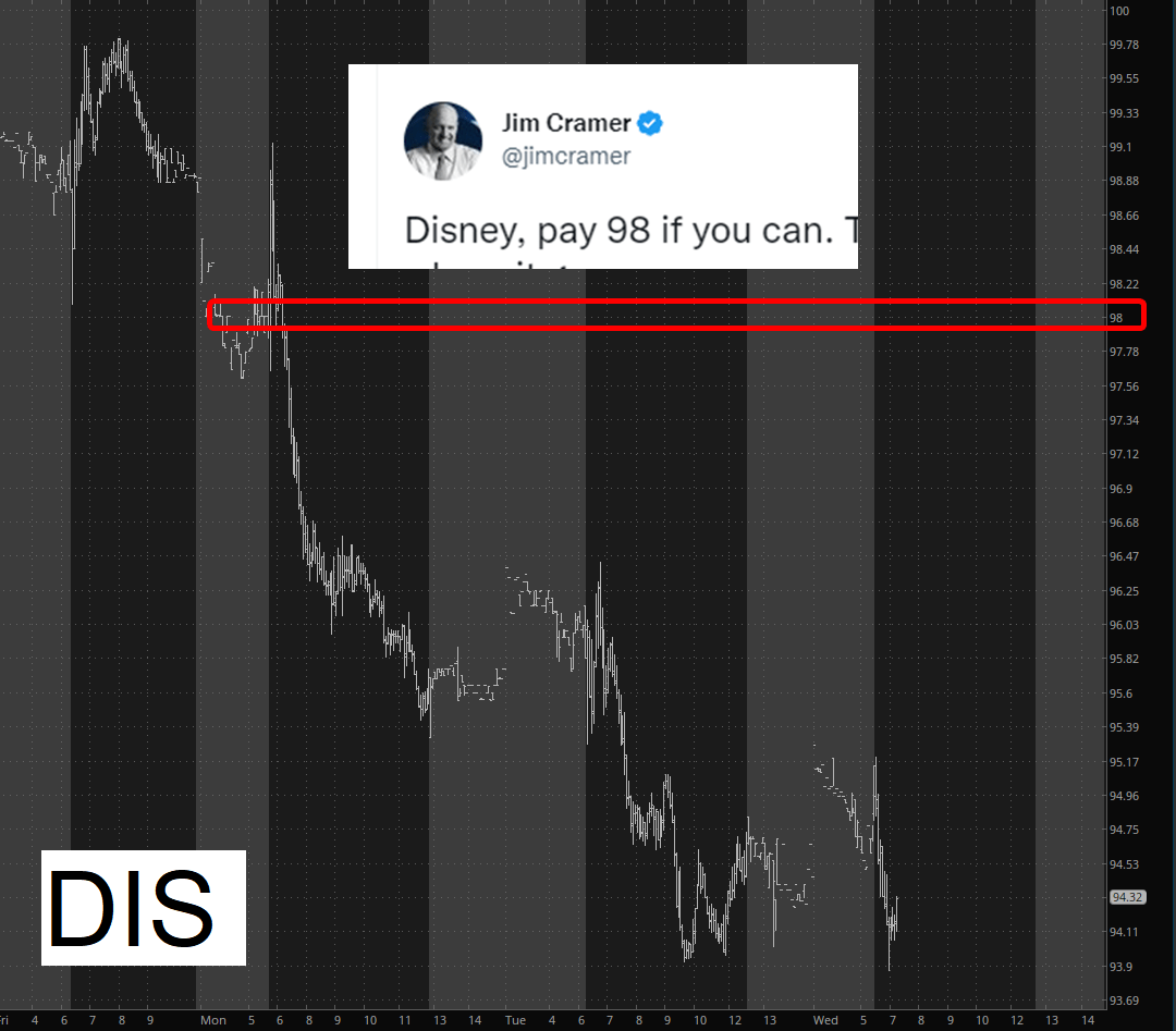
Reminder: he gets $5,000,000/year to be wrong 100% of the time.
(more…)Slope initially began as a blog, so this is where most of the website’s content resides. Here we have tens of thousands of posts dating back over a decade. These are listed in reverse chronological order. Click on any category icon below to see posts tagged with that particular subject, or click on a word in the category cloud on the right side of the screen for more specific choices.
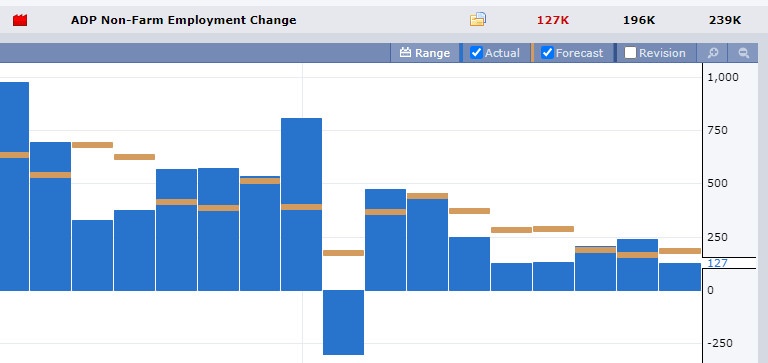
A couple of big economic reports came out today. The ADP non-farm employment change showed a weakening job market (so rare are do the forecasts numbers on this thing match reality, I’m not even sure why they bother).
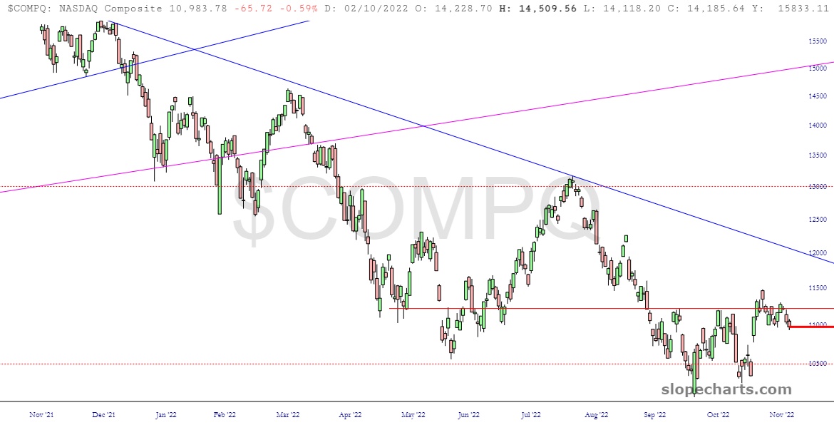
Let’s face it: Tuesday was a throwaway day. The Dow Jones Industrials climbed 0.0091% Hey, if I’m going to pick a day to have some serious downtime, I didn’t do too badly, did I? Anyway, Wednesday will be, for better or worse, vastly more dynamic, so here are a few key charts with some remarks beneath each.
There is a really cool graphic of the world’s money and markets which is about seventeen feet high I’m not going to put directly into the post. To see it in a separate tab, please click here. As shown below (this is like the top 1% part) each square represents $100,000,000,000. Quite a sight………… (if clicking “here” doesn’t create a new tab, please right-click on it instead, since it’s only visible in its own tab since it is, ya know, like seventeen feet high, as mentioned).