The fabled Sept 12/13 gap is a done deal.
Slope initially began as a blog, so this is where most of the website’s content resides. Here we have tens of thousands of posts dating back over a decade. These are listed in reverse chronological order. Click on any category icon below to see posts tagged with that particular subject, or click on a word in the category cloud on the right side of the screen for more specific choices.
The fabled Sept 12/13 gap is a done deal.
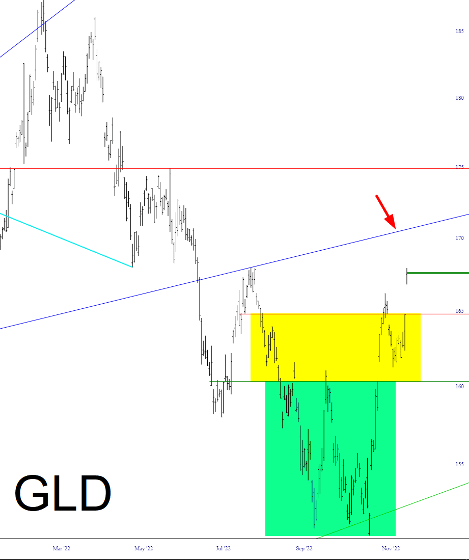
Precious metals reached escape velocity, fueled by the crumbling US dollar; that arrow marks, in my opinion, the highest target for GLD right now.
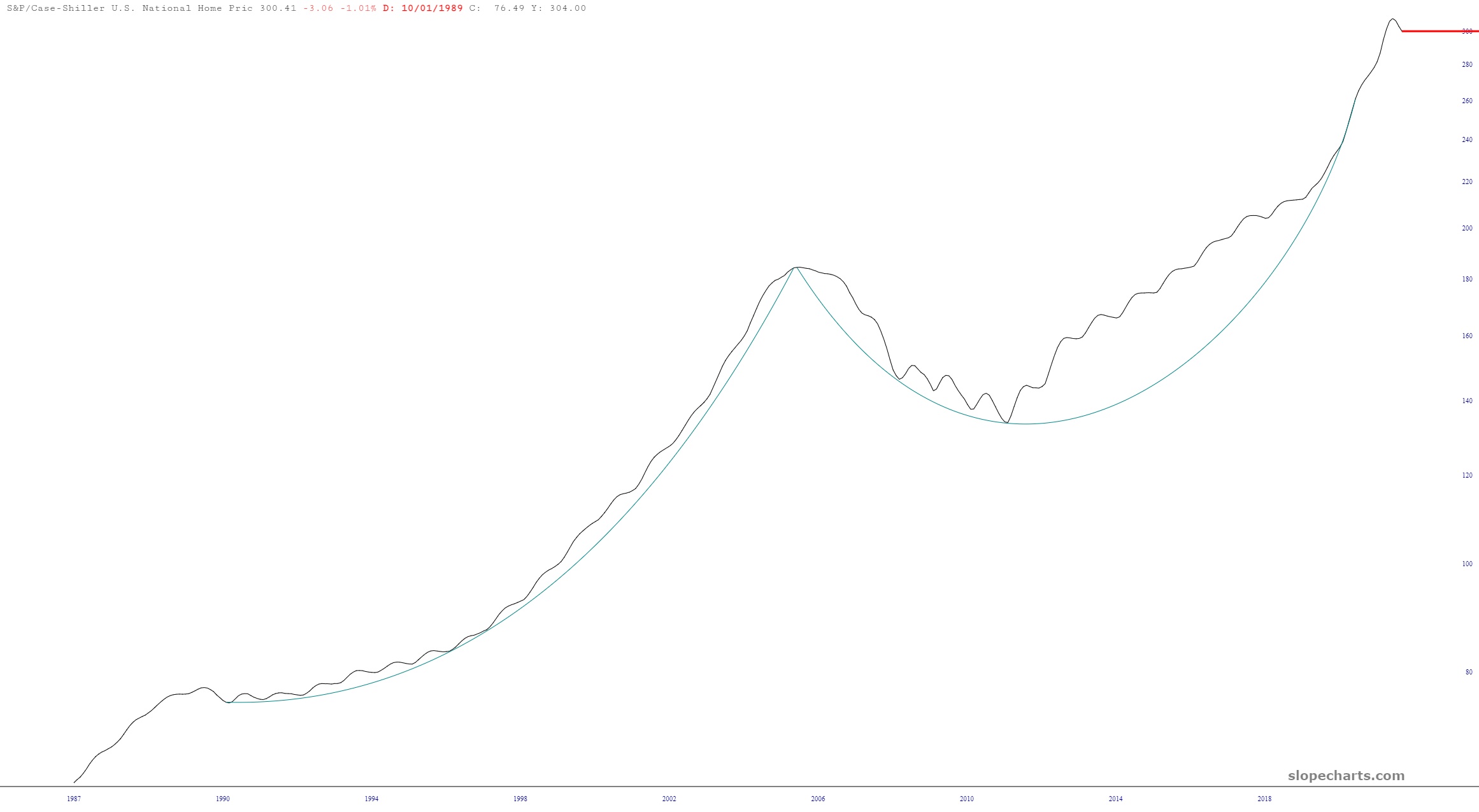
I was browsing through Slope’s economic chart database (otherwise known by the acronym SWELL) and stumbled upon two interesting ones worth sharing. The first is the Schiller Index of housing prices. As you can see, it has had its first negative inflection point since – – you guessed it – – the top of the housing bubble in 2007. Let’s just say it’s got a lot of softening to do. (Although I have proudly already lost $3 million in value from my house, so I’m doing my part).
Ugh. Here’s “the fish that got away” story.
For the longest time, I wanted to be short G-III Apparel (GIII) but the options for it absolutely STINK. So I left it alone, even though it looked like a great short.
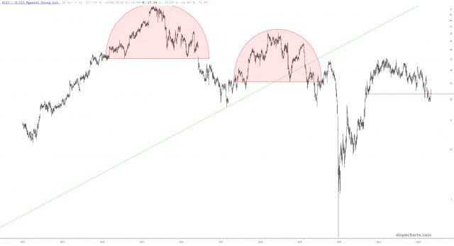
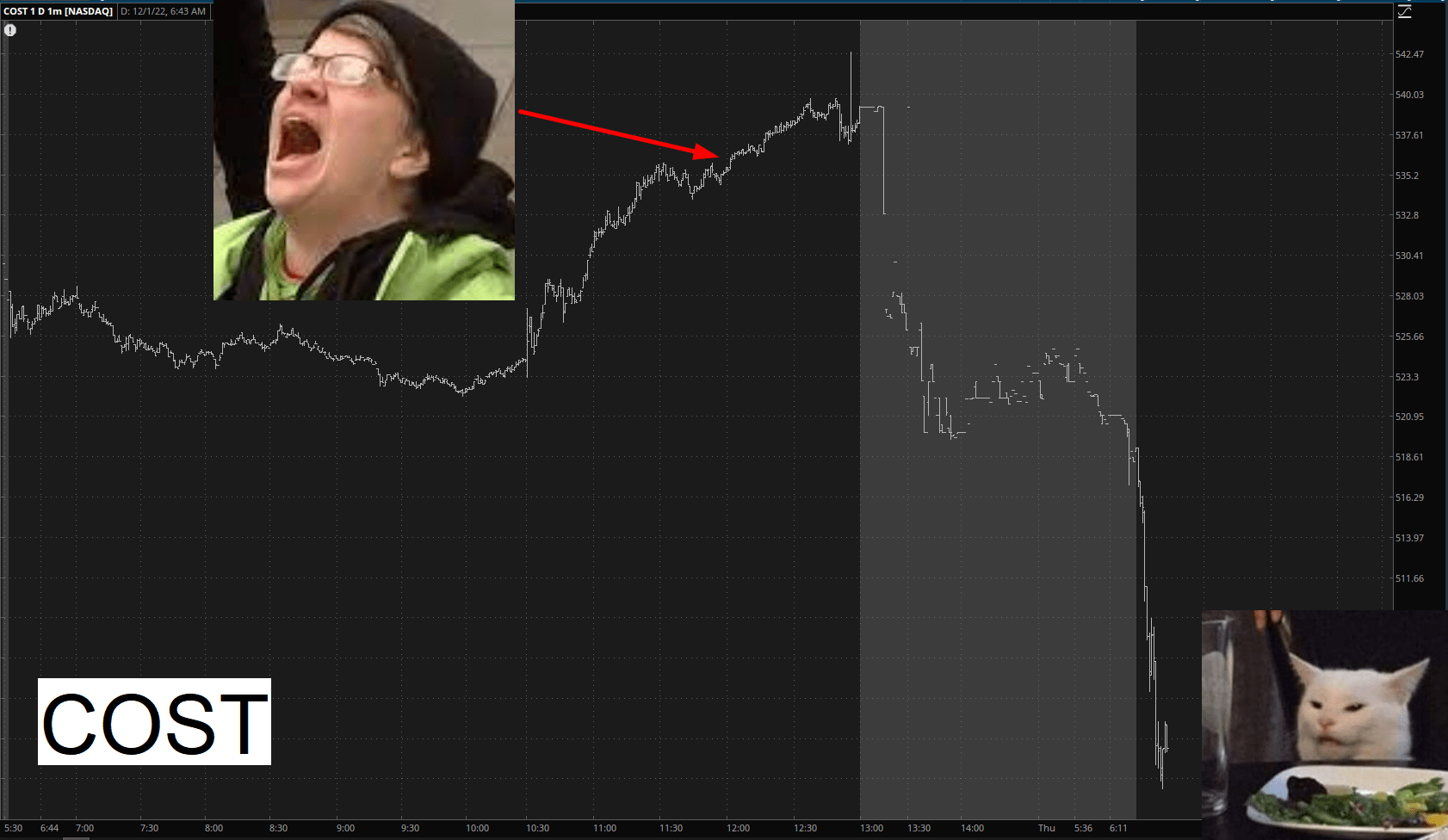
Well, I blew this one.
I had puts on Costco (symbol COST). During yesterday’s shotgun-to-the-face nightmare for the bears, for absolutely NO reason other than unchecked panic, I dumped half my position about where the arrow is shown. Well, you know what happened next. I took a loss on what I dumped, and as I glanced at my spreadsheet right now, there is a 60% profit on them (and they have 106 days left on them as well). Just pathetic on my part. At least I didn’t dump 100%, but Jesus, what a ghey-boy.