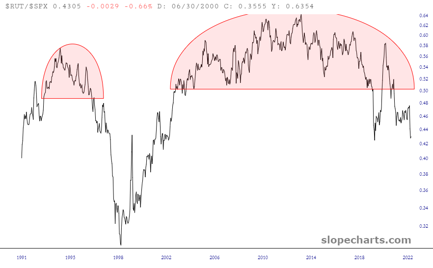
This one simple chart speaks volumes: it represents the ratio of the Russell 2000 cash index to the S&P 500 cash index. As you can plainly see, there is a fantastic top formed (vastly bigger than the prior one, which was way back in the mid-1990s) and speaks to substantially lower prices ahead.