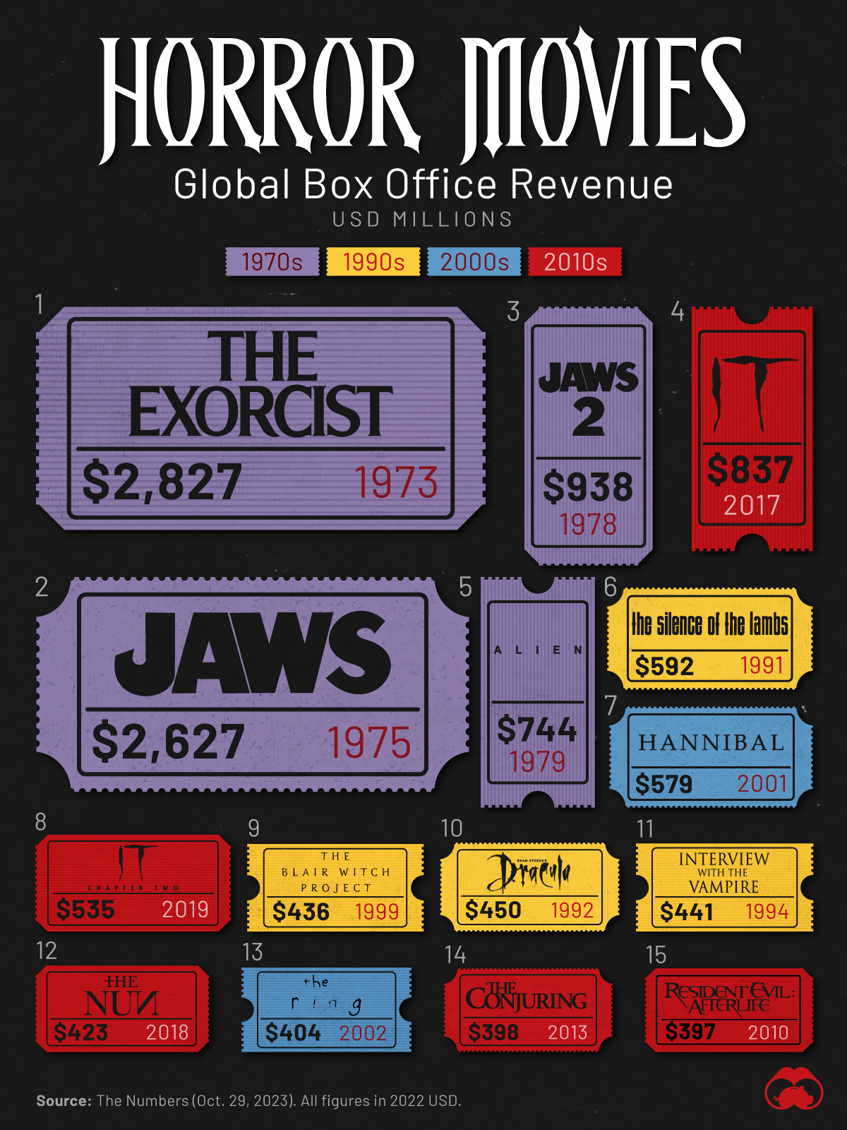
I’m not into horror or gore at all, although I did see Blair Witch, and, yeah, it scared the bejesus out of me.
Slope initially began as a blog, so this is where most of the website’s content resides. Here we have tens of thousands of posts dating back over a decade. These are listed in reverse chronological order. Click on any category icon below to see posts tagged with that particular subject, or click on a word in the category cloud on the right side of the screen for more specific choices.
I’m not into horror or gore at all, although I did see Blair Witch, and, yeah, it scared the bejesus out of me.
With the first ten months of the year now out of the way, a mere one-sixth of 2023 remains. Considering how absolutely insane this year has been already in all arenas (financial, geopolitical, legal, you name it), one can only tremble to consider what the next two months might hold.
Rather than dare speculate on the dozens of weighty matters already vexing the globe, I will simply focus on an octet of cash index charts along a common theme: the notion that each of them has hammered out a formidable and well-formed topping pattern and that, preposterous as it might seem to the mainstream pundits (and flying in the face of endless-cited bullish seasonality), it is within the realm of possibility that new lows for 2023 could be on hand for at least a few major indexes.
For simplicity’s sake, the format of each of the charts below is consistent. Specifically:
Having said all that, let’s go through the indexes one by one. We begin with the all-important S&P 500:
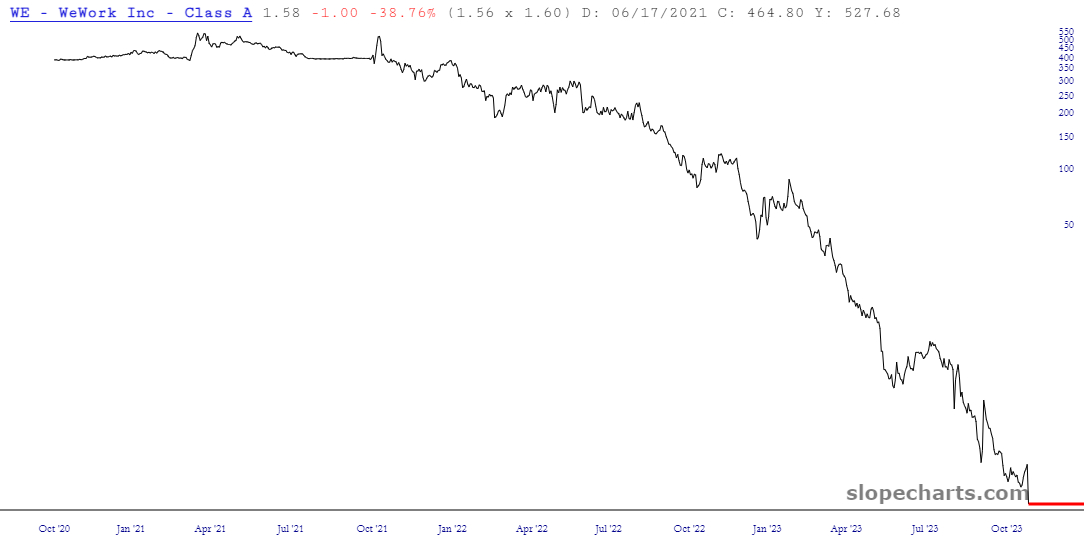
(more…)WeWork is in the news again, and as usual, it’s for bad reasons: apparently bankruptcy is at hand, and the stock, which traded at almost $600 two years ago (reverse-split-adjusted, of course) is presently at $1.58.
Yes! Several!
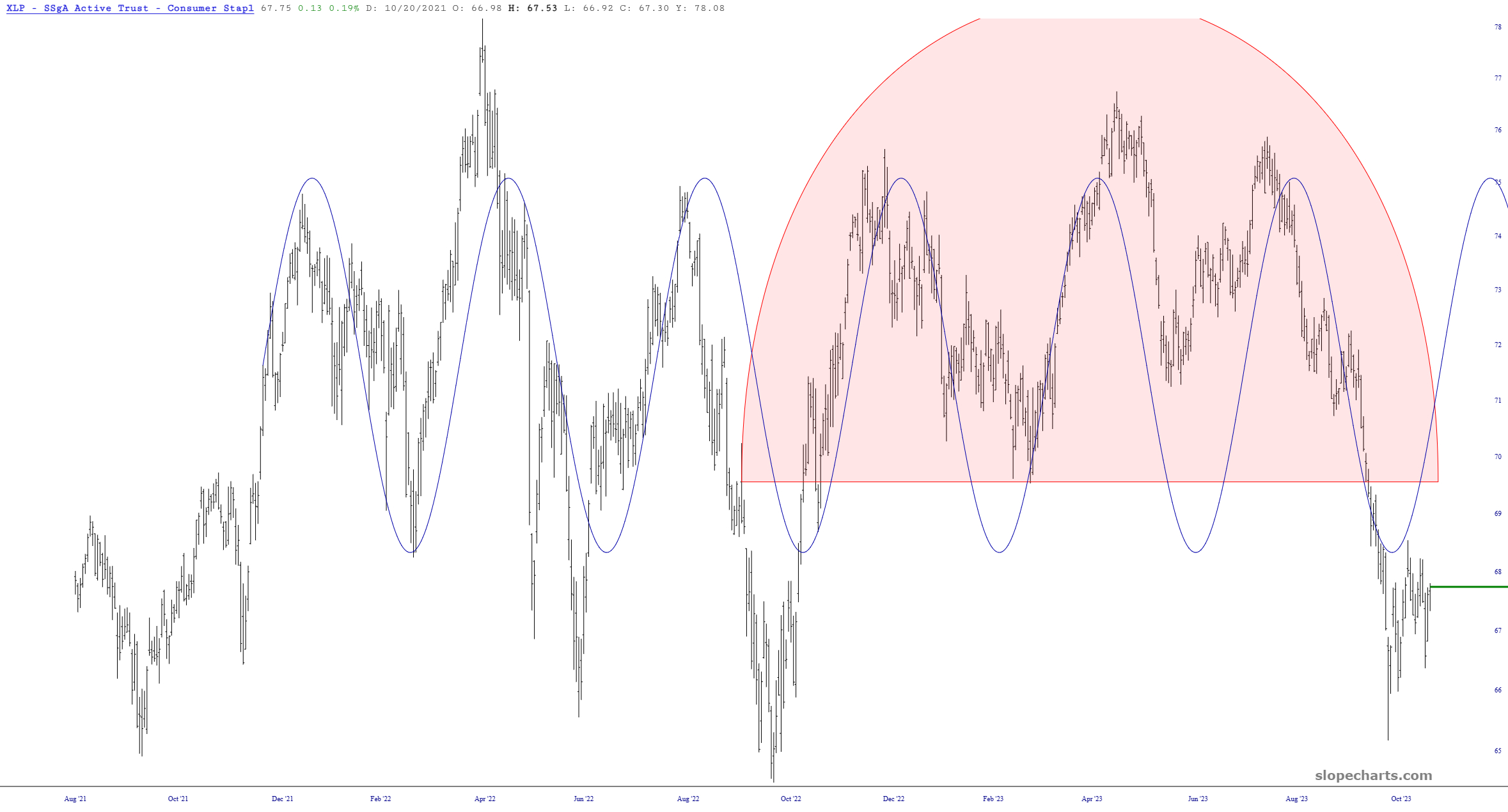
I present two ETFs that have remarkably consistent sine-wave action, each of which suggesting an ascent in the months ahead.