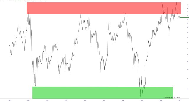
I’ve always been fascinated by the GDX/XME ratio. It has been cyclic for literally decades, and after reaching a lifetime high in February, it has been tracking downward nicely. I suspect it has years of plunge left in it.
Slope initially began as a blog, so this is where most of the website’s content resides. Here we have tens of thousands of posts dating back over a decade. These are listed in reverse chronological order. Click on any category icon below to see posts tagged with that particular subject, or click on a word in the category cloud on the right side of the screen for more specific choices.
I’ve always been fascinated by the GDX/XME ratio. It has been cyclic for literally decades, and after reaching a lifetime high in February, it has been tracking downward nicely. I suspect it has years of plunge left in it.
Here is the equal-weighted S&P 500 divided by the “standard” (and warped) S&P 500. Notice something? I sure do. This sucker is on its last freakin’ legs.
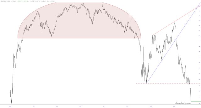
Here is the ratio chart of the NASDAQ 100 divided by the Russell 2000. It has never been higher. Not even during the Pets.com Internet bubble days. This. Will. Not. Sustain.
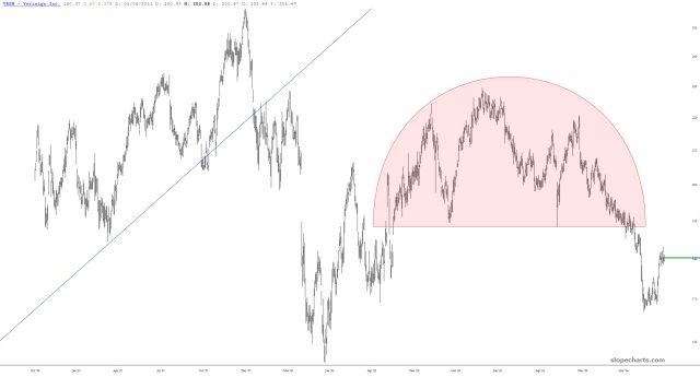
Verisign is sporting a well-formed head and shoulders reversal pattern. Sadly, the options on VRSN stink!