
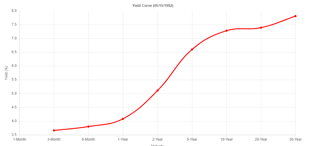
I dusted off Slope’s Yield Curve Tool and wanted to share a few interesting charts. First off, this is what the yield curve looks like during normal, healthy economies, like back in the early 1990s.
And here’s the super-duper-inverted curve during bad times, like 1981.

These days, the totally diseased and artificially manipulated curve looks like this.

As shown here via symbol FR:T10Y3M the present inversion is a slam-dunk guarantee of a recession next year, if this has-never-been-wrong indication holds true.

