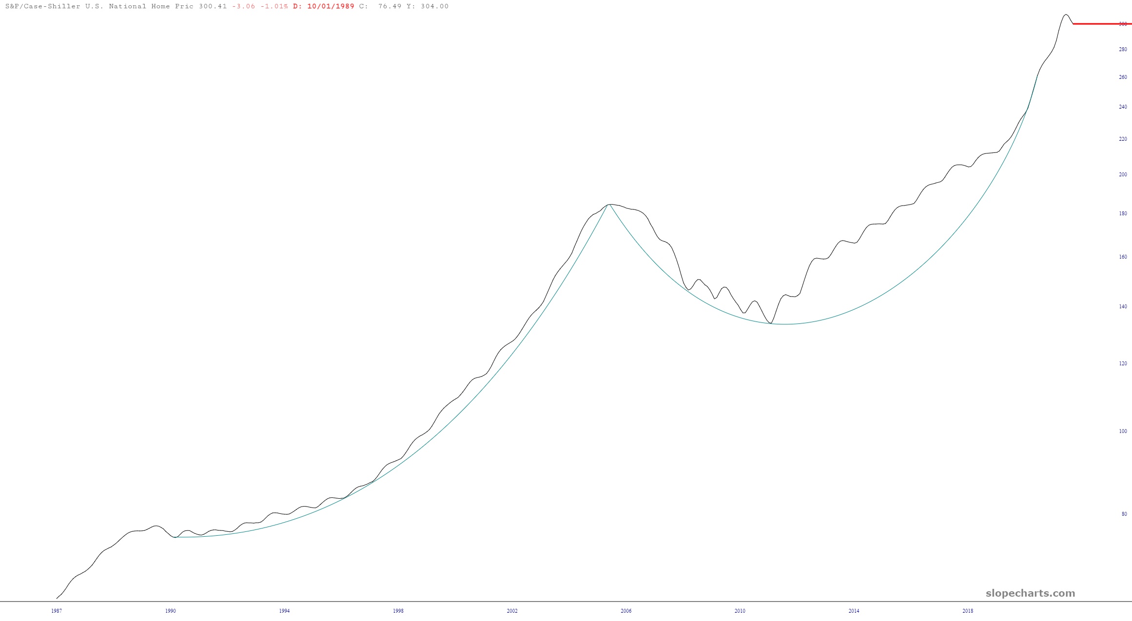
I was browsing through Slope’s economic chart database (otherwise known by the acronym SWELL) and stumbled upon two interesting ones worth sharing. The first is the Schiller Index of housing prices. As you can see, it has had its first negative inflection point since – – you guessed it – – the top of the housing bubble in 2007. Let’s just say it’s got a lot of softening to do. (Although I have proudly already lost $3 million in value from my house, so I’m doing my part).
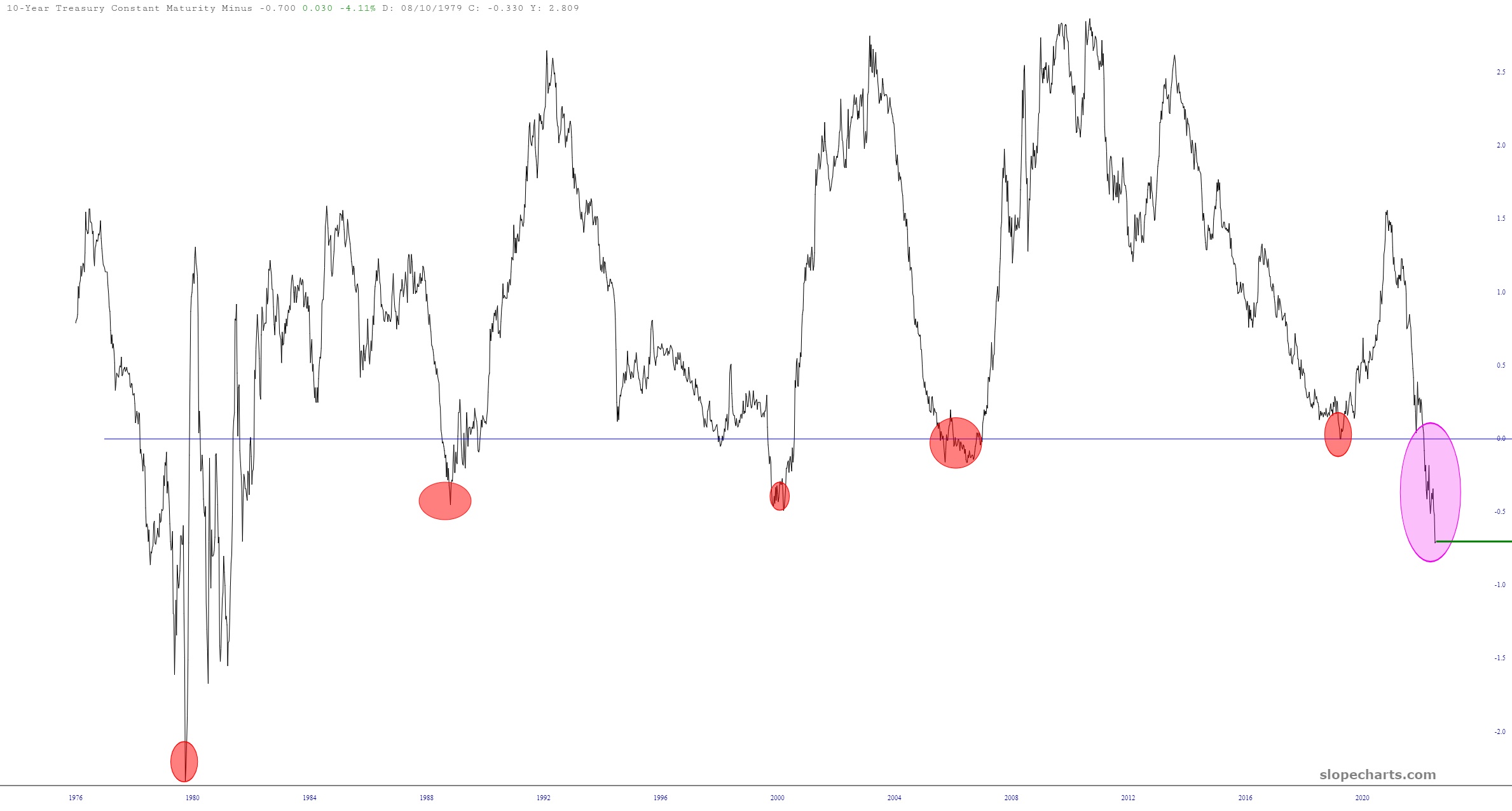
The other represents yield curve inversion. You literally have to go back over FORTY YEARS to witness anything this bad.