Index/Volatility Ratio Charts and AAPL:NDX Ratio Chart
30-Year Bonds
U.S. $
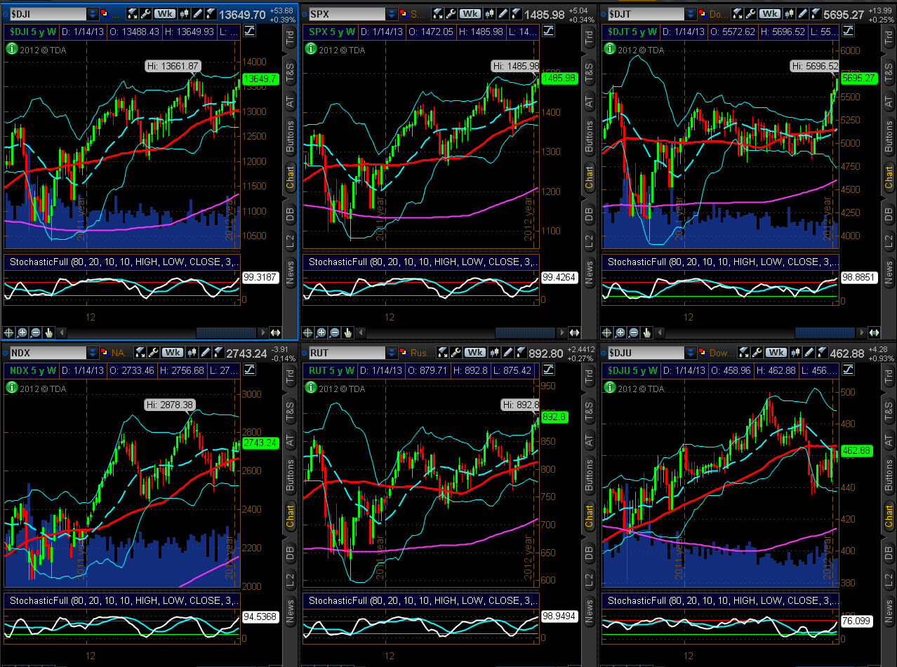
6 Major Indices
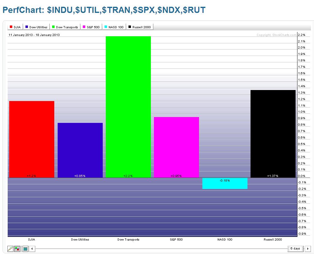
As shown on the Weekly charts and 1-Week percentage gained/lost graphs below, all but one Major Index closed higher on the week than the prior week. The Dow Transports Index gained the most, while the Nasdaq 100 lost a minor amount.
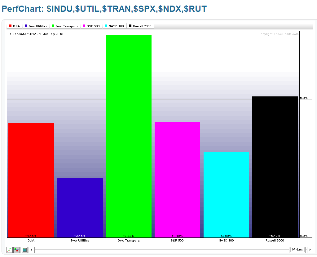
I've also added a Year-to-date percentage gained/lost graph below. You can see that the Dow Transports is leading the gains, so far this year, followed by the Russell 2000, S&P 500, Dow 30, Nasdaq 100, and Dow Utilities. Utilities remains the laggard, for the year, while the Nasdaq remains the laggard for the past week…two to watch for either developing strength, or further weakness, which could weigh on the other Indices.
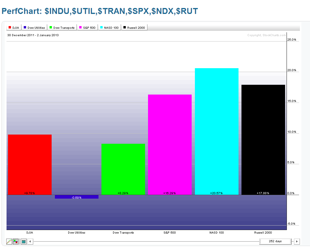
The following graph depicts total percentage gains/losses for these Indices for 2012. You can see that the Nasdaq 100 was the leader, followed by the Russell 2000, etc. It may be that the recent weakness in Technology is simply a case of profit-taking before portfolio re-balancing and buying resumes in that Sector...one to watch going forward in the near term. Perhaps we'll learn more after AAPL's earnings are released after hours on January 23rd.
9 Major Sectors
As shown on the Weekly charts and 1-Week percentage gained/lost graphs below, all but one Major Sector closed higher on the week than the prior week. The Energy Sector gained the most and Financials gained the least, while Technology lost a minor amount.
I've also added a Year-to-date percentage gained/lost graph below. You can see that most of them have gained approximately 5%. Technology and Utilities lag, but are in the green for 2013.
The following graph depicts total percentage gains/losses for these Sectors for 2012. You can see that Financials were the biggest sector gainers, while Utilities gained the least. It may be that the recent weakness in Financials is simply a case of profit-taking before portfolio re-balancing and buying resumes in that Sector…one to watch going forward in the near term as any major weakness may weigh negatively on equities, in general.
In any event, from a technical standpoint, 5 Major Indices and 8 Major Sectors are at an extreme overbought level at the top of their Stochastics cycle on a Weekly timeframe…the Utilities Index and Sector, are approaching an overbought level. We may see either a parabolic move up followed by a blow-off reversal, or we may see a measured/orderly pullback soon to relieve this condition. Either way, I wouldn't be surprised to see increased volatility enter into the markets soon.
3 Days/Candle Charts on 7 Major Indices
Each candle on the following three chartgrids represents 3 days. The current candle began today and will finish next Wednesday (since the markets are closed on Monday).
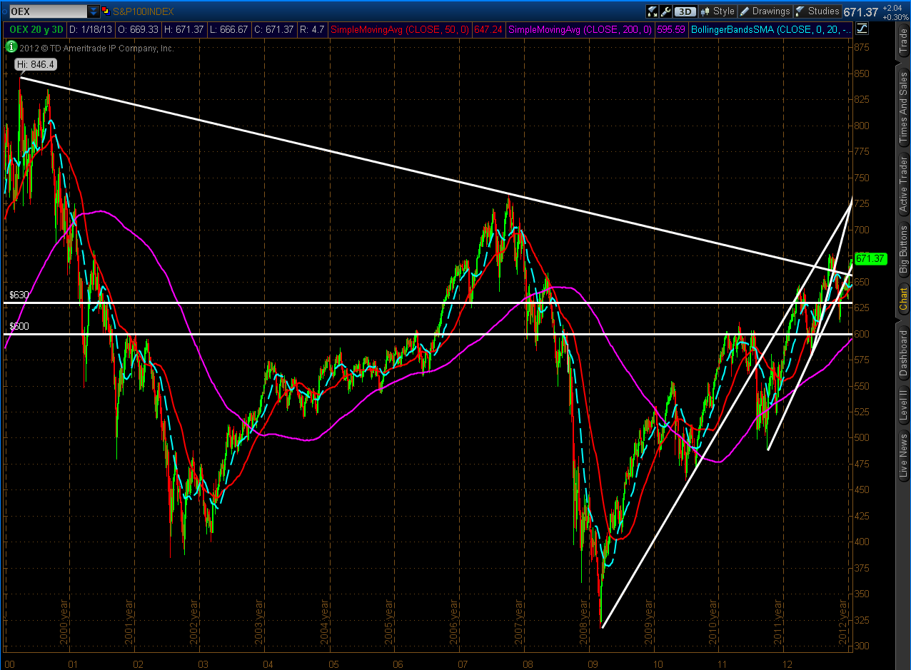
S&P 100 Index (OEX)
Price closed on Friday above both the longer-term major downtrend line from the 2000 highs and the shorter-term uptrend line from the 2011 lows.
DOW 30, S&P 500, Nasdaq 100, & Russell 2000 Indices
The Dow 30 closed on Friday above both its longer-term major downtrend line from the 2007 highs and the shorter-term uptrend line from the 2011 lows. The S&P 500 and Russell 2000 Indices are still above their trendlines, while the Nasdaq 100 is still below its uptrend line…another verification of its weakness compared with the other Indices.
Dow 30, Dow Transports, & Dow Utilities Indices
Along with the Dow 30, the Dow Transports Index is still trading above its trendline, while the Utilities Index is still below…another verification of its weakness compared with the other Indices.
Index/Volatility Ratio Charts and AAPL:NDX Ratio Chart
The four 10-Year Weekly ratio charts below compare the SPX, NDX, and RUT Indices to their respective Volatility Indices, and AAPL to the NDX.
Comparing relative strength during this 10-year time period among the 3 Index/Volatility ratios, the RUT is leading, followed by the NDX, then the SPX, because the Russell and Nasdaq are above their 2007 highs on these ratios, while the SPX is still approaching its highs. We may not see a meaningful pullback in the SPX (and possibly in equities, in general), until the 2007 highs have been reached on SPX:VIX…something to keep an eye on.
The AAPL:NDX ratio shows that price is approaching a level of minor support. As I mentioned above, we should see some clarification of near-term direction in AAPL after the markets have digested its earnings next week…one to watch as a possible positive or negative influence on equities, in general.
30-Year Bonds
As shown on the 5-Year Weekly chart below of 30-Year Bonds, price closed, once again, above major support. We may see further buying in bonds while equities remain at these extreme Weekly stochastics levels, as mentioned above…one to watch as possible hedge-buying continues.
U.S. $
As shown on the 5-Year Weekly chart below of the U.S. $, price closed, once again, above major support at 80.00. We may see further buying in the dollar while equities remain at these extreme Weekly stochastics levels, as mentioned above…one to watch as possible hedge-buying continues.
Summary
In summary, we may see an increase in volatility due to extreme overbought Stochastics levels (on a Weekly timeframe) in equities, and further hedge-buying in 30-Year Bonds and the U.S. $. In this regard, the Nasdaq 100, Utilities, Financials, and AAPL are worth keeping a close eye on in the coming week(s) as a possible gauge of further (and any meaningful) weakness in equity markets…particularly as these markets begin a new monthly Options Expiration period on Tuesday.