
Too many of the ETFs right now can only conjure up the reaction, “Wow, that’s just nuts. I wonder if it’ll ever stop going up, or what?” That’s a silly waste of time, so what I’d like to do instead is focus on the charts which, even given recent circumstances, still presenting exciting and intriguing risk/reward ratios.
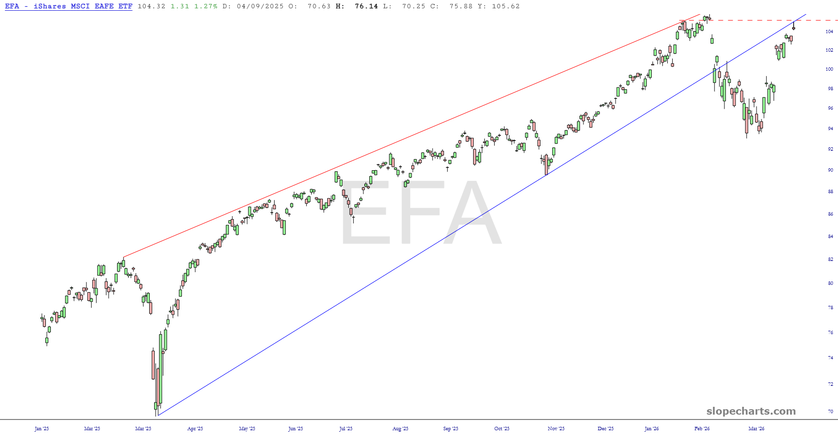
First up is EFA, which I am short. There are three exceptionally cool things about this chart. First, Friday’s action formed a beautiful shooting star reversal pattern. Second, the price peak on Friday was precisely below the broken trendline. Third, the price peak also came deliciously close to an important price gap. This is just a dynamite combination.
For the other eight charts, I’m just showing those to paying members (all levels) who have kept the lights on at the Slope of Hope for over 21 years now. Please consider joining them to support Slope!
