
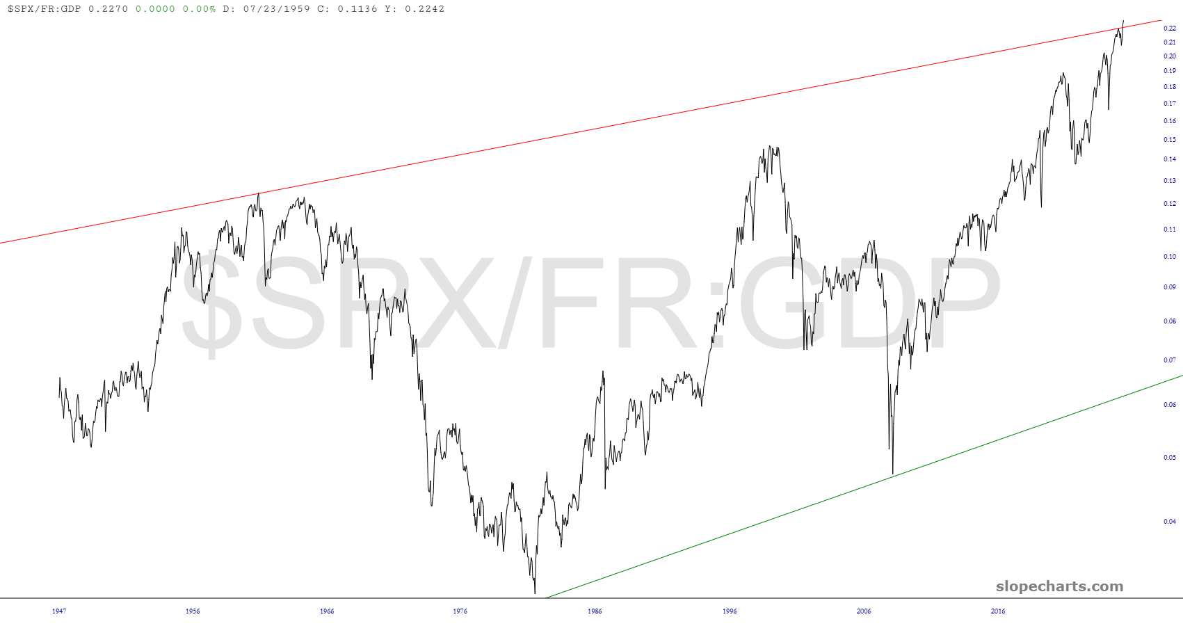
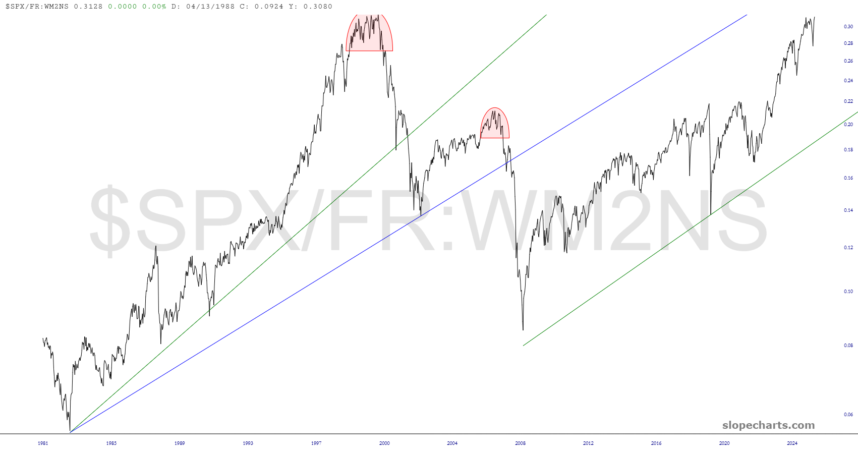
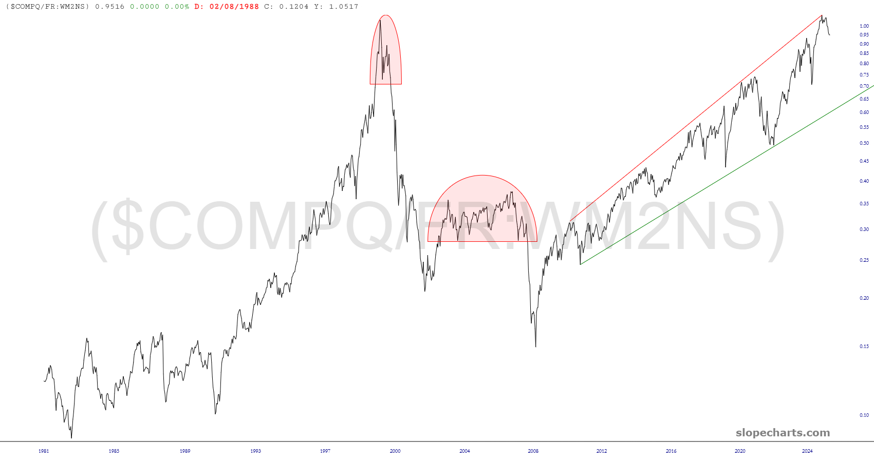
One of my favorite features in SlopeCharts, a product I used constantly, is the custom symbols. This is a special feature for our beloved Gold and Platinum members, and we’ve just made a huge improvement that I dreamed up a week ago. As a starting point, look at some of these charts I just made:
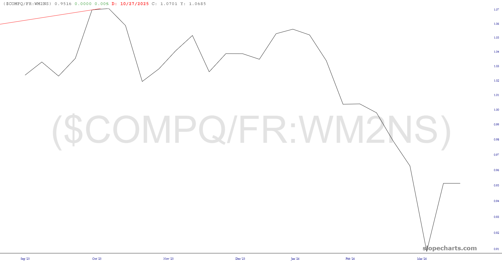
There are two enormous problems with charts like these:
- Granularity: If a ratio chart is calculated with, for example, one set of data which is daily and another set of data which is monthly, then the chart itself will conform to whatever the crudest granularity is that is to say, monthly. This makes for a rather choppy, chunky, harder-to-read chart.
- Early Termination: For a similar reason, the chart will end wherever the last data point ends with the crudest data. Let’s say you had a ratio chart comprised of the daily S&P 500 and the quarterly GDP number. Even though we’re already in May 2026, your chart might end in December 2025, simply because that’s when the most recent data point was for the chart with the quarterly data.
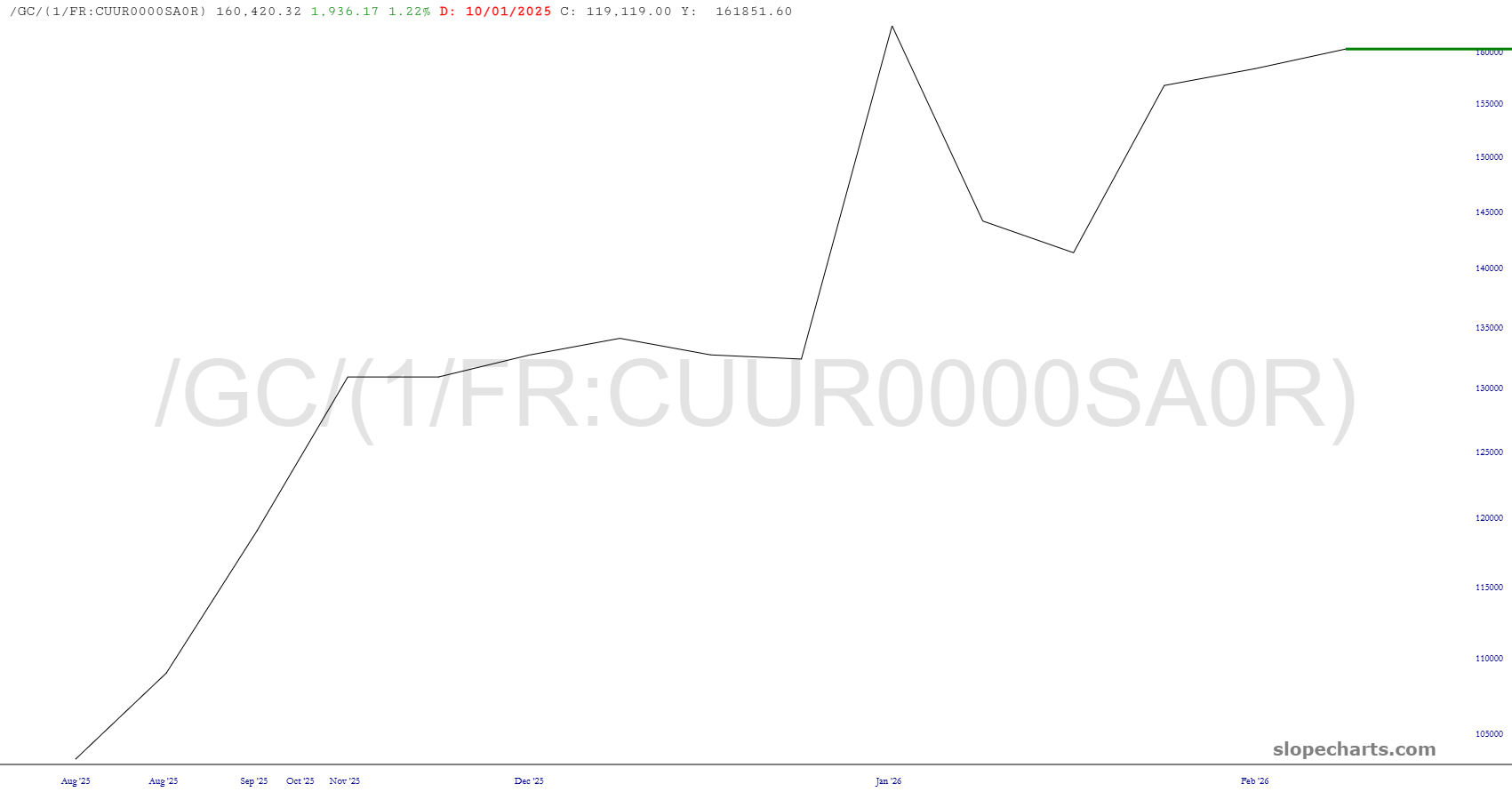
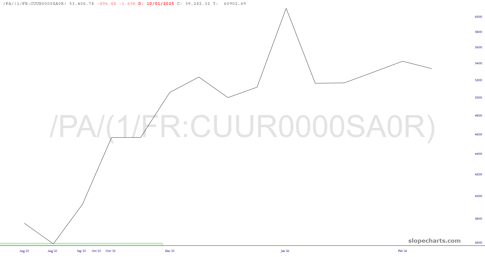
We have solved these issues, I am delighted to report. Here are some of the resulting charts:
Out with crudeness! In with refinement! Here’s a video I made yesterday for Gold and Platinum folks which explains in more detail:
