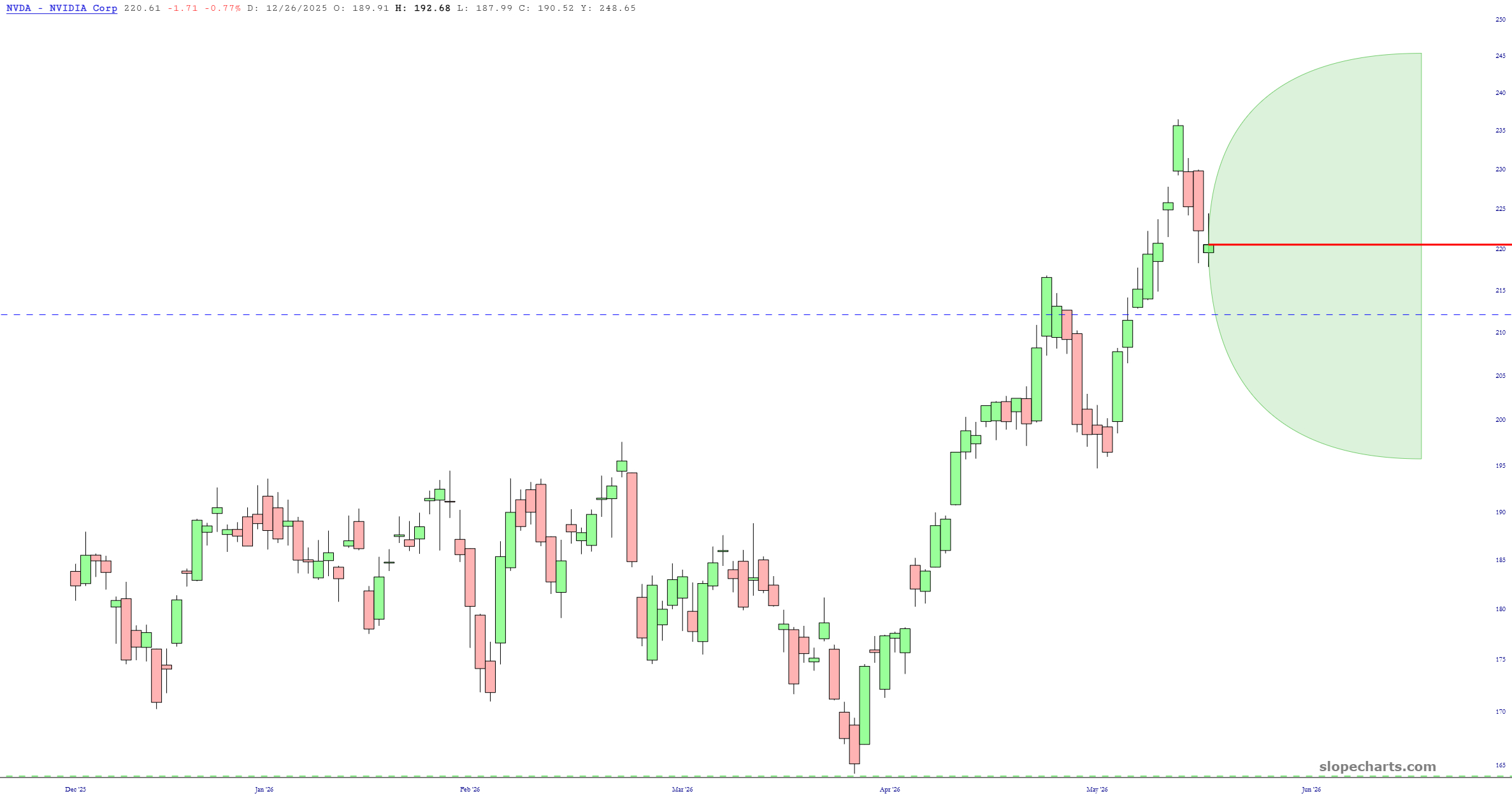
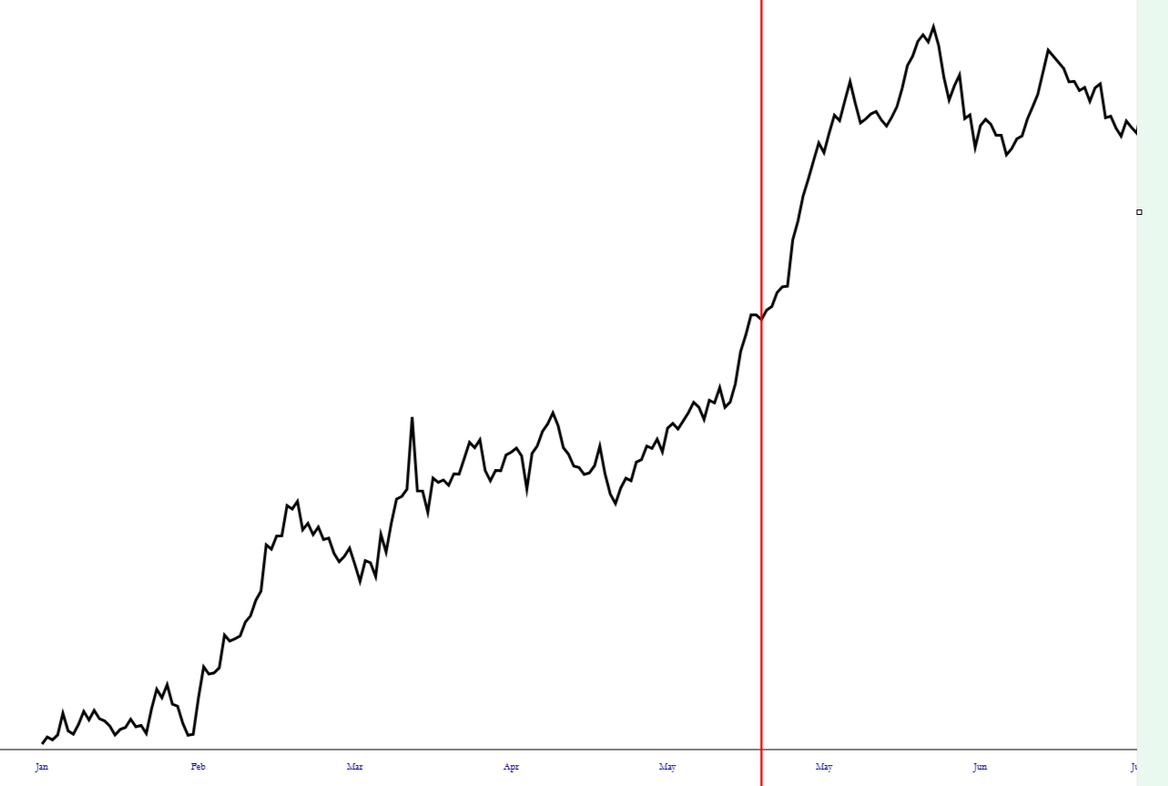
Since the Main Event this week is coming up soon (NVDA earnings after the close), I thought I’d share some Slope of Hope charts featuring this one symbol. I’ve described them in the captions.
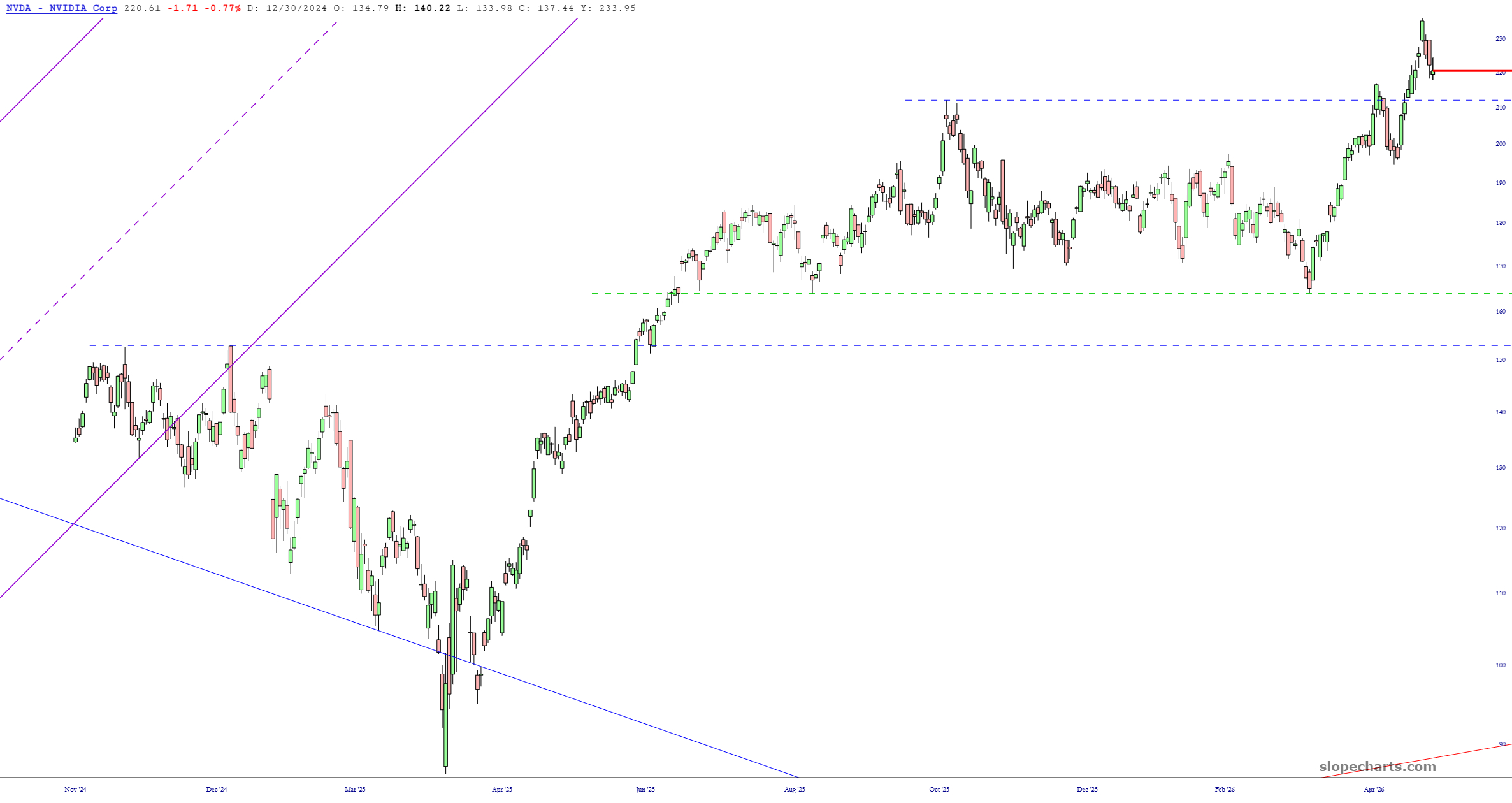
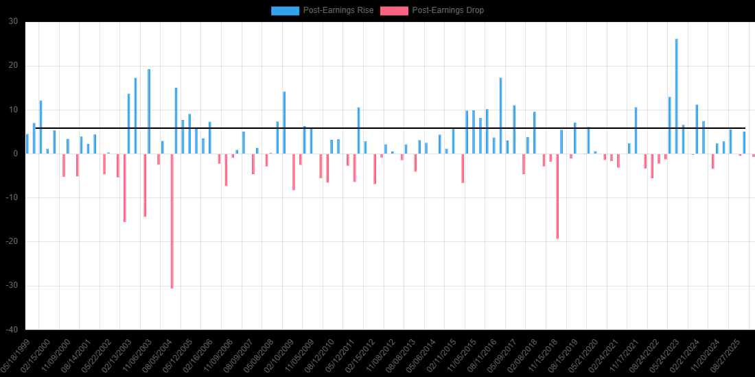
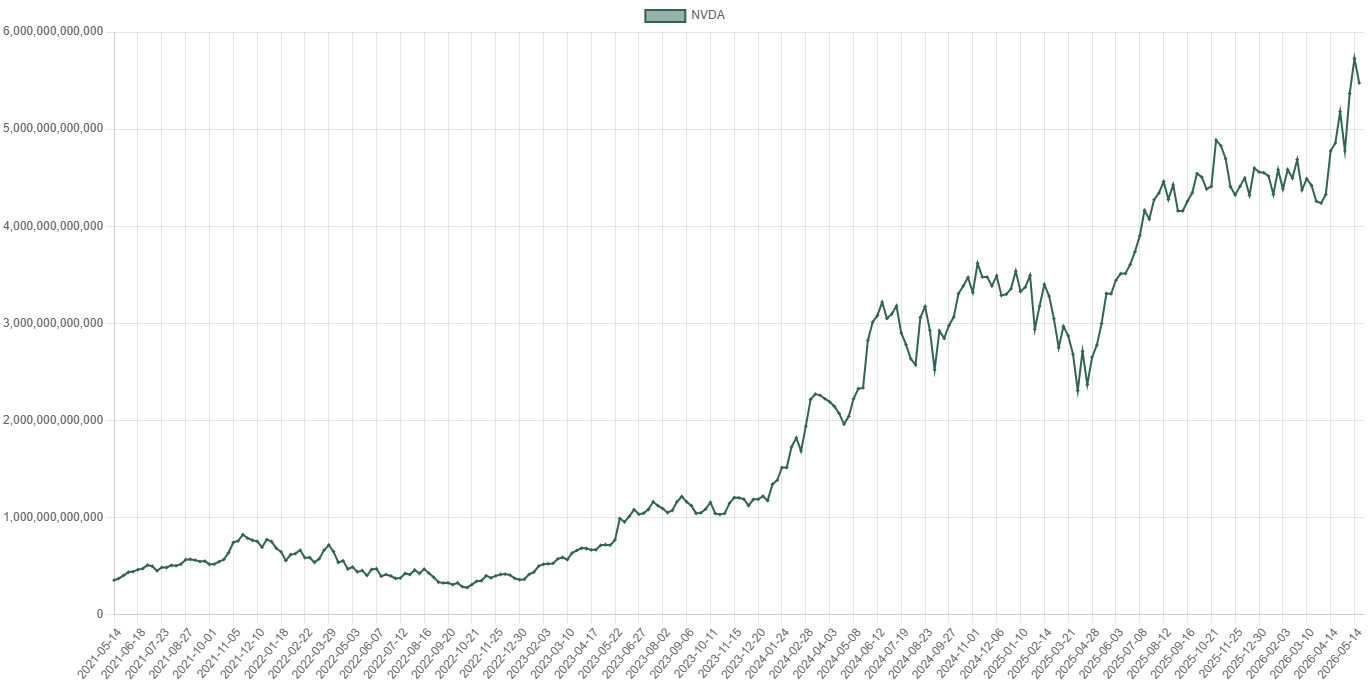
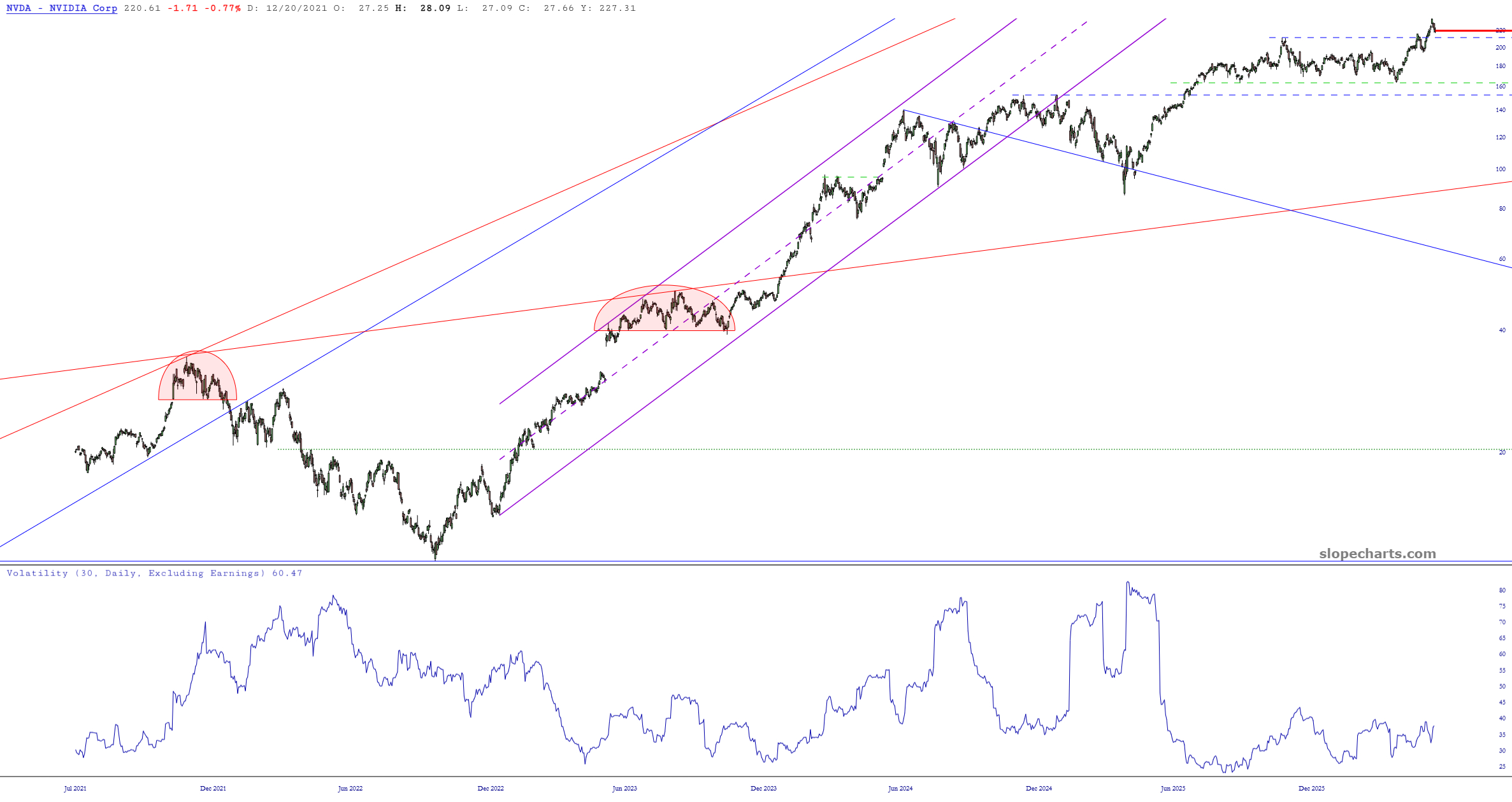
A simple daily price chart, showing the recent breakout from its ten-month range. It seems poised to push higher from here.Historical reactions to quarterly earnings over the lifetime of the stock, both positive (blue) and negative (red).The market cap of NVDA, which is far and away the most valuable company on the planet.Here we have the 30-day implied volatility on the lower pane, which has been quite subdued for months.The large green tinted zone is the price cone which shows the expected range over the next month based on the implied volatility.Finally, the seasonality of the stock, with the red line representing today. It suggests strength, although that’s not surprising from a stock which has done little but go up for so many years.