Slope of Hope Blog Posts

Slope initially began as a blog, so this is where most of the website’s content resides. Here we have tens of thousands of posts dating back over a decade. These are listed in reverse chronological order. Click on any category icon below to see posts tagged with that particular subject, or click on a word in the category cloud on the right side of the screen for more specific choices.

Weekly Sector Report | 11/05/10 (by Leisa)

By -

The market showed no signs of fatigue last week. The broad market index was up 3.57% with a sweep of sectors positive across the board.  Below is the Weekly Sector profile compared to the broad market index (in blue). (Click to make larger).

Note that the more defensive sectors, healthcare, food/beverage, utilities, are lagging. Here's a chart of the broad market index (Click to make larger)

Prices are very extended and caution is warranted for longs.  Prices are approaching a heavy volume@ price bar (which I have extended and placed in a dotted outline).  It will be interesting to see how volume/price action react at these levels over the next few weeks.

To facilitate your personal study of the the sectors, I've created a downloadable PDF which contains detail sector information, summary sector information, and chart books for the summary sectors in both weekly and daily format.  It is a large file, so be patient with the download.

Weekly Sector Report | 10/29/10 (by Leisa)

By -

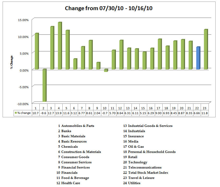
We closed October without any of the oft-anticipated fireworks that define this transition month into 4th quarter. The total stock market index was up .13%–we can call that flat.  Below are the 24 major Sectors and their relative performance.


Snap142a

As is usual, I have prepared a chart book in PDF form for your use with the weekly, daily, and monthly (since it is month end charts) for each of the sectors listed above.  You can downoad it here. It's a large file, so be patient.

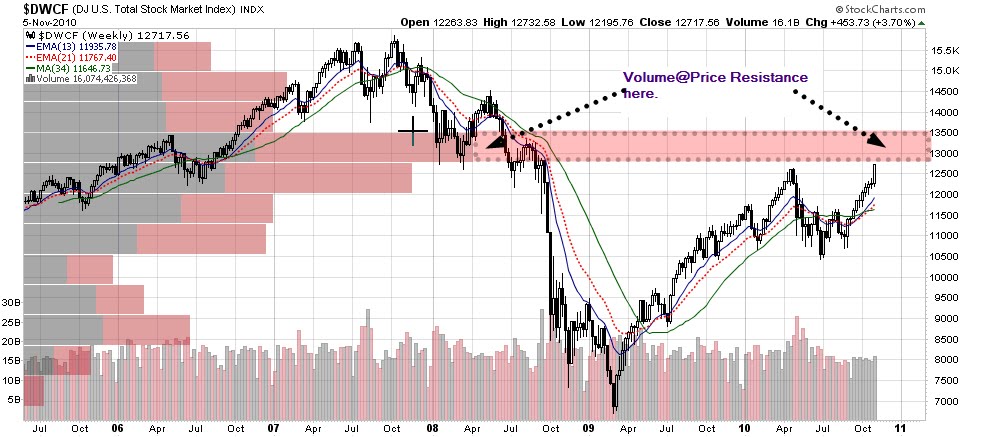
Below is a weekly chart of the total stock market index.  I like to view this chart because it eliminates the bias of small, large, mid-cap, tech, industrials weighting that is evident in the other indices. I also like to look at the weekly to eliminate some of the daily noise. 


Snap147

We've a string of positive bars–9 weeks now.  With elections this week, perhaps the market will give us its own version of the move  9 1/2 Weeks?  As we've repeatedly seen, when the market gets to critical junctures, the news flow is the major impetus for the direction up or down–and last week was an example of much activity but very little direction although the sectors had quite a bit of push and pull (which is why I look at them).


A Sloper asked a very good question about "What is Intermarket Analysis".  John Murphy, at Stockcharts.com, has an intermarket chart that you can access (free to all)  to see the interplay between the USD, 30 Year bond price (price is inverse to rates), CRB index, and the S&P index:

Snap149

To quote John Murphy:

Intermarket Technical Analysis is the study of the relationships between the four major financial markets: Stocks, Bonds, Commodities and Currencies. There are three key relationships that bind these four markets together. These relationships are:

  • The INVERSE relationship between commodities and bonds
  • The POSITIVE relationship between bonds and stocks
  • The INVERSE relationship between the US Dollar and commodities

POSITIVE: When one goes up, the other goes up also.
INVERSE: When one goes up, the other goes down.

When these relationships occur, the markets are said to be acting "normally" and there is a good probability the current trends will continue. When one or more of these relationships break down, the markets should be watched carefully for signs of general trend reversals


I believe it is worth cutlivating a general understanding of these relationships–they truly are market drivers.  Trading/investing is often like juggling:  there are several balls that one has to keep in the air.  As with most endeavors, with practice and discipline, it becomes easier.

Courtesy of Wiki

(courtesy of Wikipedia)


Here's a clip from the Rocky Horror Picture Show…seems appropriate for this market to date and for the 'anticipation' for the coming week.  I wish you good trading this week.


Weekly Sector Report | 10/23/10 (by Leisa)

By -

Another week marked by some sector rotation juiced by a strengthening dollar.   Here's a graph of the major 24 sectors (CLICK!):

Travel and Leisure's oomph was due to the strength in Airlines, the highest performing industry. Here's a chart of the the Total Stock Market (CLICK!)

The last rally that formed the top of the much hyped head in a potential H&S pattern developed over a period of 8 weeks prior to correcting.  We've just completed the 8th week of consecutive, positive weekly close on the broad market.  With earnings season upon us, watching how the market responds to news will be important. The volume over this last 8 weeks has been lower than the previous run up to the last high as well as volume from the same time last year.  While I'm not making any predictions, I would surmise that given this run up combined with the overall overbought nature of the market, there is vulnerability to negative news. Let's also take a look at the sectors that have the highest short interest (data courtesy of FINVIZ):

As is usual, I've created a chartbook for you.  You can find it HERE

Sector Report | 07/30/10 – 10/16/10 (by Leisa)

By -

With this post, I’m re-committing to weekly sector reporting.  However, this report is spanning from July 30, 2010, since I have to use a data starting point, and I’m too lazy to pull the data and enter them individually. I’ll resume to weekly changes in the next submission next week.  You can download the full PDF here.

Hard to believe that behind Basic Materials/Resources, that Utilities would be such an outstanding performer!  I chalk that up to dividend yield in the face of declining interest rates.
Here’s a chart of the DJ Total Stock Market Index (Weekly Format) with the Volume profile.  I placed a yellow highlight over the next longest bar.

China Stock Chartbook (by Leisa)

By -

Tiangongkaiwu
 I've been a lazy toad, and I've not done weekly sector reports.  I plan to resume them as some find them helpful.  I abdicated doing them because FINVIZ has them. However, I like the Stockcharts presentation better, plus compiling the sector report is a very organic way for me to interface with the market sectors.  I'll resume them next week.

To atone for my laziness, I offer this chartbook of Chinese stocks for those looking to do a little weekend homework.  It's a large file, so be patient with the download which you can find here.