On January 10th of this year, I posted one of the more reliable buy/sell indicators that I follow. I would highly encourage those interested to revisit the notes from that post which can be viewed here. As luck (of lack thereof) would have it, the Jan 10th sell signal that was given the day of that post was only one of two out of the 14 sell signals since the bull market began back in March 2009 that did not pan out (not including the two current sell signals that just triggered which mark the 15th & 16th sell signals since the bull market began). (more…)
Slope of Hope Blog Posts
Slope initially began as a blog, so this is where most of the website’s content resides. Here we have tens of thousands of posts dating back over a decade. These are listed in reverse chronological order. Click on any category icon below to see posts tagged with that particular subject, or click on a word in the category cloud on the right side of the screen for more specific choices.
The Head Fake
 Head fake: A Head fake occurs when a player moves the head to fake a change in direction. (more…)
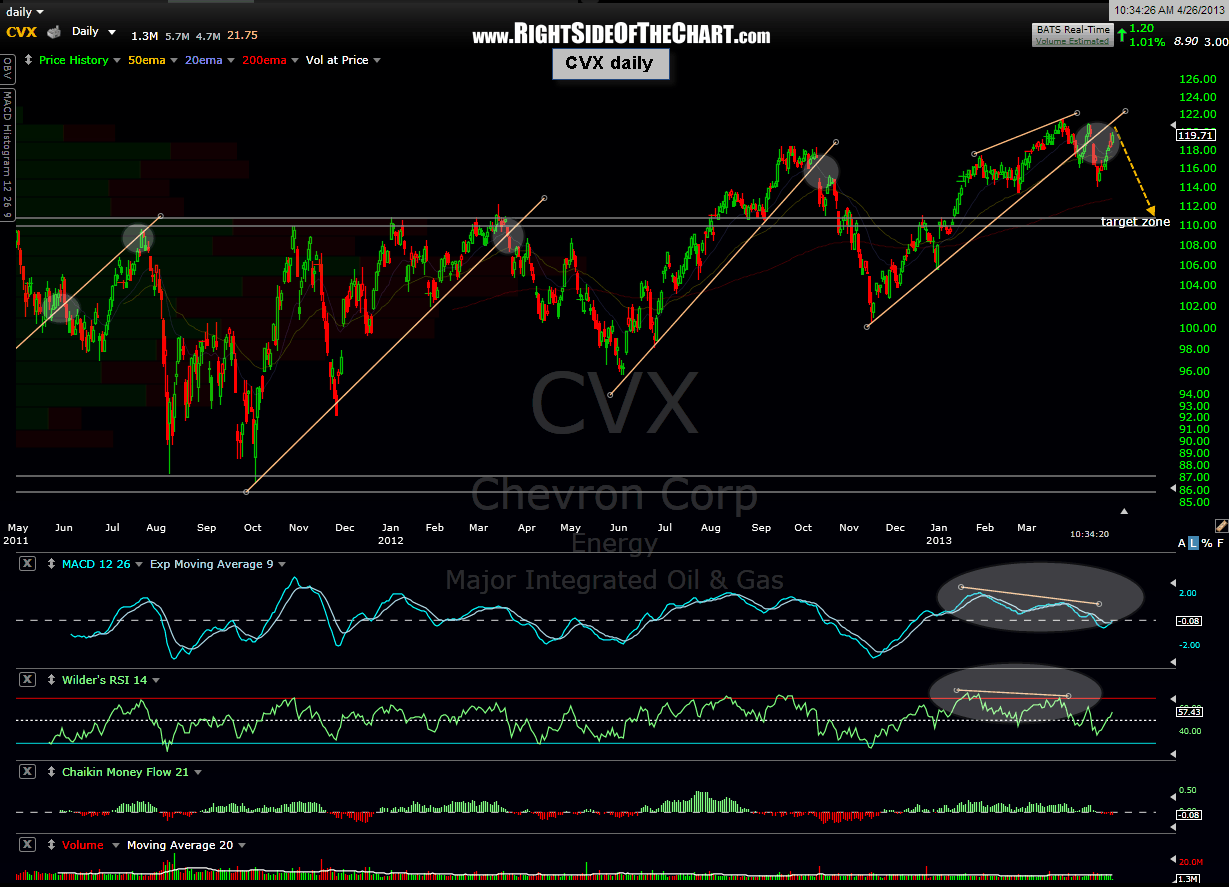
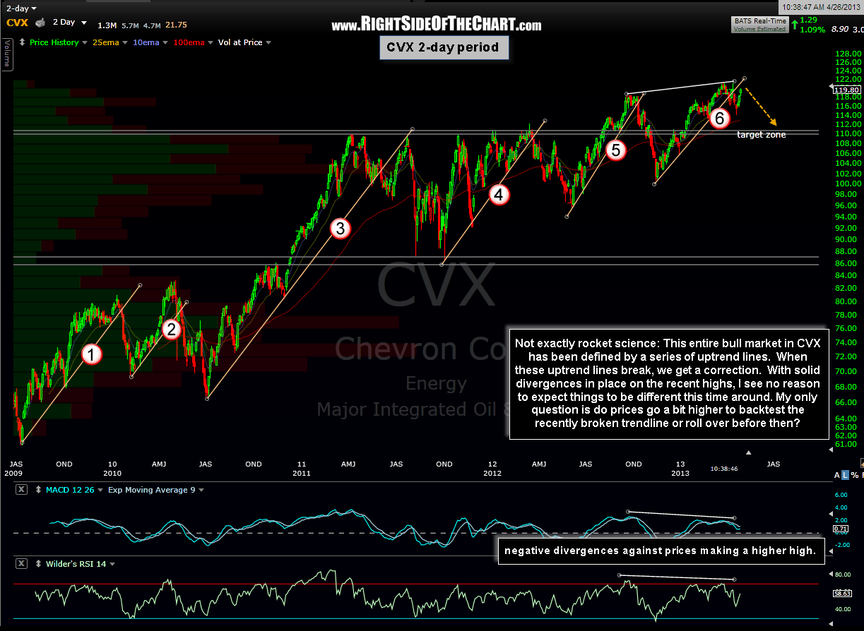
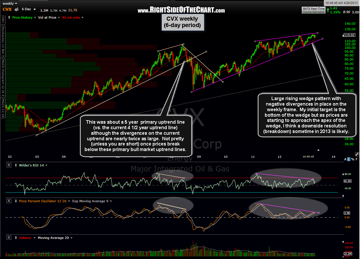
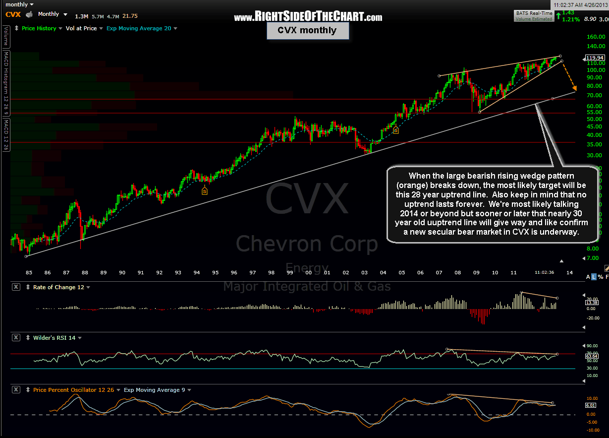
CVX… Going Down?
I’ve recently posted my thoughts on XOM, the largest stock in the world and largest component of the S&P 500 but here’s another behemoth which is sure to have an impact on the broad market, assuming these patterns play out. CVX (Chevron Corp) is currently the 4th largest component in the S&P 500 so I’ve put together a series of charts, complete with annotations, starting with the daily time frame and zooming all the way out to a 28 year, monthly period chart.  By my interpretation, these charts look bearish on all time frames but in the short-term (i.e.-daily chart), I can easily see a little more upside in CVX in order to backtest the recently broken uptrend line. That may or may not happen & if so, the upside should be limited.
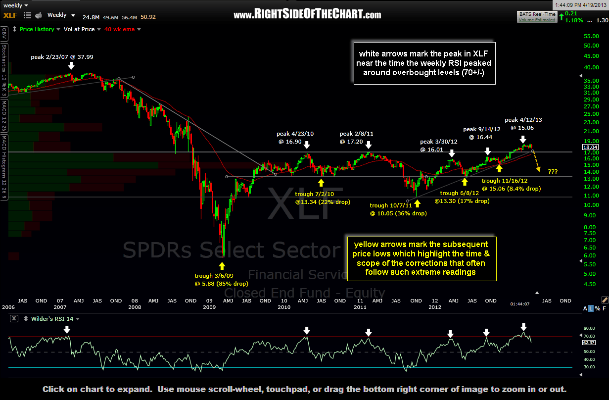
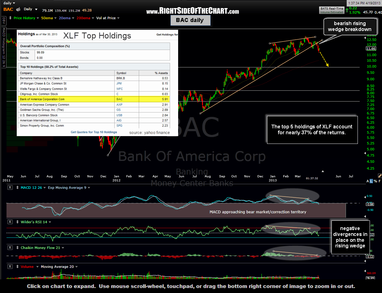
Maybe Too Big To Fail…
…But certainly not too big to short. Here’s a weekly chart of XLF highlighting the peak to trough corrections following the weekly overbought readings going back to 2007.
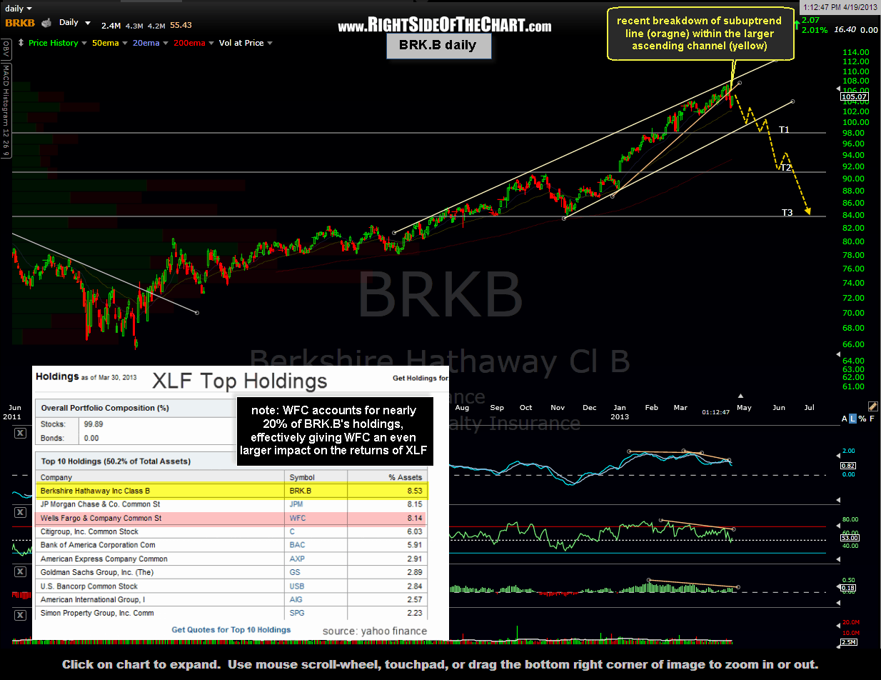
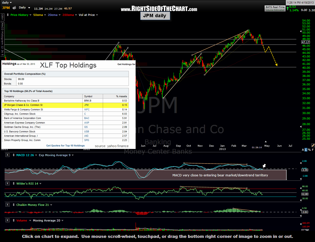
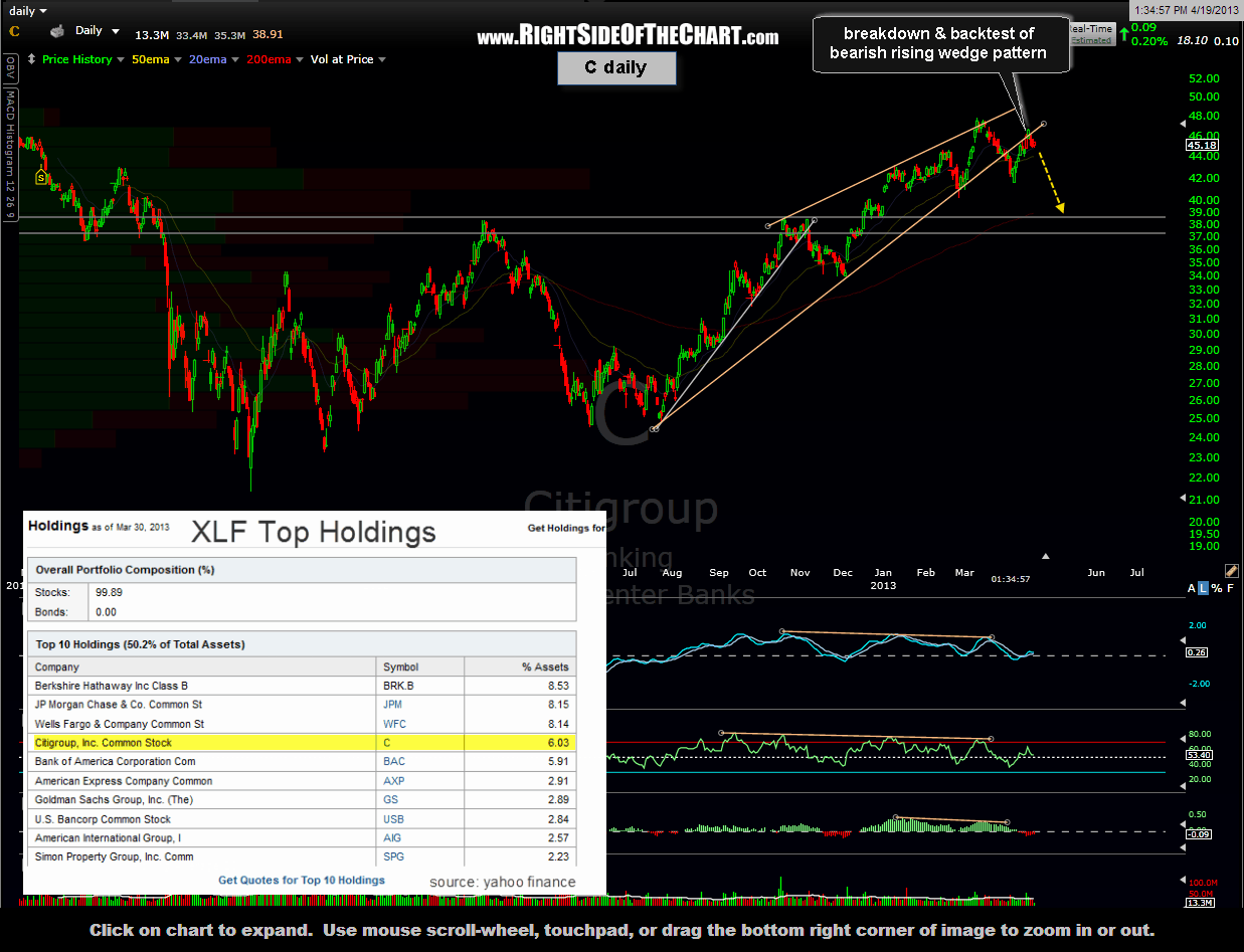
Zooming into the daily charts, let’s just focus on the top 5 holdings of XLF, as they comprise nearly 37% of the holdings in that widely held financial ETF. As noted on the charts, Berkshire Hathaway cl. B, which is the largest component of XLF, is comprised of nearly a 20% stake in Wells Fargo Corp, which is also the third largest component of XLF. Therefore, WFC is definitely one to keep on your radar.

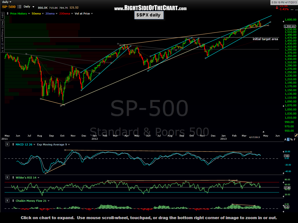
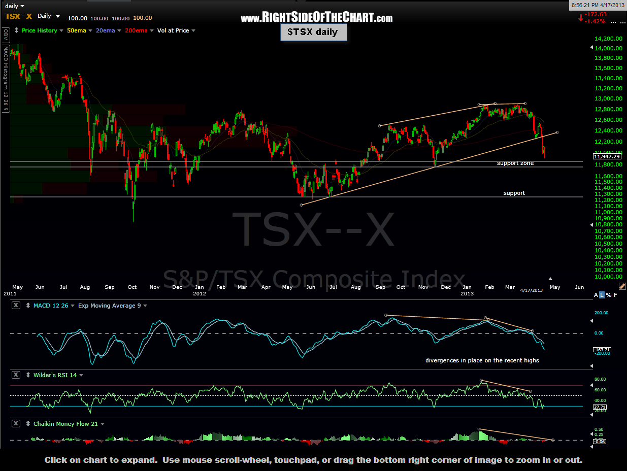
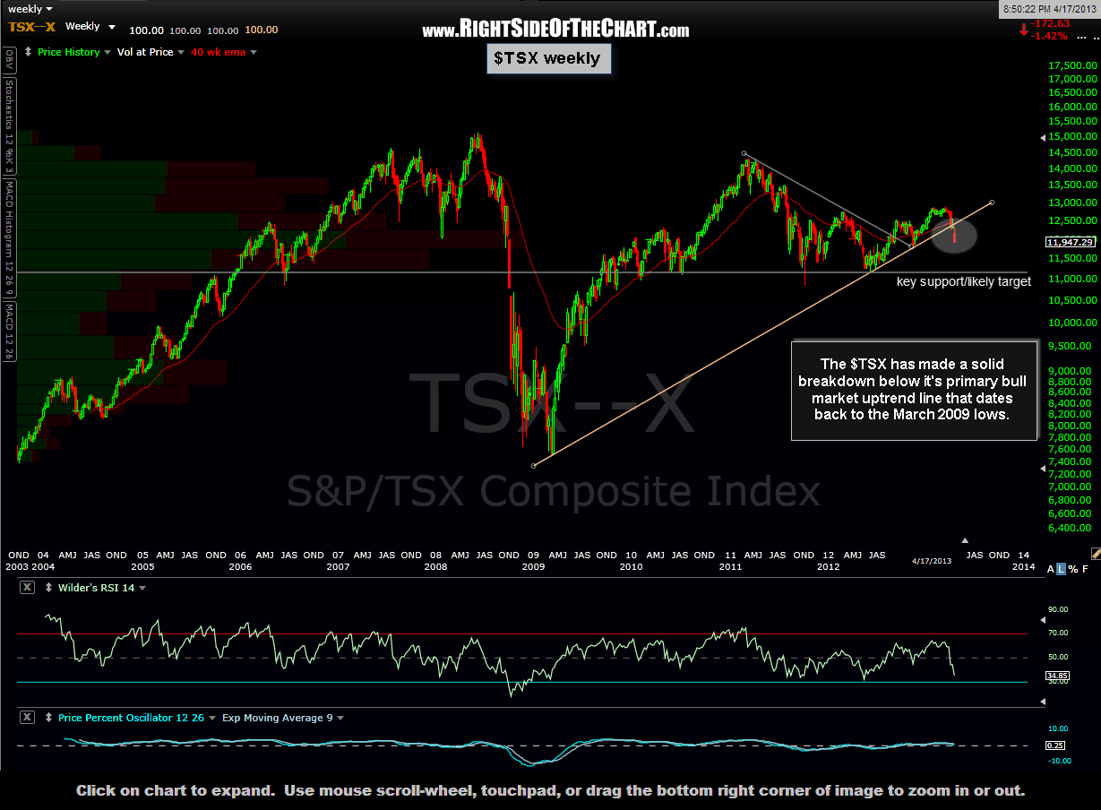
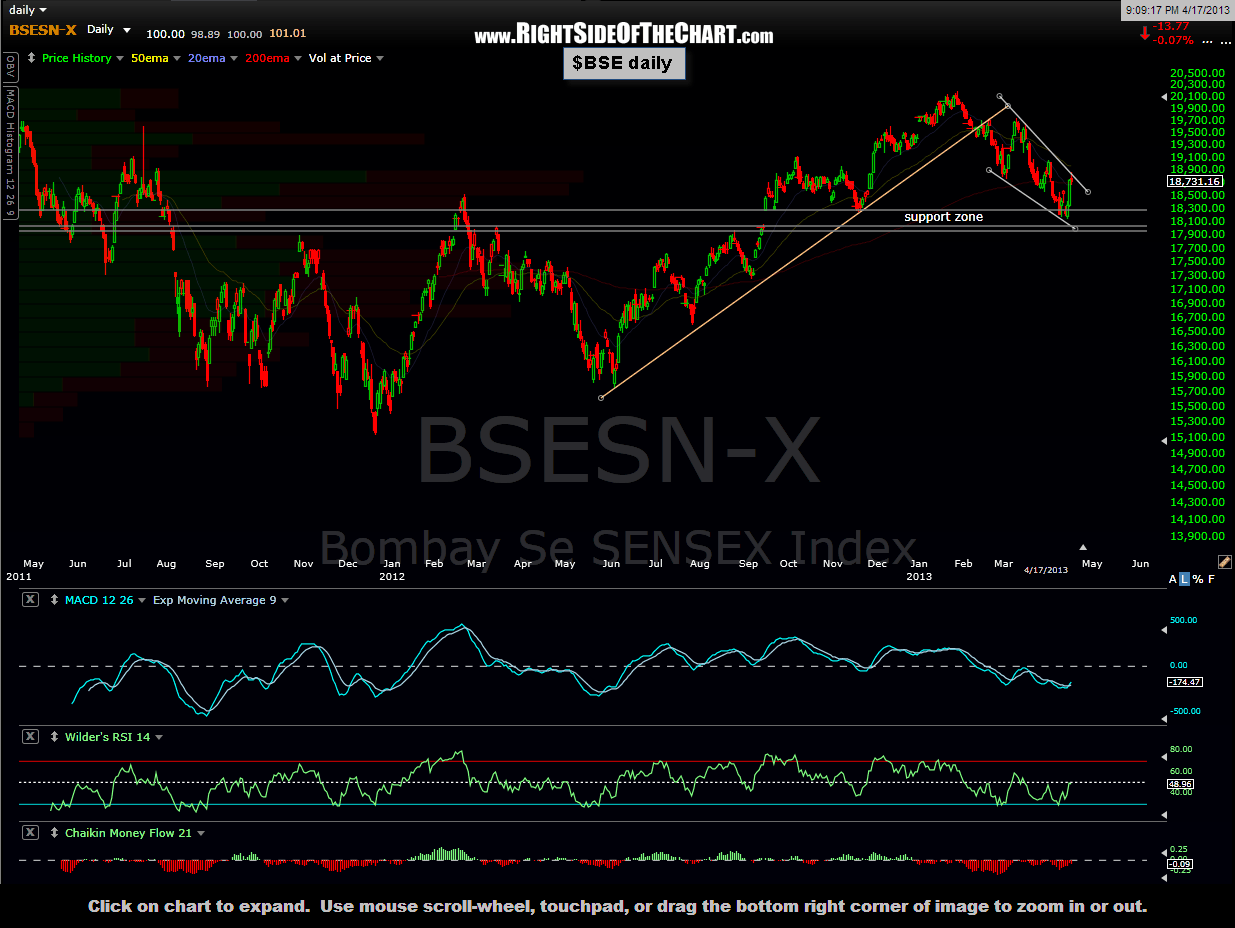
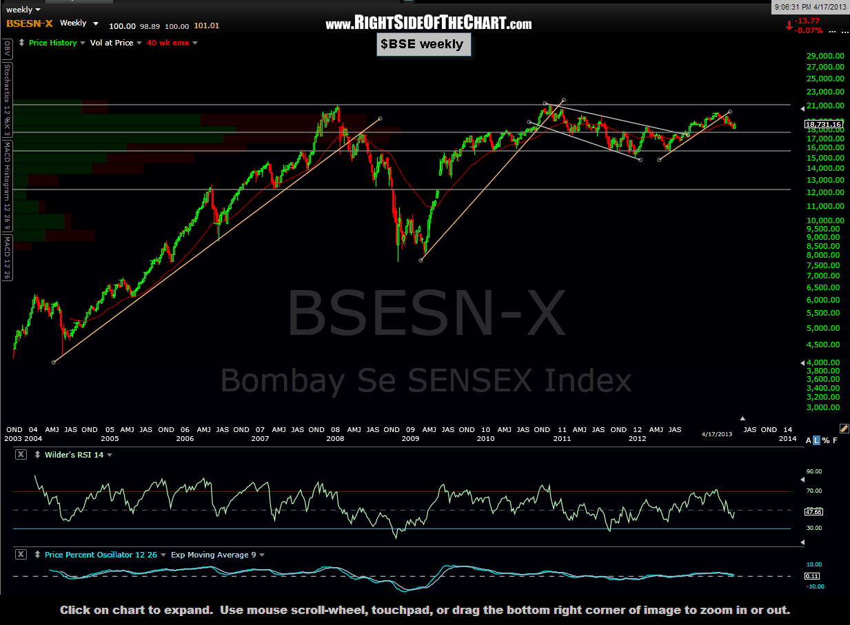
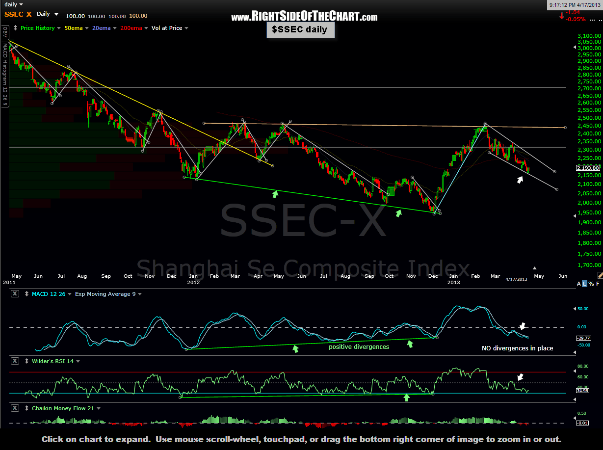
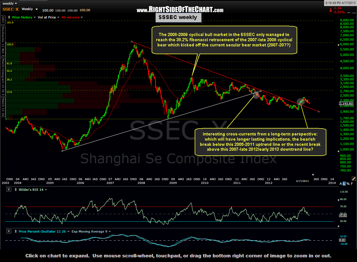
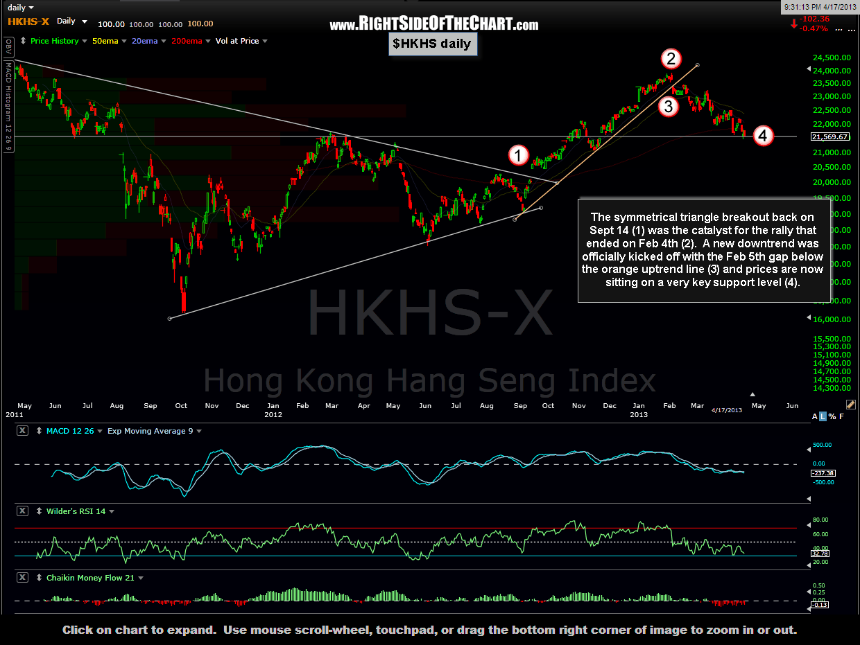
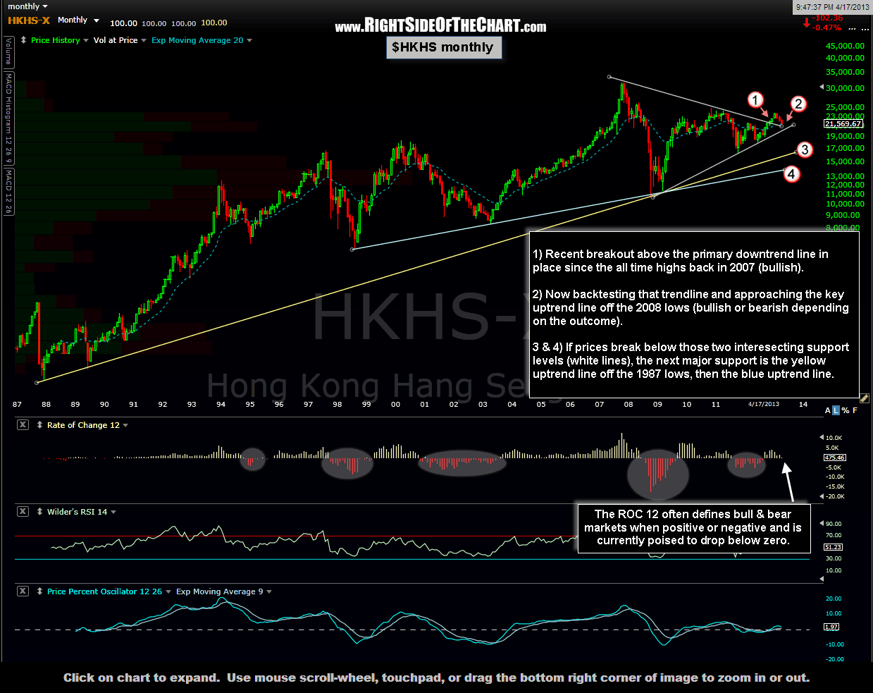
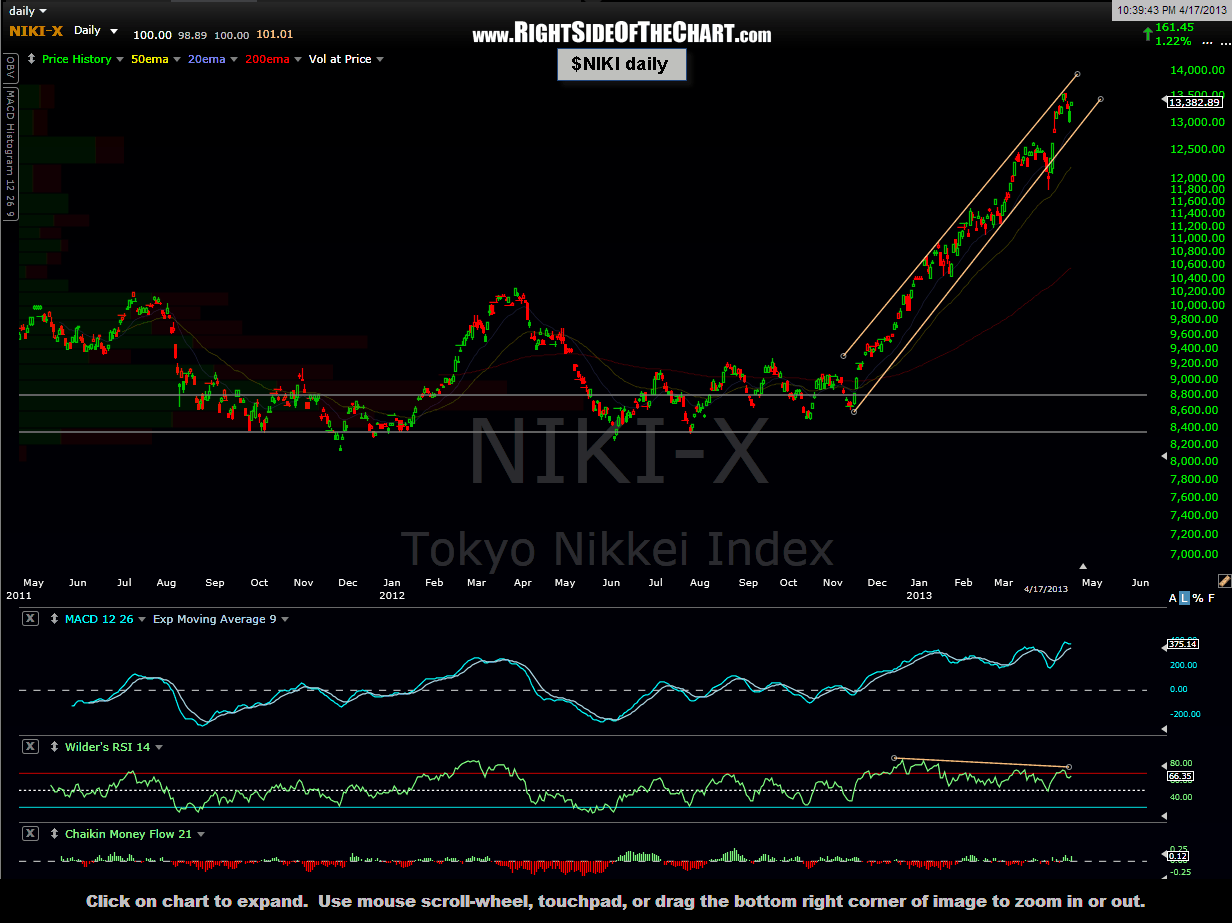
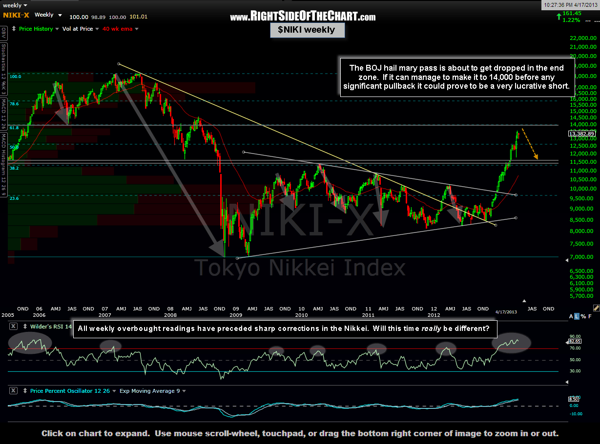
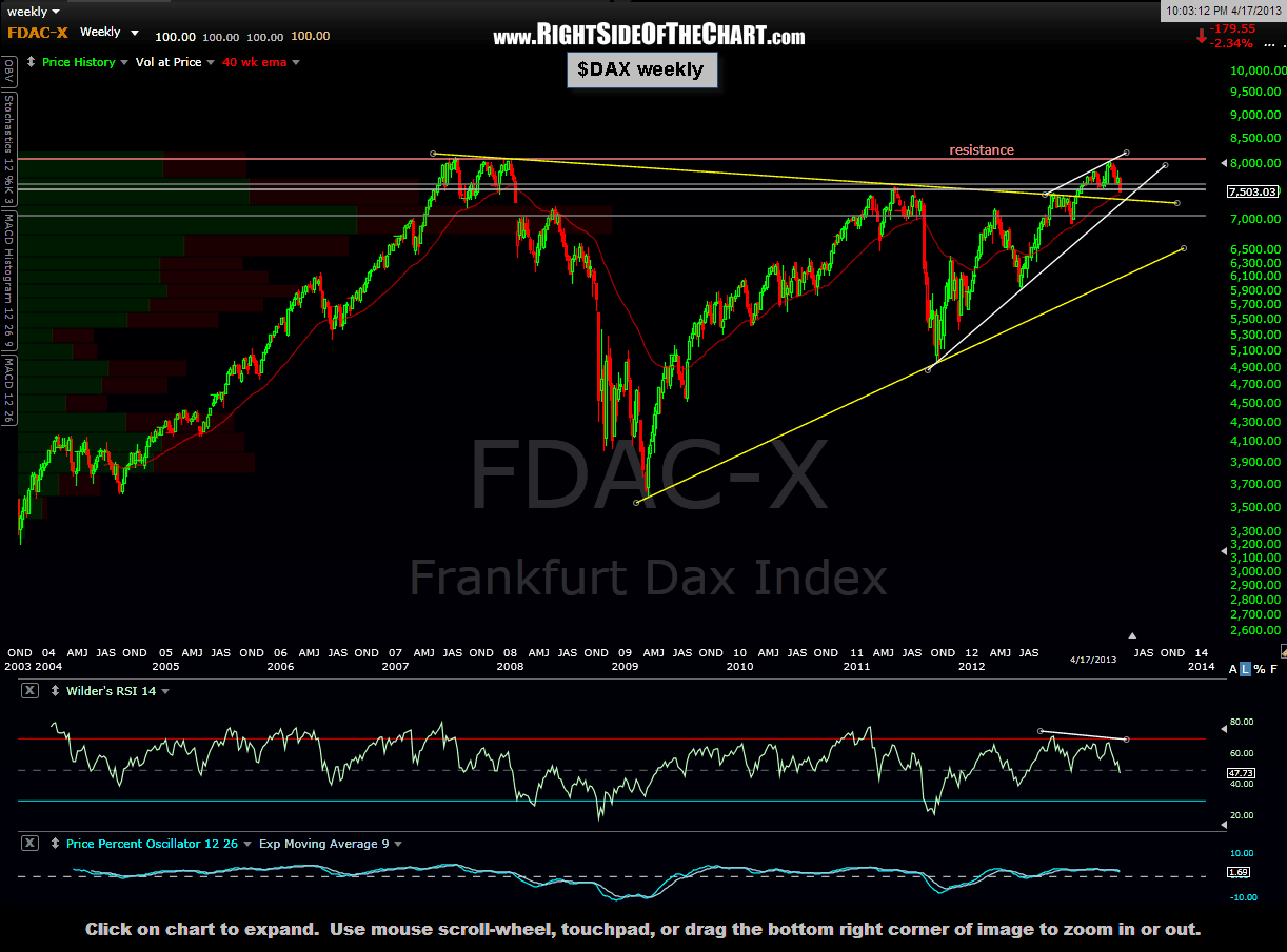
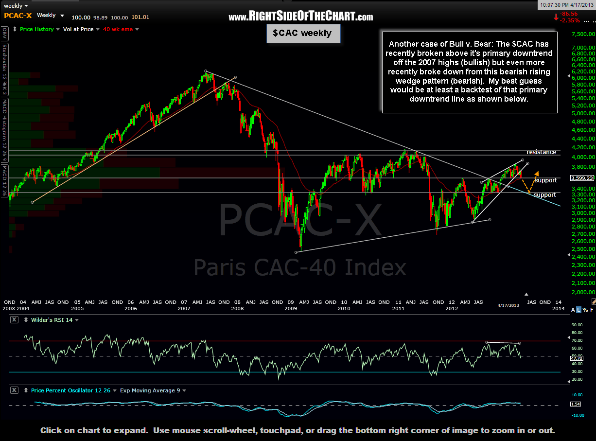
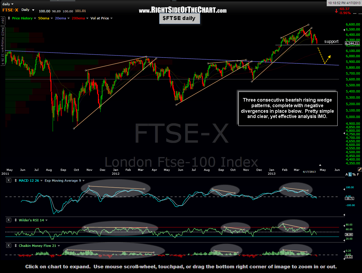
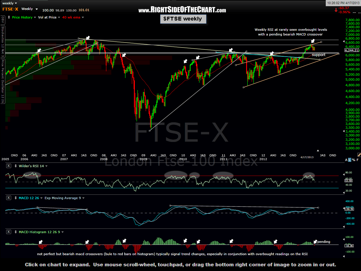
Around The World In 30 Seconds
Although it took over two hours of analysis and to annotate these charts, with a few clicks of the mouse you should be able to travel around the world to view nearly all of the major global equity indexes from a technical perspective in under a minute. All of the indexes below are shown with the daily time frame chart first followed by the weekly time frame, except for the $HKHS, in which the weekly chart was substituted with the more significant monthly chart. The following indices are shown in this order: $SPX (S&P 500), $TSX (Toronto), $BSE (Bombay), $SSEC (Shanghai), $HKHS (Hong Kong), $NIKI (Tokyo), ($DAX (Frankfurt), $CAC (Paris), and the $FTSE (London). (ProTip from Tim: right-click your mouse over any given thumbnail so that the image shows up in a separate tab).