The Trump Top
Slope initially began as a blog, so this is where most of the website’s content resides. Here we have tens of thousands of posts dating back over a decade. These are listed in reverse chronological order. Click on any category icon below to see posts tagged with that particular subject, or click on a word in the category cloud on the right side of the screen for more specific choices.
In recent weeks, the VIX blasted from 18 to almost 30 back to 18 again. I was curious if there were any other occurrences in which this took place. I found a very similar set of behavior that ended, of all days, last Christmas Eve.

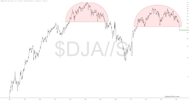
I’ve shared my pairs charts, or ratio charts if you prefer, many times. The general conclusion from these, going back for a long while, was “bullish precious/bearish equities.” Yes, precious metals have done great, but equities just keep going up anyway. Let’s take a look at three major ratio charts, all of which reach the same conclusion:
My Twitter account has about 25,700 followers. There’s another account from a far more bullish chap which has nearly a million. He offered up the following thought regarding the forthcoming Fed cut: