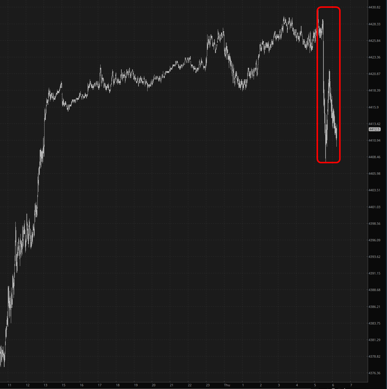
The Fed’s favorite inflation data point was just released, and it came in ice cold. Ostensibly, it was up a mere 0.1% for the month, which was half the level that was forecast.

Slope initially began as a blog, so this is where most of the website’s content resides. Here we have tens of thousands of posts dating back over a decade. These are listed in reverse chronological order. Click on any category icon below to see posts tagged with that particular subject, or click on a word in the category cloud on the right side of the screen for more specific choices.
The Fed’s favorite inflation data point was just released, and it came in ice cold. Ostensibly, it was up a mere 0.1% for the month, which was half the level that was forecast.

Ever since the 30 year Treasury bond yield (one ‘top-down’ macro tool NFTRH uses to gauge the environment so that we may invest in, speculate upon or avoid certain situations, accordingly) broke its Continuum of pleasantly declining long-term Treasury bond yields, macro nerds have been called to task in order to correctly interpret the forward backdrop that this break implies. The note at the upper right of the chart asks the key question.

Mercifully, the CPI numbers came out, and they are a bit on the hot side. Nothing big, but at least a little strong. Incidentally, if you think the price of goods and services is only going up 3.7% per year, I’ve got some FTX Tokens I’d like to sell you in exchange for gold bullion.
