Weightless Exports
Slope initially began as a blog, so this is where most of the website’s content resides. Here we have tens of thousands of posts dating back over a decade. These are listed in reverse chronological order. Click on any category icon below to see posts tagged with that particular subject, or click on a word in the category cloud on the right side of the screen for more specific choices.
I can relate to this chart…………here we have Spotify, with nearly half a billion free users (they have to see ads) which contribute a mere 6% of profits. Then we have a much smaller group of folks who actually pay for the service and constitute 94% of profits. Kind of like Slope, except that the split is 0% and 100%, since I decided years ago not to sully my beloved website with advertisements for denture cleaners and shoe lifts.

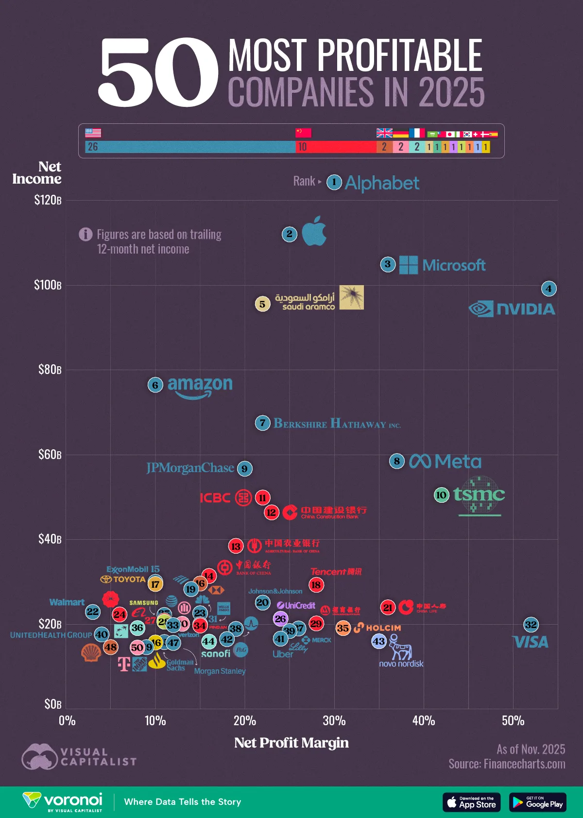
Here’s a diagram of the most profitable companies out there. The champion? Google!