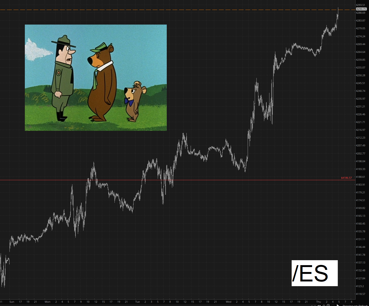
In just a few days, the /ES has slapped nearly 200 points on itself for the bulls. At this very moment, every single quote on my screen is green, and a one-two punch by AAPL and the jobs report would give the bulls a clean sweep of this entire week.
Slope initially began as a blog, so this is where most of the website’s content resides. Here we have tens of thousands of posts dating back over a decade. These are listed in reverse chronological order. Click on any category icon below to see posts tagged with that particular subject, or click on a word in the category cloud on the right side of the screen for more specific choices.
In just a few days, the /ES has slapped nearly 200 points on itself for the bulls. At this very moment, every single quote on my screen is green, and a one-two punch by AAPL and the jobs report would give the bulls a clean sweep of this entire week.
With the first ten months of the year now out of the way, a mere one-sixth of 2023 remains. Considering how absolutely insane this year has been already in all arenas (financial, geopolitical, legal, you name it), one can only tremble to consider what the next two months might hold.
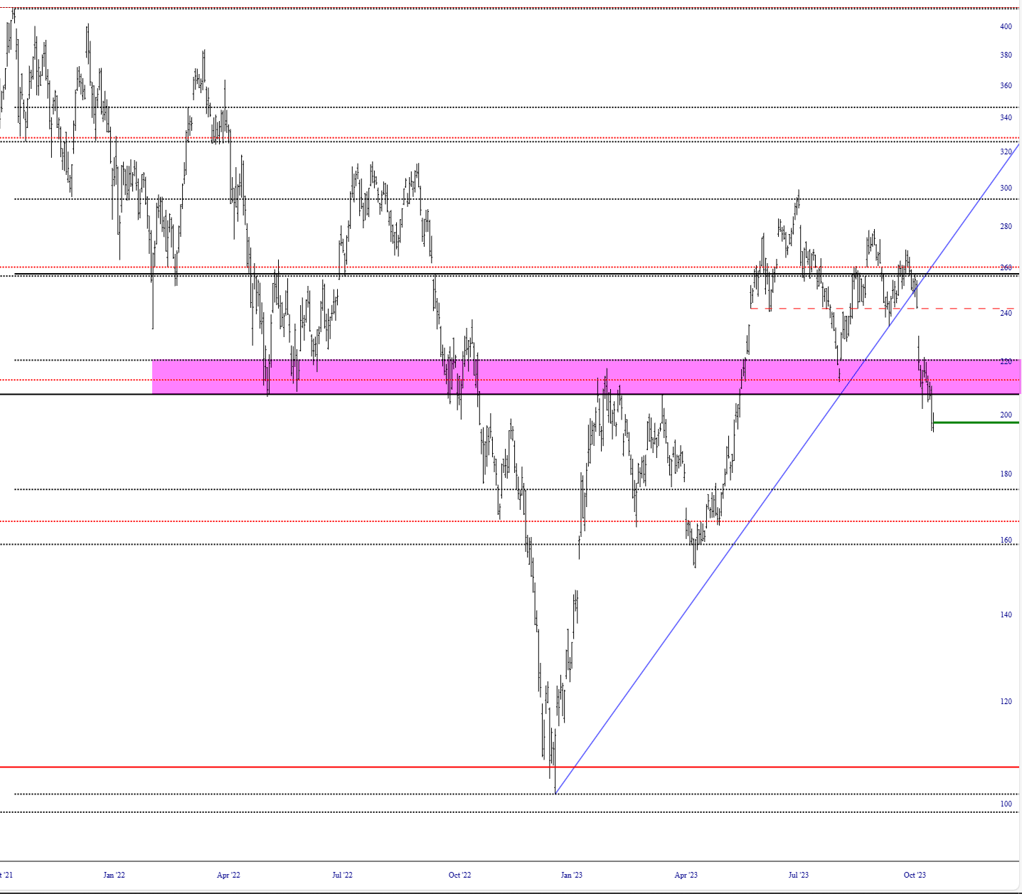
Rather than dare speculate on the dozens of weighty matters already vexing the globe, I will simply focus on an octet of cash index charts along a common theme: the notion that each of them has hammered out a formidable and well-formed topping pattern and that, preposterous as it might seem to the mainstream pundits (and flying in the face of endless-cited bullish seasonality), it is within the realm of possibility that new lows for 2023 could be on hand for at least a few major indexes.
For simplicity’s sake, the format of each of the charts below is consistent. Specifically:
Having said all that, let’s go through the indexes one by one. We begin with the all-important S&P 500:
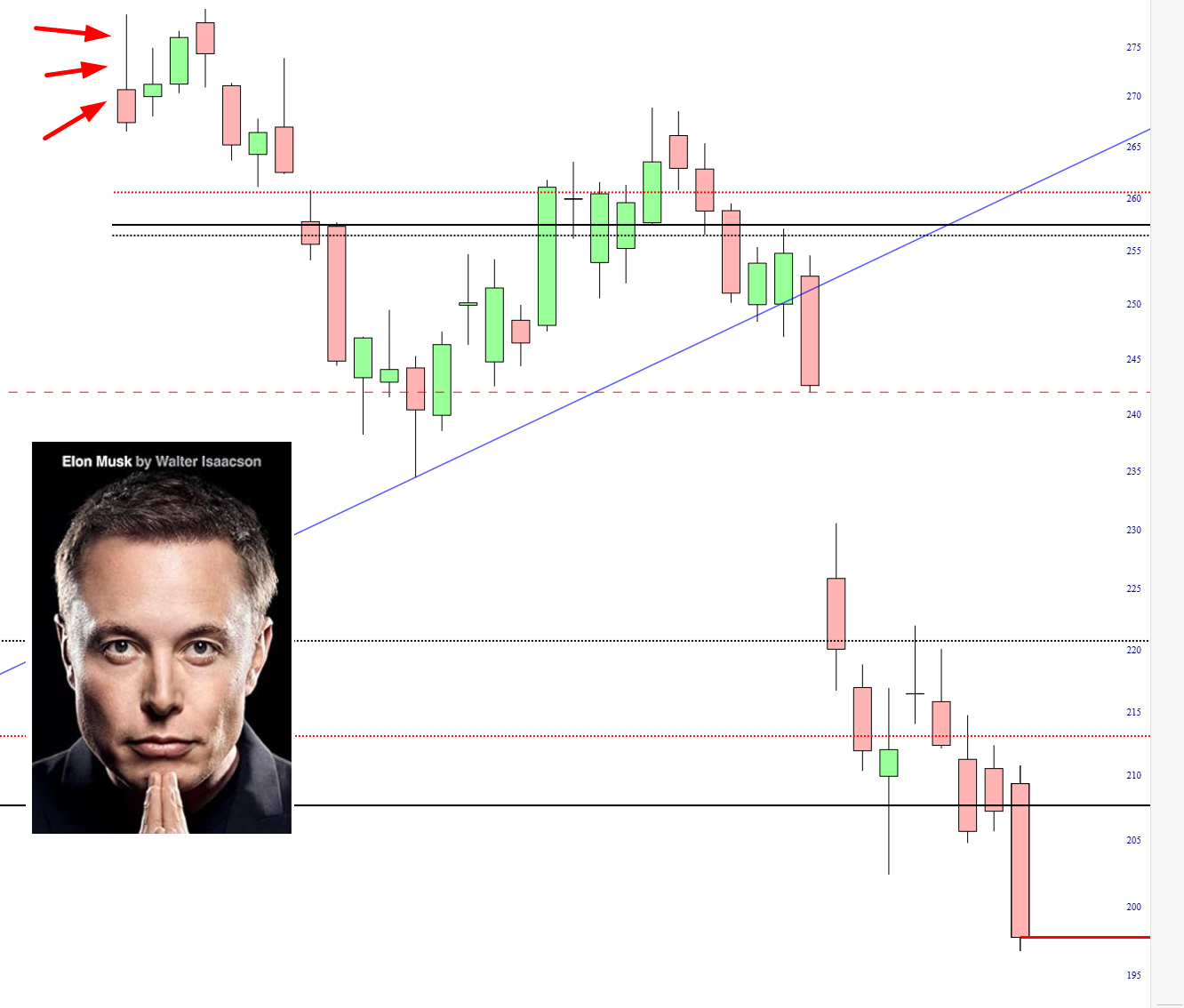
(more…)Simply stated, massive support has morphed into massive resistance. The tide fully turned by October 15th, and now that we’ve plunged beneath all three Fib levels, I’d say TSLA isn’t getting much past the very low $200s for a long while.
I knew it. I knew it, I knew it, I knew it. All human history shows the same thing. Get on the cover of a magazine or, even worse, have a major book come out about you, and you are HOSED. I have subtly put some arrows marking the PUBLICATION DATE of Elon’s biography. Notice anything happen since then? Yeah, it rhymes with “market cap downs hundreds of billions of dollars.”
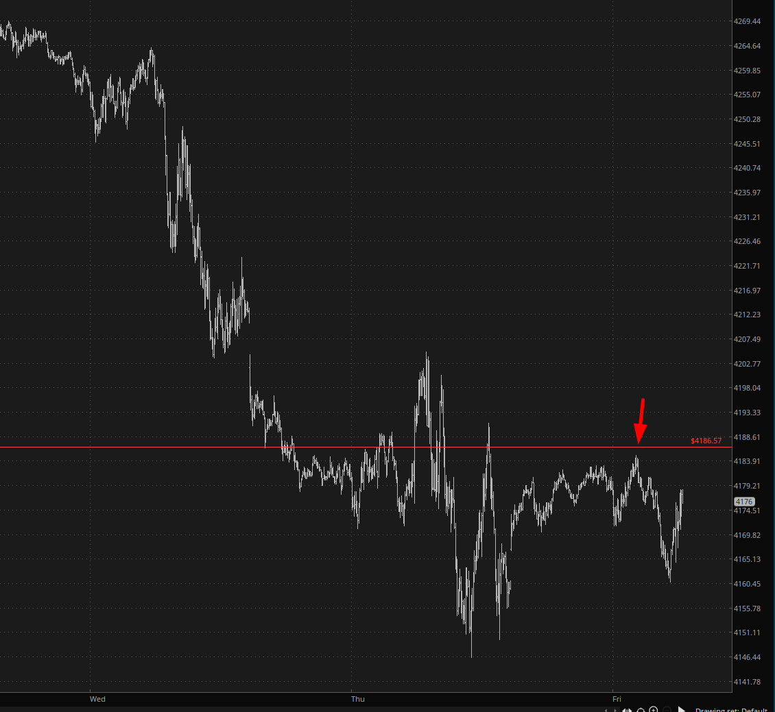
Good morning, and Happy Friday, everyone! Well, our friend the Fibonacci is continuing to do God’s Work. You can see how this important level has transformed from support to resistance on the /ES after a brief phase-change. Last night’s peak almost perfectly touched this sucker.