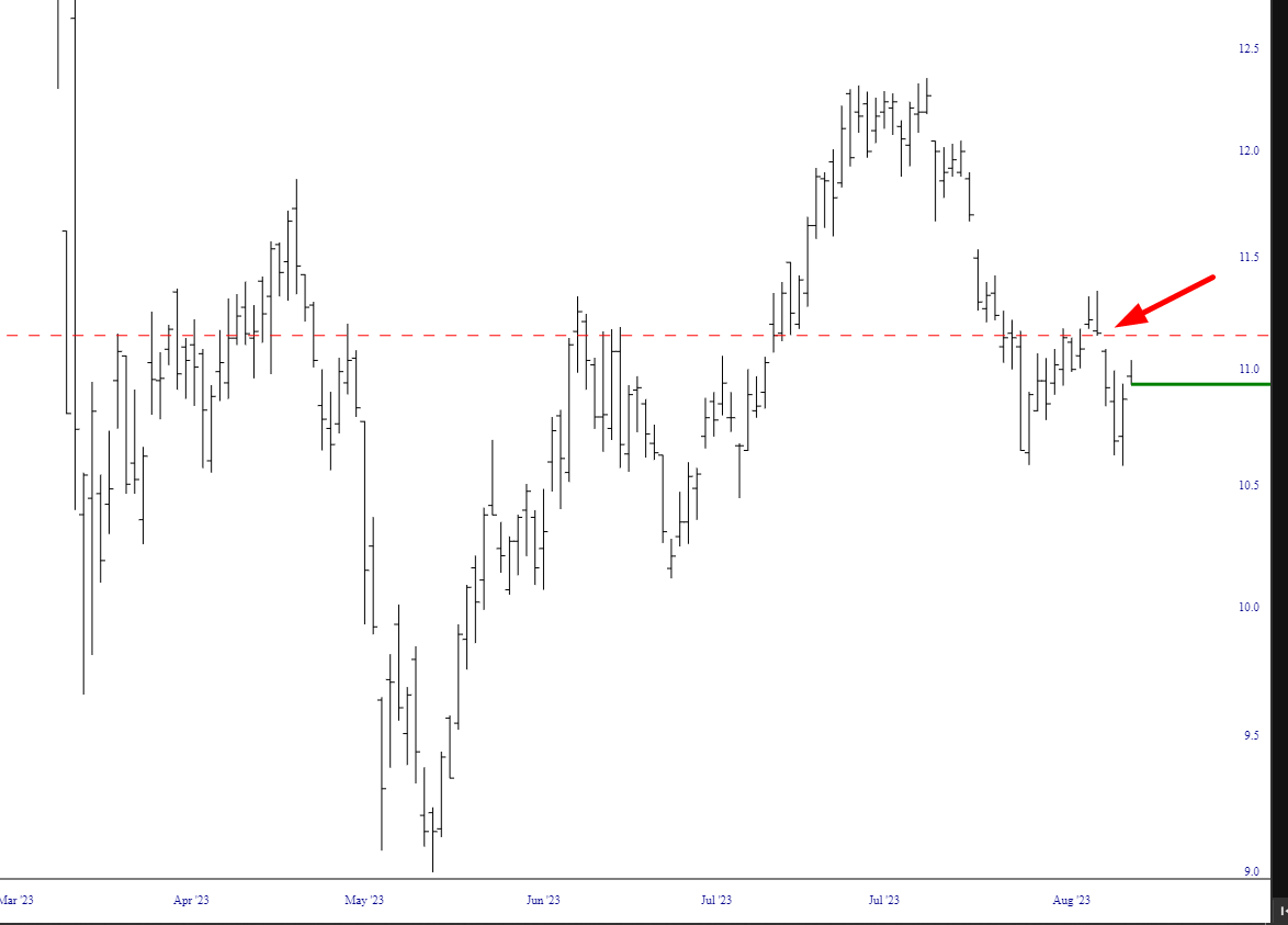
One of my 14 bearish positions is Huntington Bancshares (HBAN) which is sporting a very clean price gap at 11.15. Keep in mind, it’s a Banc, not a Bank.
Slope initially began as a blog, so this is where most of the website’s content resides. Here we have tens of thousands of posts dating back over a decade. These are listed in reverse chronological order. Click on any category icon below to see posts tagged with that particular subject, or click on a word in the category cloud on the right side of the screen for more specific choices.
One of my 14 bearish positions is Huntington Bancshares (HBAN) which is sporting a very clean price gap at 11.15. Keep in mind, it’s a Banc, not a Bank.
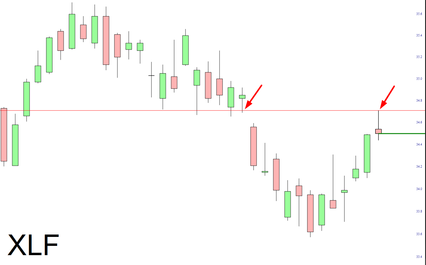
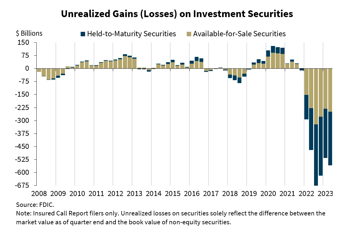
The Treasury Department will tell you that banks have never been healthier. Utter crap. Banks are, by honest accounting methods, largely bankrupt and should have shuttered many years ago. They’re being kept afloat by a dishonest government. Here’s what reported, and this is what they CHOOSE to tell you.
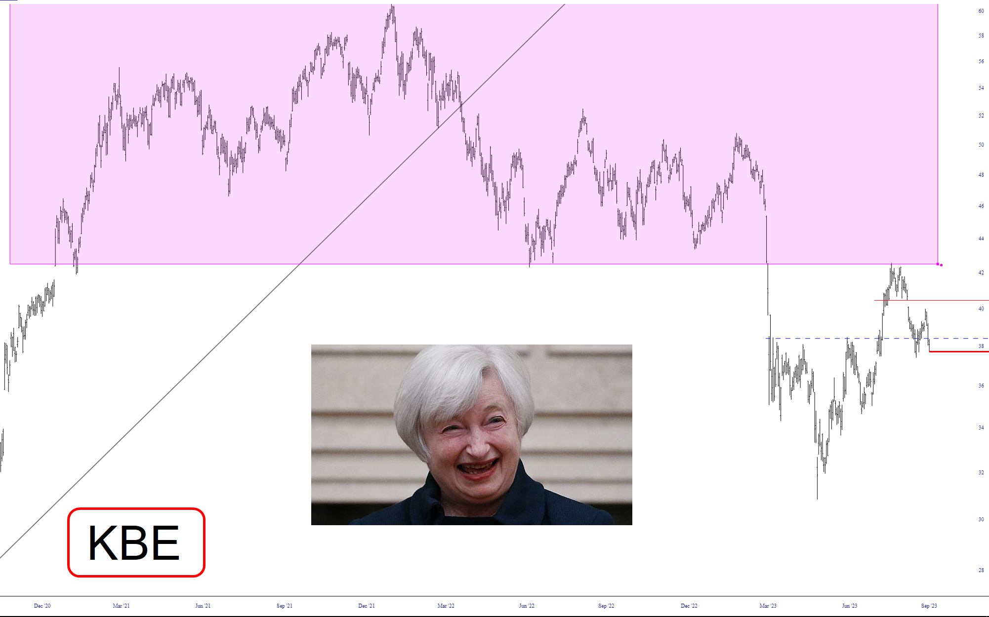
This was already a good day, but it got even better when I took a look at the bank ETF symbol KBE. The failure of that horizontal is EXACTLY what I was hoping would happen. HUZZAH!!!
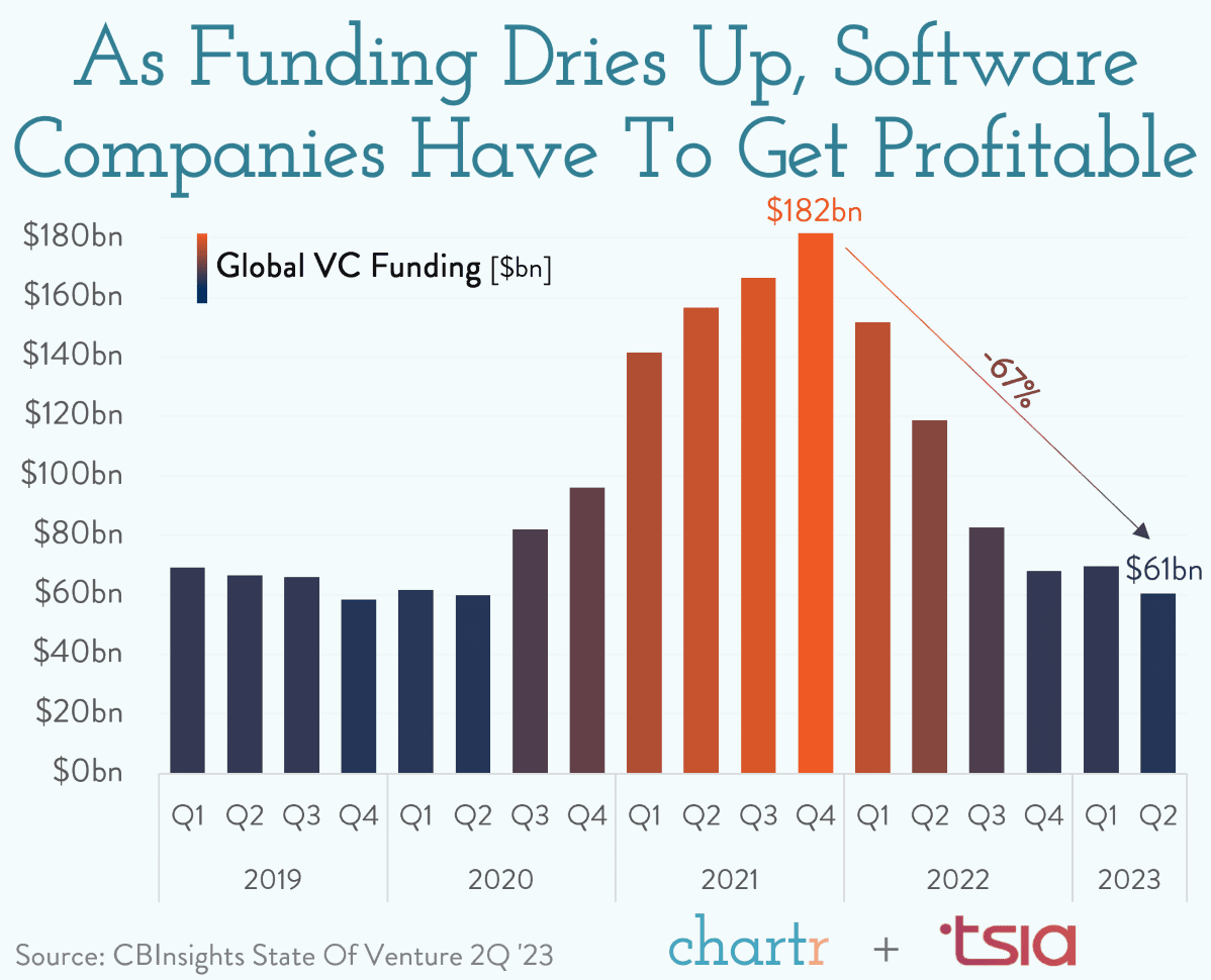
I live in the Silicon Valley, which is the center of the universe for venture capital. This VCs dumped ungodly amounts of cash into ridiculous startups during the Covid craze. Mercifully, a bit of sanity has returned, as almost none of these investments panned out (with WeWork being just one of hundreds of examples). The amount of VC cash has crashed by two-thirds lately.
Beautiful!