Slope of Hope Blog Posts
Slope initially began as a blog, so this is where most of the website’s content resides. Here we have tens of thousands of posts dating back over a decade. These are listed in reverse chronological order. Click on any category icon below to see posts tagged with that particular subject, or click on a word in the category cloud on the right side of the screen for more specific choices.
U.S. Banks and 2 & 10-Year Yields
During the past year, or so, U.S. 2-Year Treasury Yields have shot up sharply, in comparison with 10-Year Yields, as shown on the following weekly price comparison chart and percentage comparison chart.


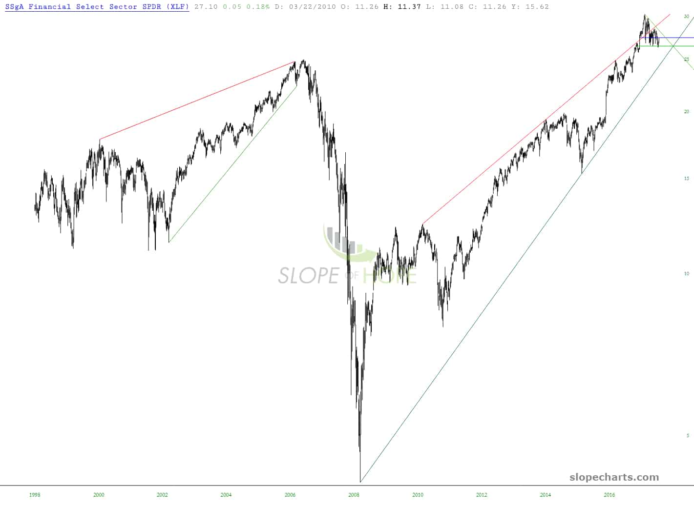
Tank de la Bank
As I trust I have made clear, the financial sector is a favorite right now for shorting. This chart of the XLF is, based on over 30 years of staring at charts, one of the most exciting and enticing opportunities I have ever laid eyes on. The analog and breakdown have, thus far, been spot-on.
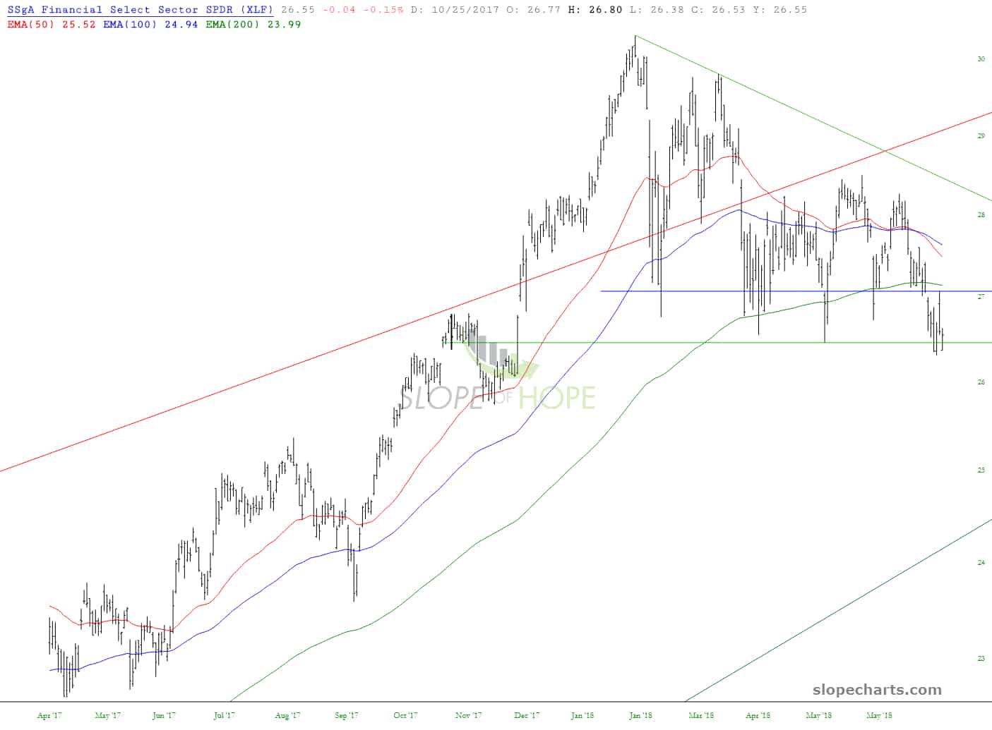
Financials Farce
The massive financials analog continues to play out beautifully. We may see a little strength (or not) after all the recent weakness, but I think the die is cast. The financials, by way of XLF below, should ideally stay below 27.08 from here on out.