Sooooooo………did everyone enjoy that completely ridiculous, totally fake ramp-up from midnight until now? Good, good.
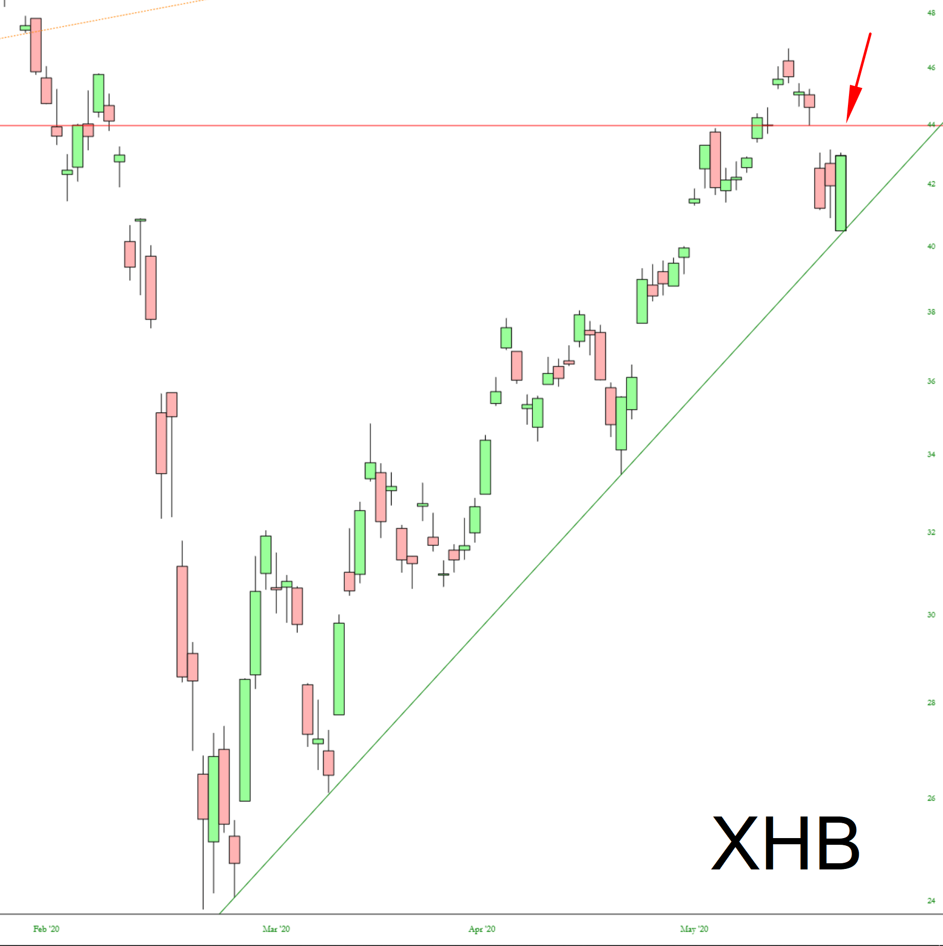
May I suggest a look at the homebuilders ETF and the price gap at 43.98
Slope initially began as a blog, so this is where most of the website’s content resides. Here we have tens of thousands of posts dating back over a decade. These are listed in reverse chronological order. Click on any category icon below to see posts tagged with that particular subject, or click on a word in the category cloud on the right side of the screen for more specific choices.
Sooooooo………did everyone enjoy that completely ridiculous, totally fake ramp-up from midnight until now? Good, good.
May I suggest a look at the homebuilders ETF and the price gap at 43.98
It has been 75 days since the tragic cessation of the one-month long bear market, and while the Stonks Only Go Up meme is totally saturated into the public mindspace, I think the ten charts below are worth your time. I’ve said a few words about each in the caption.
I’ve been watching this for the past two months. It sealed it up Ziploc-tight with yesterday’s high.
I don’t think many folks here trade futures, but SlopeCharts has a rich collection of futures charts, and I thought a few were worth sharing with you. First up is the FTSE 100 chart. Take note of that monstrous gap which is just about closed.
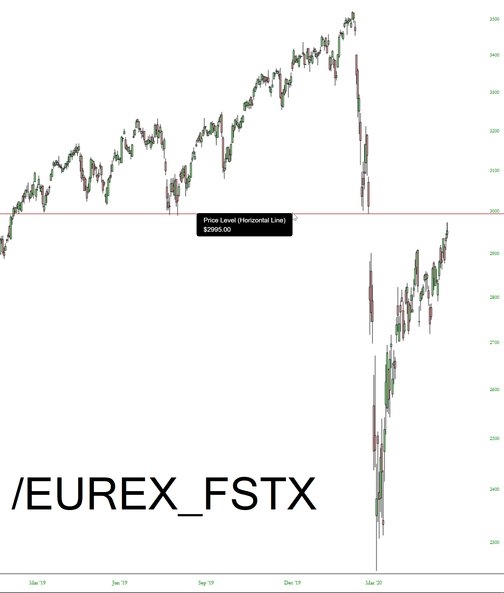
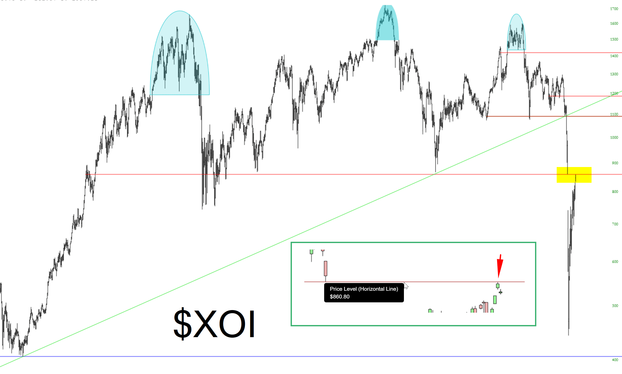
Not that gaps and trendlines have proved much of a match for the trillions of dollars of endless Fed stimulus, but these are major enough, I feel inclined to point them out:

