I have shared the XME/GDX chart dozens of times. The basic idea is that, long-term, we peaked on this ratio chart and short XME/long GDX would be the way to go. It’s a slow mover, but so far, so good.

Slope initially began as a blog, so this is where most of the website’s content resides. Here we have tens of thousands of posts dating back over a decade. These are listed in reverse chronological order. Click on any category icon below to see posts tagged with that particular subject, or click on a word in the category cloud on the right side of the screen for more specific choices.
I have shared the XME/GDX chart dozens of times. The basic idea is that, long-term, we peaked on this ratio chart and short XME/long GDX would be the way to go. It’s a slow mover, but so far, so good.
Equities down and Silver up. That’s precisely what I want to see! Looking at the one-hour bar chart of silver, we can see that it had an important fake-out late in October, which was pretty disappointing in its aftermath, and we’re going to have another go at conquering that horizontal line.
Here are a couple of precious metals miners I’ve mentioned in the past which look better than ever.

It has been said many times over decades that copper is an excellent canary in the proverbial coal mine for judging where the economy is heading. May I direct your attention Freeport McMoRan (or fREEPORT mCmOrAN if you like) symbol FCX. Looks like doom to me!

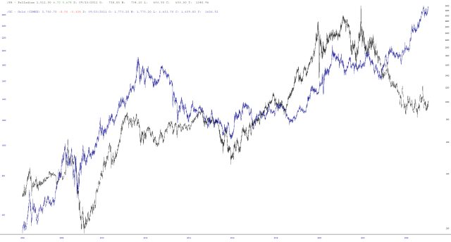
Well, Maxx has created a monster, because palladium has gone from “never even gave it a thought” to “living rent free in my head.” I wanted to share a few more charts about this critter.
First is the layered chart of the long-term gold futures versus those of palladium. They pretty much tracked one another until a couple of years ago, at which time palladium decided to vastly underperform gold. I suppose the big question is whether PA can ultimately clamor its way back up to GC-land.