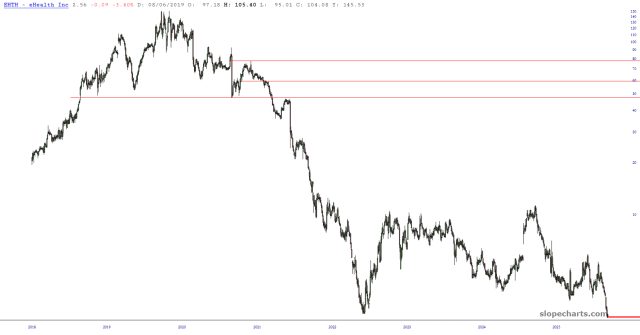
This is a superb example of the head and shoulders top in action. Below is EHTH, which completed a marvelous H&S at about $48. It is trading at just a couple of bucks now. Beautiful.
Slope initially began as a blog, so this is where most of the website’s content resides. Here we have tens of thousands of posts dating back over a decade. These are listed in reverse chronological order. Click on any category icon below to see posts tagged with that particular subject, or click on a word in the category cloud on the right side of the screen for more specific choices.
This is a superb example of the head and shoulders top in action. Below is EHTH, which completed a marvelous H&S at about $48. It is trading at just a couple of bucks now. Beautiful.
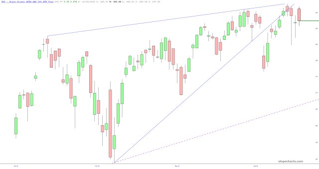
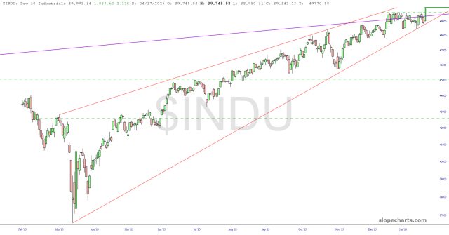
That was a seriously crazy week. It seemed like the bears were going to absolutely take over the market, with an amazing crescendo late Thursday as Bitcoin plunged to less than HALF its peak price. Friday was the revenge of the bulls, however, and the /NQ and /ES went up hundreds of points, the /YM went up quadruple digits, and the Dow Industrials crossed above 50,000 for the first time in human history:
With Amazon down a double-digit percentage, it’ll be interesting to see who wins the day tomorrow: will the over-stretched NQ spring back higher temporarily, or will AMZN be bad enough to make the stretched even more over-stretched? I’m fairly aggressively short, so……..I’ll be watching closely!

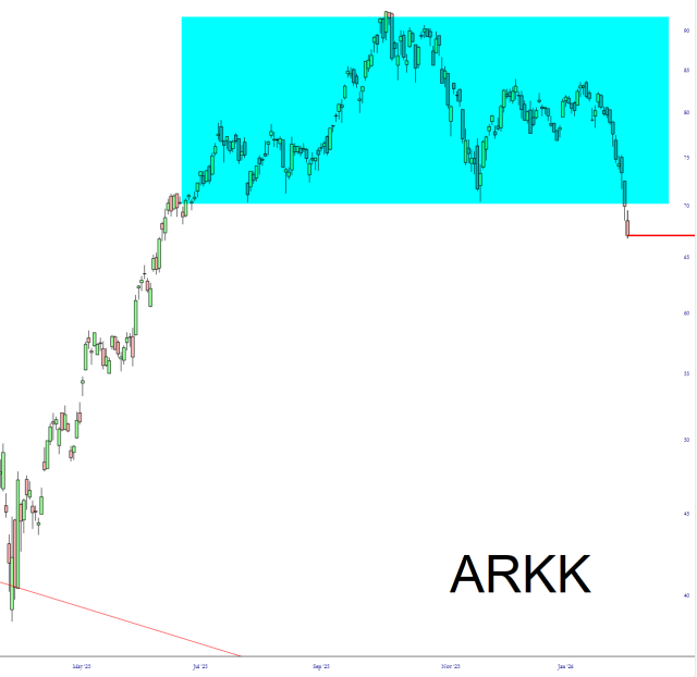
Not that Cathie D. Wood won’t get any media time she ever desires, since she was really on fire about six years ago.
Now it’s all starting to make sense.