Once again, allow me to self-congratulate the post title. C’mon, that’s a good one!
Anyway.
SlopeCharts has another new study.
(more…)Slope initially began as a blog, so this is where most of the website’s content resides. Here we have tens of thousands of posts dating back over a decade. These are listed in reverse chronological order. Click on any category icon below to see posts tagged with that particular subject, or click on a word in the category cloud on the right side of the screen for more specific choices.
Once again, allow me to self-congratulate the post title. C’mon, that’s a good one!
Anyway.
SlopeCharts has another new study.
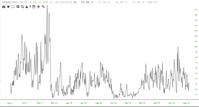
(more…)They’re not ready yet, but quite soon now, we’re going to have an entire phalanx of “new highs” and “new lows” indicators in SlopeCharts. We’ve never had this information before, or even access to it, but we’re creating and managing our own data now. Here’s a sneak peek of new highs:
I know that not everyone hangs out on Slope during the weekend, so just to be sure you didn’t miss it, I wanted to remind folks that:
We’re actually working on a bevy of indicators right now, and obviously I’ll announce those one by one as they are released.

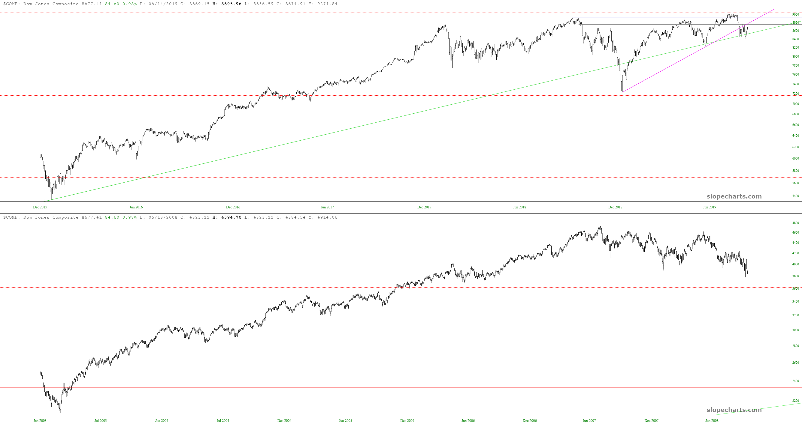
Even though it’s an exclusive feature for Diamond members, the grid feature in SlopeCharts is something I wanted to mention again for a couple of reasons. First, we’ve enhanced the grid feature so that it handles drawn objects intelligently (we had suppressed them before). Second, there are some pretty cool analogs going on I wanted to share below.
First, here is the Dow Jones Composite:
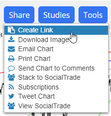
Someone recently suggested the means to create a URL that would bring up SlopeCharts with a symbol already entered. Your wish is our command! There is now a new menu item under the Share menu: