Slope of Hope Blog Posts

Slope initially began as a blog, so this is where most of the website’s content resides. Here we have tens of thousands of posts dating back over a decade. These are listed in reverse chronological order. Click on any category icon below to see posts tagged with that particular subject, or click on a word in the category cloud on the right side of the screen for more specific choices.

Q1 GDP Advance (by MacroStory.com)

By -

The first look at GDP for Q1 2011 came in at 1.77% in real (inflation adjusted) terms, a decline from 3.11% in Q4 2010 and 3.72% in Q1 2010.

Below are the highlights.

A big drag was government that actually contributed a negative 1.09% to growth driven mainly by state government and national defense.

Inventory bounced back slightly and contributed 0.93% from a prior quarter contraction of 3.42% but clearly the inventory build cycle is declining.  Should retailers grow concerned about business conditions it is probable inventory will contract in Q2.

Trade was flat at negative 0.08% from the prior quarter where it actually contributed to growth by 3.27%.  The trade deficit contracted in Q4 2010 but the first two months of data in 2011 showed this trend reversing and thus highly probable to be a larger drag on GDP in Q2.

Looking forward to Q2 2011 GDP contraction is very possible and at risk due to government, inventory or trade.  This assumes consumers stay relatively strong as in this current report although a big portion of consumer income growth was from the government.  As government austerity becomes reality the Federal government will be a big drag on future GDP and very likely a cause of the next recession.

The next recession is the scary one when you consider labor is already in a difficult position and the government will be even harder pressed to stimulate or face the risk of rising bond yields.  This is when things get scary and I am of the opinion that Q2 could in fact be the next negative GDP print.

Charts below for your viewing pleasure.


Submitted by MacroStory.com – to read more please visit - MacroStory.com

Further Look at Energy Sector (by Leaf_West)

By -

A further look at the energy sector after my blog post from yesterday … just as an aside, I started a short on the XLE etf at yesterday's HOD this morning at $79.50.  I did it via the 2x Proshare "DUG" at $26.33.  I plan to monitor and add to this trade if it works like I think it will.

Another Energy component is the oil service sector … much like the XLE chart that I posted yesterday, OIH is lagging the break higher that the markets are having here.

OIH_April28, 2011_Daily

With triangle patterns, it is best to wait for the pattern to break either higher or lower instead of trying to guess which way it is going to go.

One stock that seems to be in a confirmed move is TranOcean (RIG) …

RIG_April28, 2011_Daily

RIG_April28, 2011_30min

While keeping my eye on the OIH, I plan to try and short RIG on any push into that 50EMA area on the 30min chart ($72ish). Cheers … Leaf_West

Hedging Macro Trend Risk

By -

Hey fellow Slopers,

My largest long position is an Australia-based nano cap I've mentioned in the comments on occasion, Alloy Steel International (Pink Sheets: AYSI). AYSI uses a high tech, proprietary process to manufacture protective wear plates for mining equipment. Essentially, the company is a picks & shovels play on the mining industry (particularly iron ore and coal mining). As such, it has the potential to benefit from the macro trend of Chinese demand for those commodities.

As is typical of nano caps, there are no options traded on AYSI, so it's impossible to use options to hedge against AYSI's idiosyncratic, or stock-specific risk — some of which it has exhibited over the last week, as the stock dropped 25% after reporting a sequential drop in earnings in its fiscal Q1, following its release of record Q4 and annual numbers in February:

The way I try to manage AYSI's idiosyncratic risk is by keeping my cost basis low (e.g., by buying more when the stock tanked to the low .40s last year, and not buying more when it spiked to $1.89 earlier this year, after releasing its 2010 numbers). How to hedge against its macro trend risk though, i.e., a big dropoff in Chinese commodity demand?

One way is to look for an optionable stock that's exposed to the same macro trend risk. BHP Billiton (NYSE: BHP ) fits that bill here (and is also a good fit for another reason: it's one of AYSI's largest customers). If you've got a position in AYSI, you could look at an equivalent dollar amount position in BHP and consider buying optimal puts on it as a hedge against macro trend risk. Using Portfolio Armor (available as a web app and as an Apple iOS app), you could simply enter "BHP" in the symbol field, your dollar-equivalent number of shares in the "shares owned" field, and the maximum decline you're willing to risk in the "threshold" field, and then Portfolio Armor would use its algorithm to scan for the optimal puts to give you that level of protection at the lowest cost. What number should you use as a maximum decline threshold though? 

In previous posts on hedging, I mentioned that I often use a 20% decline threshold when hedging (i.e., I hedge against a greater-than-20% loss), and that I got that idea from a comment fund manager John Hussman made in a market commentary in October 2008:

An intolerable loss, in my view, is one that requires a heroic recovery simply to break even… a short-term loss of 20%, particularly after the market has become severely depressed, should not be at all intolerable to long-term investors because such losses are generally reversed in the first few months of an advance (or even a powerful bear market rally).

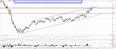
I wouldn't use a 20% threshold in this case though. If there's a big dropoff in Chinese demand for iron ore, I'd expect a much bigger decline in BHP's share price. How much of a decline? Take a look at the 5 year chart of BHP below. 

The lows of late '08 could be attributed to the general end-of-the-world atmosphere post-Lehman, so I'd start with BHP's share price in Q1 '09. By the end of Q1 '09, some of the immediate panic of the global financial crisis had lifted, but there were still fears about a dropoff in Chinese commodity demand. At its lows in Q1 09, BHP was trading at about 10x its trailing earnings. Currently, it's trading at about 16.5x its trailing earnings (of $6.13). So if BHP's valuation dropped to 10x its trailing earnings today, the stock would be trading at $61.30, about a 40% drop from BHP's closing price Wednesday of $101.16. So I'd use 40% as my threshold if I were looking for optimal puts on BHP as a hedge against the macro trend risk of a dropoff in Chinese iron ore and coal demand.

Checking Portfolio Armor now, the cost of hedging against a >40% drop in BHP over the next seven months, using the optimal puts for that, is 0.86% of your position value. I may pick up a few of those optimal puts this week, while the VIX continues to hover near its two-year lows.

Fed vs US Dollar (by Springheel Jack)

By -

The Fed's not a guardian of the US Dollar that inspires much confidence, but even by the Fed's low standards, the mad rush to escape USD that followed the FOMC meeting and statement yesterday was one to remember, and was somewhat reminiscent of watching a crowd trying to escape from a burning theater. There were big spikes in equities, precious metals and in currencies not controlled by the Fed, and there's more coming I'm sure.

EURUSD  has risen about 180 pips from when I was writing yesterday and is well on the way to the next target, which is the upper channel trendline currently at 1.506. I'm expecting the current rise to test the 2009 high at 1.5144, but that can't happen for about three weeks within the current channel:

AUDUSD moved up strongly too and the next rising channel target there is currently in the 1.115 area:

On ES the upper trendline of the rising wedge I posted yesterday was broken but an alternative rising wedge upper trendline was established at the high, so there are still two alternate resistance trendlines in play. The support trendline is unambiguous and support is at 1347.5 at the time of writing. A break down from that trendline will signal a retracement, though that retracement may well be modest and just test the big IHS neckline in the 1336-8 area. The rising wedge upper trendline is currently at 1357.5 and the rising channel upper trendline is currently at 1371.5:

Precious metals did very well and palladium, which I'm currently long on from 752 yesterday, had a very nice day. I did a writeup on the long setup on palladium yesterday at SharePlanner and you can see that here. Elsewhere though there are some odd aspects to this move up on equities. Bonds are divergently strong and copper is divergently weak. I've been having a careful look at the copper chart this morning, and after breaking down from the broadening ascending wedge from the June 2010 low, copper has now clearly formed a triangle. We need another upside hit to tell us whether this triangle is ascending or symmetrical, but I'm leaning towards a symmetrical triangle. On a break of the lower trendline I'd expect to see support at 408 tested, and if that breaks the obvious target would be the support level at 365. On the longer term charts there is a strong rising support trendline in the 365 area, and that both strengthens 365 as a target and makes it unlikely that copper would go lower. That doesn't fit that well with a strong equities move up here, but this wave up from July is in the final months and you'd expect some divergences here. Here's the setup on the copper daily chart:

I posted a chart showing the potential double-top on oil yesterday morning and that looks even stronger this morning. If CL can't break up through 113.5 then I'd be looking for a move back to gap support in the 95-6 area:

I don't usually post charts on soft commodities but a couple of them, notably cotton and sugar have been falling hard in recent weeks. I'm not getting much from the cotton chart but there's a very nice setup on sugar with decent possibilities both long and short. I've written the setup up on the daily chart:

I'm leaning long on equities and forex today, but 'll switch to short on equities on a break of the ES support trendline.

I've started to do a post or two a day at SharePlanner on individual stock and commodity charts. Ryan Mallory's invited me to do some of these writeups there and it works well for me as I can (shamelessly) select from a picked group of stocks there that have not been selected primarily on the basis of trendline setups and then write up and trade the ones that I like best. I'm planning to do more individual stock plays in future and this is a good way for me to build a large library of these. You can see my posts there in the featured bloggers section or at my blog. I'll be doing my more general market posts here every morning as normal.