
Below are a series of 2-Year Daily charts. I'll be comparing the current levels of the Emerging Markets ETF (EEM) with those of the BRIC countries for the purpose of determining relative strength of each.
The first chart is of the EEM. Price is currently in a trading range just below major resistance established in the first half of 2011 and just above major support established in the second half. There are negative divergences on the RSI, MACD, and ROC indicators, as well as declining volumes. Price is still subject to the influences of the existing bearish 50/200 sma Death Cross formation, and will be until such time as price breaks and holds convincingly above major resistance, and the moving averages cross to form a bullish Golden Cross pattern.

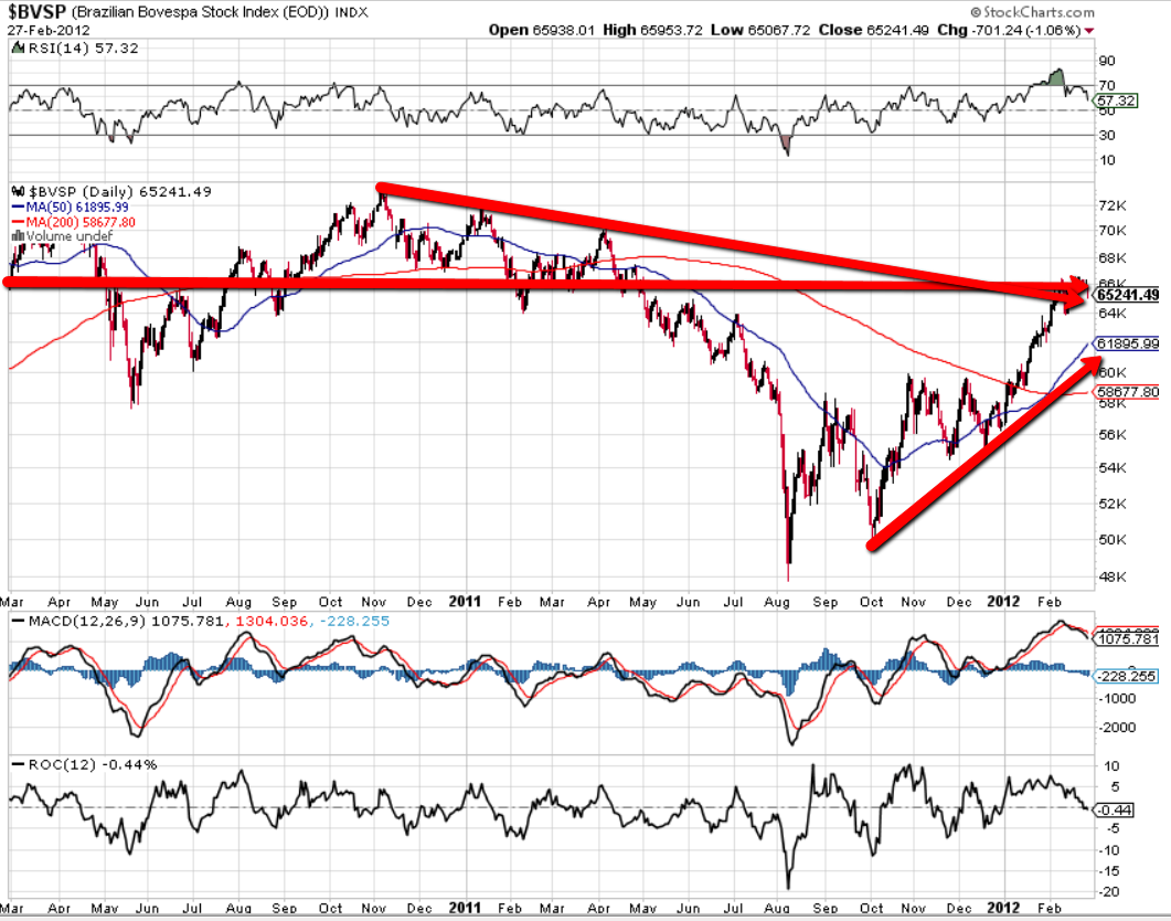
The next chart is of the Brazilian Index. Price is currently in a trading range just below major resistance established in early 2011, and just above a downtrend line from November 2010. There are negative divergences on the RSI, MACD, and ROC indicators. Price is subject to the influences of the existing bullish 50/200 sma Golden Cross formation.
The next chart is of the Russian index. Price is currently trading below major resistance established in the first half of 2011 and a downtrend line from April, and just above recent minor support. There are negative divergences on the RSI, MACD, and ROC indicators. Price is still subject to the influences of the existing bearish 50/200 sma Death Cross formation, and will be until such time as price breaks and holds convincingly above major resistance, and the moving averages cross to form a bullish Golden Cross pattern.

The next chart is of the Indian Bombay Index. After hitting major resistance, price has been dropping the past few days and is currently trading at major support established in 2011, and a downtrend line from November 2010. The RSI, MACD, and ROC have all turned down. Price is still subject to the influences of the existing bearish 50/200 sma Death Cross formation, and will be until such time as price resumes convincingly above the major support/resistance confluence level, and the moving averages cross to form a bullish Golden Cross pattern.

The next chart is of the Chinese Shanghai Index. Price has been rallying the past few days and is currently trading at major resistance established in 2011, and the downtrending 200 sma. There is a negative divergence on the MACD histogram and ROC, and the RSI has reached overbought territory. Price is still subject to the influences of the existing bearish 50/200 sma Death Cross formation, and will be until such time as price resumes convincingly above the major support/resistance confluence level, and the moving averages cross to form a bullish Golden Cross pattern.

The graph below shows the percentages gained/lost during this two-year period for all of the above indices and ETF.
Since the beginning of March 2010, Russia has gained the most, followed by EEM, and then India. China has lost the most, with Brazil losing about the same in percentage as India gained.
With the exception of Russia, EEM has outperformed China, Brazil and India by a considerable percentage, and is not an accurate measurement of how the actual BRIC indices have actually performed.

Inasmuch as price on all of these instruments is trading below major resistance in the presence of negative divergences on indicators, and (with the exception of Brazil) are still subject to the influences of bearish moving average Death Cross formations, we may see a pullback occurring at some point soon. I'd keep a close watch on Russia and China for indications of possible weakness developing which may also affect the other indices and ETF…India has already been dropping and may be the signal that the others will follow suit. Ones to watch over the next days/weeks.
http://www.strawberryblondesmarketsummary.com/
