Below are a series of percentage comparison graphs of a number of markets. They compare money flow between the first week in February and so far this week.
The first graph depicts gains made for the Major Sectors during the first week in February. The Financials sector made the biggest gains that week, with no losses for any sector.

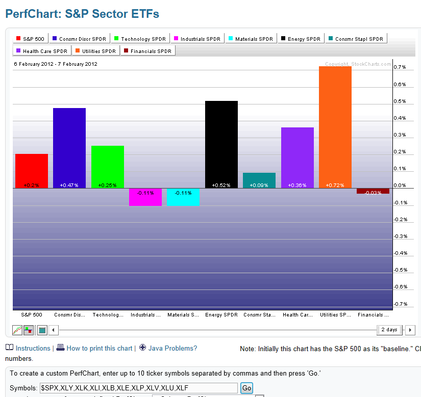
The second graph depicts gains/losses made for these Major Sectors so far this week. Note the drop in the Financials, Industrials and Materials sectors, and the increase in the Utilities and Health Care sectors…indicating a preference for more defensive stocks so far this week.
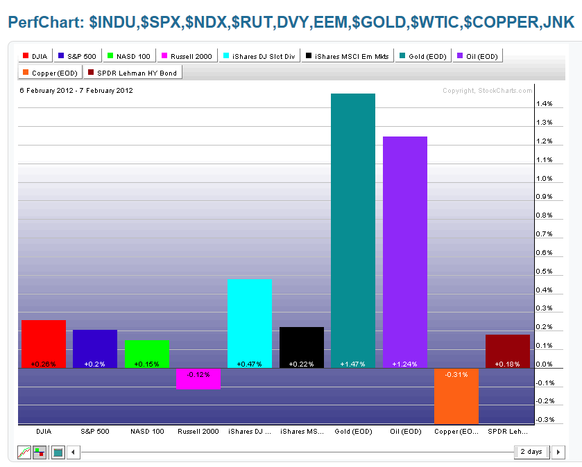
The third graph depicts gains/losses made for the Major Indices, DVY, EEM, Gold, Oil, Copper, and JNK during the first week in February. There was notable buying in EEM, DVY, and the Russell 2000, moderate buying in the Dow 30, S&P 500, Nasdaq 100, and Copper, and tepid buying in JNK. There was selling in Gold and Oil.

The fourth graph depicts gains/losses made for these same markets so far this week. There was a marked increase in buying in Gold and Oil, while the Russell 2000 and Copper sold off into negative territory. Buying in the other markets continued this week, but to a greatly reduced extent. This indicates a reduced appetite in risk for equities and a greater desire for Gold and Oil (perhaps as a hedge against a potential downturn in the equities markets as they battle against some major resistance levels).