Firstly, I apologize for my lengthy post…but as I know you're such a nice group, perhaps you'll grant me this indulgence and bear with me!
Further to my last weekly market update, here is a summary of where money flow ended for Week 2 of April 2012.
The Weekly charts below of YM, ES, NQ & TF show that they all closed lower than the prior week, following last week's bearish engulfing candle. The ES has now joined the YM & TF in closing below its uptrending channel from the 2011 lows, while the NQ is still above the channel.
We can see that volatility is building and money is still flowing out of each, although the only one to close near its weekly low was the NQ. Beginning this week and for the purposes of this type of broad weekly review, I'm going to examine the following 5-year Weekly charts to see where price sits at the close of each week and give it a bullish or bearish rating until the end of this year (because volatility is rising and because price may not respect trendline breaks as news items seem to be having more of an effect lately on trending than it did from October 2011 until March, and price movement has become choppy with larger intraday swings).
On each chart are a horizontal price channel, Fibonacci fan lines, Bollinger Bands, 50 sma (red), 200 sma (pink), Volume Profile (the 5-year POC is the red horizontal line), and a white X within the channel from now until the end of the year. In each case, I've drawn the channel from the 5-year high down to what I consider to be major support on this timeframe…as you study each chart, it should become clear why I chose these channel levels. My present projections are for price to move within this channel until a clear break and hold have been achieved…price may or may not hit the lower channel, depending on week-to-week sentiment, news events, earnings announcements, Fed announcements, data releases, etc.
The channel is broken into quarters and thirds (each yellow line represents one-third and the pink lines represent one-quarter). Bullish ratings will apply for anything above the 50% level (broken green line) and bearish ratings for that below. So, when price is:
- above upper pink line, price is bullish
- above upper yellow line but below upper pink line, price is moderately bullish
- above green line but below upper yellow line, price is mildly bullish
- below green line but above lower yellow line, price is mildly bearish
- below lower yellow line but above lower pink line, price is moderately bearish
- below lower pink line, price is bearish
As of this past week's close, the ratings are as follows:
- YM = mildly bearish
- ES = mildly bearish
- NQ = bullish
- TF = mildly bearish
The NQ's volume in the Volume Profile from February onwards is very thin, which signals a potential weakness/problem in this e-mini futures index being able to advance much further and hold above its 2011 highs. I wouldn't be surprised to see price drop back to this level at some point and further buying volumes finally enter to support a convincing rally…no doubt this would have a negative impact/drag on the other three indices.
The three Daily charts below depict support and resistance levels on the percentage of Stocks Above 20-Day, 50-Day, and 200-Day Averages.
Stocks Above 20-Day Average gapped down and fell below 15% at one point and closed lower than last week just above a 20% support level.
Stocks Above 50-Day Average also gapped down and fell below 30% at one point and closed lower than last week just above the 30% level.
Stocks Above 200-Day Average also gapped down, tested the 60% level and closed lower than last week just above the 60% support level.
We may see each of these retest this past week's low before re-defining their respective near-term support levels as, indeed, support. I'd conclude that, in the short term, stocks are bearish, in the medium term, stocks are moderately bearish, and in the longer term, stocks are mildly bullish…but, as has been the case for the past three weeks, all are still on negative watch for further potential weakness.
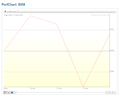
Once again, the VIX gained on the week (by 3.93%), as shown on the graph below.
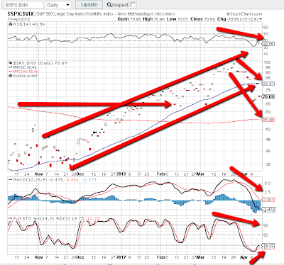
Further to the comments in my last weekly market update, the Daily ratio chart below of the SPX:VIX shows that that the SPX dropped below its uptrending channel and 50sma and closed above near-term support of 65.00. Negative divergences are still in place on the RSI, MACD, and Stochastics…however we now have an upward cross on Stochastics, which is reflective of reaching an oversold condition. A drop below 65.00 would signal more selling in the SPX, so it's definitely an important level to keep an eye on this week.
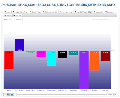
As shown on the graph below of the Industry Groups, the only group to close higher was Gold/Silver, with Biotech, Banks, and Brokers attracting the greatest losses.
As shown on the graph below of the Major Sectors, there was further profit-taking on all sectors, except Materials.
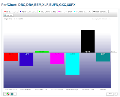
As shown on the graph below, losses were made in the Commodities ETF (DBC), Agricultural ETF (DBA), U.S. Financials ETF (XLF), and European Financials ETF (EUFN). The Emerging Markets ETF (EEM) was basically flat, and gains were made in the Chinese Financials ETF (GXC).
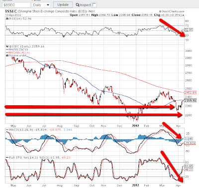
Further to the comments in my last weekly update, China's Shanghai Stock Exchange Index managed to reverse its decline and closed back above its major support level of 2300 and just below its 50 sma, as shown on the Daily chart below. The RSI and Stochastics indicators have reversed their downtrend, and the MACD is crossing upwards. We may see price attempt a move up towards the 200 sma at some point if it can, first, penetrate and hold above the 50 sma…one to watch, along with EEM, and the BRIC countries, as last updated in my post of April 9th.
As shown on the graph below, gains were made in Gold and Oil, while Copper lost the most, and Silver was basically flat.
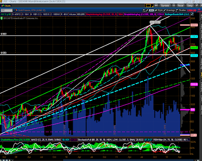
The following four Weekly charts of Gold, Oil, Copper, and Silver show support and resistance levels…ones to watch, particularly Copper.
As shown on the graph below of the Major Indices, the Nasdaq 100 was the biggest loser. Losses were made in the High Dividend-Paying Stocks ETF (DVY), while there were gains made in the Corporate Bonds ETF (JNK)…and, as noted above, EEM was basically flat.
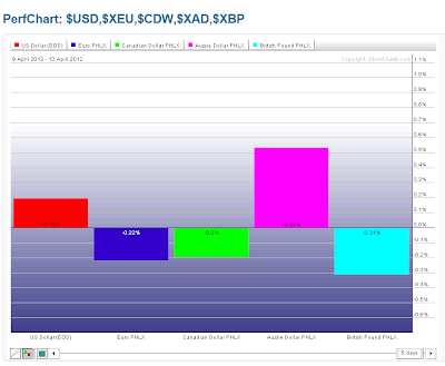
As shown on the currency graph below, money flowed into the Aussie $ and the U.S. $, and out of the British Pound, Euro, and Canadian $.
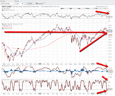
The Daily ratio chart below of the SPX:U.S. $ shows the recent flight out of equities and into the $…there is now a tug of war going on between the two as this ratio grapples with the near-term support level of approximately 17.00…one to watch.
This bears repeating from last week's post…With volatility building, I'd just remind you that "Mr. Fat Finger" may revisit the markets, as mentioned in my post of March 28th…it pays to have one's stops/hedges in place to try and mitigate any losses from such action…and particularly with the recent very volatile downside movements in Spain and Italy and other European countries.
Enjoy your weekend!


