Slope of Hope Blog Posts

Slope initially began as a blog, so this is where most of the website’s content resides. Here we have tens of thousands of posts dating back over a decade. These are listed in reverse chronological order. Click on any category icon below to see posts tagged with that particular subject, or click on a word in the category cloud on the right side of the screen for more specific choices.

Testing the Daily Middle Band

By -

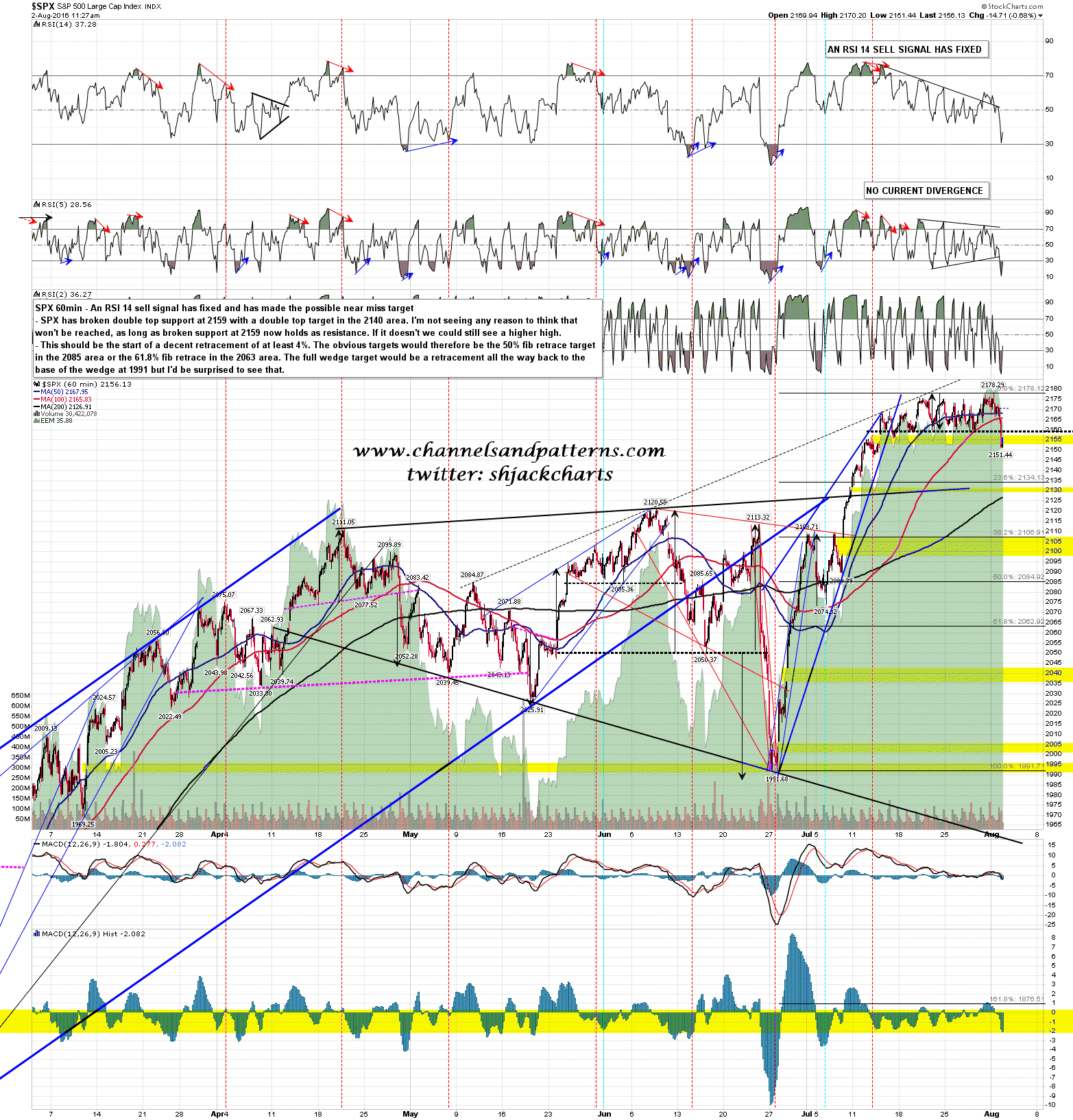
SPX has broken range and double top support at 2159, and then the daily middle band at 2155. If bears can now hold that 2155-9 area as resistance today then there are decent odds of a trend down day and the double top target is in the 2140 area. A close below the daily middle band opens up a move to the daily lower band as the obvious next target, and that is currently in the 2111 area.

If the bears can’t hold the 2155-9 area as resistance then this may just be the low before the higher high, and we could still see the 2190-2 test that I was looking at yesterday morning. SPX 60min chart:

160802 SPX 60min Support Break

(more…)

Yearning for Yen

By -

Our overseas friend Kuroda isn’t having a very good year. Quite against his wishes, the Yen has been strengthening pretty much the entirety of 2016. We can see the upside-version of that with the USD/JPY below. I will whine once again: it’s too bad U.S. stocks aren’t tied to the waist to this like they used to be, otherwise the ES would be down 25 right now instead of freakin’ 3 points.

0802-yen

(more…)

The Gaping Maw

By -

Even though the S&P 500 hit (on an intraday basis) the highest level in the history of the universe today – – – higher than the Internet bubble, higher than the financial crisis – – more overvalued than any time in the history of the financial markets – – my portfolio of entirely short positions is, for the most part, profitable.

How could this be? Well, for one thing, I’ve got a pretty good concentration of energy shorts. I wanted to illustrate just how detached the market in general has become from energy. The chart below overlays the SPY (in blue) with the XLE energy fund (in black). I wanted to illustrate “tight” and “loose” and was delighted that Ms. Sherilyn Fenn and Ms. Hillary Clinton were available to offer their services for this purpose. Thanks, ladies.

0801-maw

So as you can on Sherilyn’s side, the markets were extremely tightly coupled. Recently, however, if you can stomach looking at the right side of the chart, you’ll see an absolute chasm of difference between the two.

My fervent desire, of course, is for the overall universe of stocks to “catch down” with oil and related companies.