I’m very pleased to announce some more improvements to SlopeCharts.
First, you’ll notice some new items in Drawn Objects. Well, they’re not new per se, but we’ve made the functions more granular. I’ve highlighted the icons below – – from left to right, there is rectangle, oval, rectangle-with-text, and oval-with-text. You can probably figure out what they do, but the point is that if you just want to draw a shape and definitely aren’t bothering adding text, you can save an extra step by just using the “pure” shape tools. (Please remember to press Ctrl-F5 to force a reload of the page so you’re sure you’ve got the latest version).
![]()
The much bigger news is automated trendlines, however:
I am a big fan of trendlines, and I’ve drawn many thousands of them over the years. I’m good at it, and pretty quick, but honestly, it becomes really tedious after a while, particularly when drawing the very basic long-term support and resistance lines.
I therefore set about to automate this process, and this cool new feature is exclusively for our Plus subscribers. (Reminder: you can still use the coupon code “october” for a few more days to get a free month of the service, if you want to try it out).
There are six different functions to this tool: three of them are to drop trendlines “from top” and three “from bottom”. Imagine a ruler sliding from the top (or bottom) of the chart toward the center to picture how this works, as it seeks out the two best anchor points.
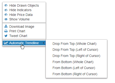
Often you’ll want to have this function use the entire width of the chart to determine its anchor points, but there are plenty of times you’ll want to just “drop” the imaginary ruler from the cursor’s location toward the right of the screen or, alternately, left.
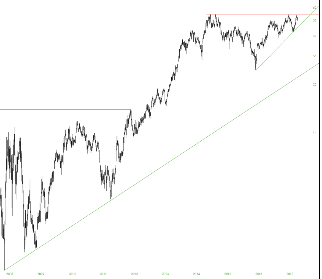
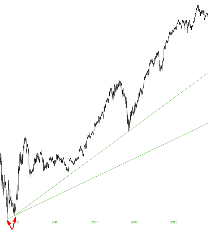
An example will help clarify this: below is a chart where I put an auto trendline from the bottom using the entire chart. It sound the two lowest anchor points (see arrows) and put the trendline there. In this instance, the trendline is pretty useless. So I pointed the cursor to the point between those arrows that I’ve drawn and put the auto trendline down to the “Right of Cursor”, which established a much more useful line illustrating the long-term uptrend.
In any case, I’ve used these auto trendlines, and they are a huge time-saver. It takes literally one second to accomplish what normally takes about half a minute (including the inevitable moving of the anchor point that takes place). I hope you enjoy this cool new feature in SlopeCharts!