Record highs everywhere. A volatility index crushed down to 11. Endless – – and quite correct – – optimism. Let’s take a look at this one chart, though:
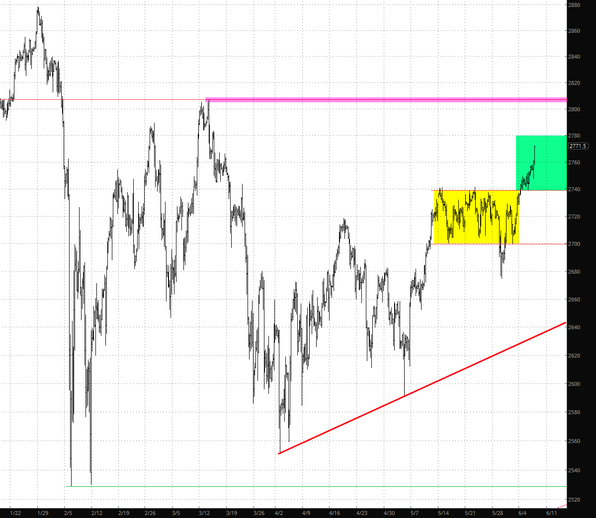
- The yellow zone represents the range we were bound within for weeks: 2700 to 2740;
- The green zone represents the target price now that we escaped the aforementioned range, which is from 2740 to 2780;
- The magenta horizontal represents the next significant gap, which is at about 2800
- The red line is the supporting trendline defined by lower highs.
Simply stated, life has sucked for the bears since April 2nd – – over two solid months now – – and the bulls have already been granted a free pass for at least ten more points on the ES. Today, for me, there was just one very silver lining.