I’ve joked and mocked the man from time to time, but I’ve refrained since I’m weary of getting pissed-off emails form Slopers who adore and worship him. I don’t have the time or the interest, so I just avoid the topic altogether. But, orders are orders, and since my company is indeed an American company, I need to get busy looking for alternatives to China. So if I seem distracted, please understand that I’m simply doing my job. The boss has spoken.
(more…)Slope of Hope Blog Posts
Slope initially began as a blog, so this is where most of the website’s content resides. Here we have tens of thousands of posts dating back over a decade. These are listed in reverse chronological order. Click on any category icon below to see posts tagged with that particular subject, or click on a word in the category cloud on the right side of the screen for more specific choices.
Fudge Packard
I can’t believe any of us (especially me) wasted emotional energy anticipating Jerome Powell’s speech this morning. Here’s a summary of the entire thing:

Tits for Tats
A few minutes ago, I woke up as I typically do, reaching blearily for my iPad at the side of the bed, interested to see what color the ES and NQ are. This morning was especially important, since I didn’t know precisely when the Powell speech details were going to be released.
Through my bleary eyes, for a millisecond I thought I was a green “60” (in other words, the ES up 60 points) and my heart skipped a bit, but the screen refreshed and it showed both the ES and NQ down double digits. Apparently whatever it was that made them spike down had happened just a few seconds before I turned on my iPad (good timing on my part), so I fired up Twitter to see what was going on.
(more…)Trendy Read
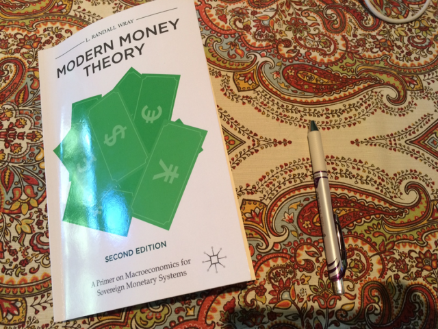
I’m takin’ one for the team, folks. I am spending just about all my time plowing through the book below, which I purchased for the express goal of having at least a basic understanding of MMT.
Relatively Speaking
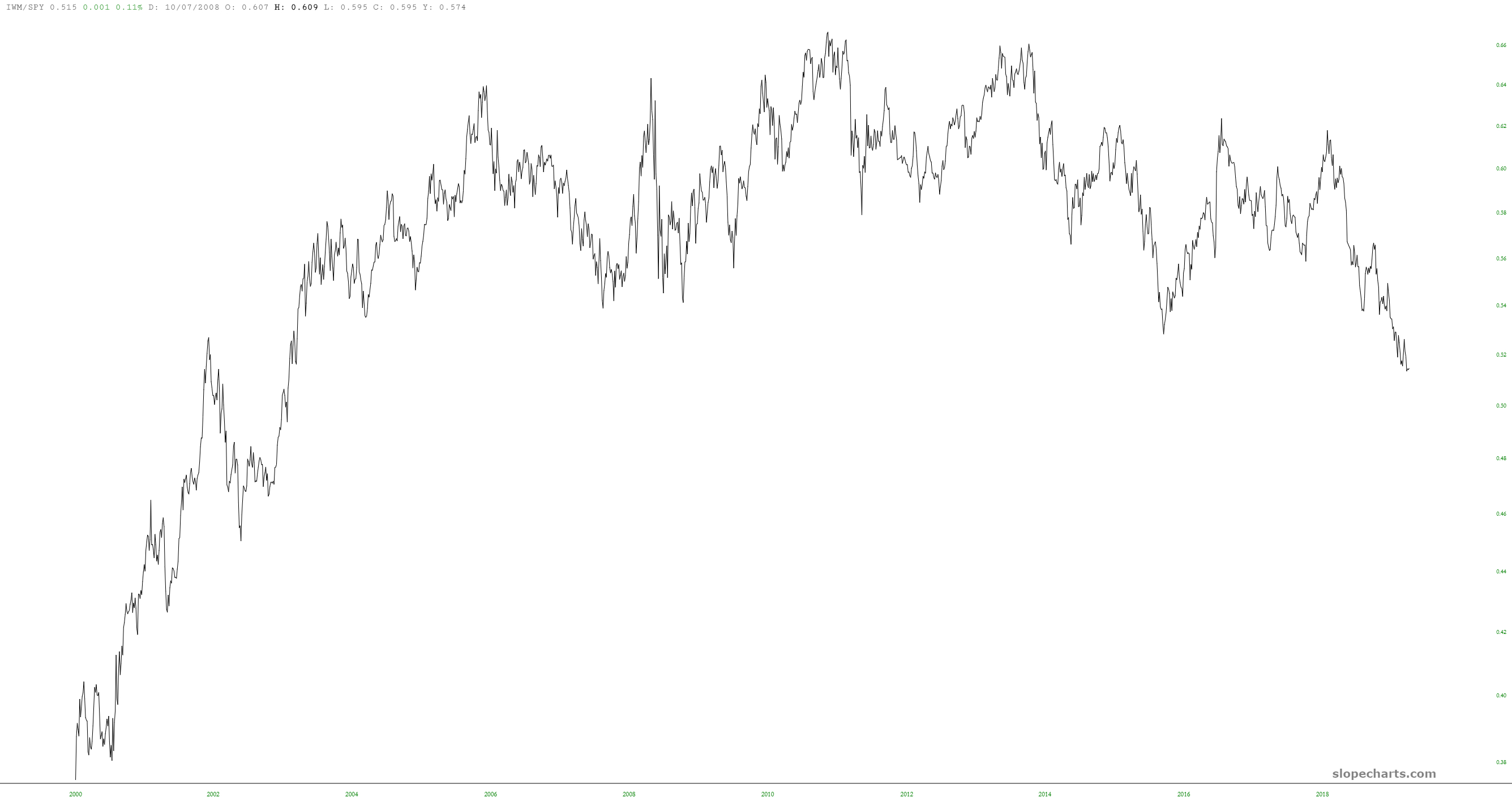
As a reminder, SlopeCharts has the ability to present charts based on combining symbols, modified with any mathematical mutations you might like. Below I am showing three simple ratio charts, each of which is pretty interesting.
The first is IWM/SPY, which nicely shows how, over the course of many years, small caps have been losing the battle against the S&P 500. If this were an individual stock, it would look very shortable, because that is one huge inverted saucer.