
More instant gratification from SlopeCharts, my friends!
On Monday, a prospective Sloper wrote me and said that if we’d just add options expiration dates to SlopeCharts, he would sign up.
By Tuesday, we had spec’d, developed, tested, and deployed this new feature. Bid-a-bang, bid-a-boom. Let me explain how to use it.
First, you go to the Preferences (gear icon, in the lower-left of SlopeCharts) and, once the dialog box is up, you select the Appearance tab. You will notice a whole new set of controls, which I have tinted below.
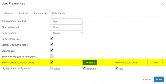
The controls are fairly self-explanatory. You check the checkbox if you want to see options expiration lines on the chart. You can choose from the dropdown how “zoomed-in” the chart should be before lines appear. This is more important than it sounds, because if you have it set to show options expiration dates with all the data, the chart will look absolutely ridiculous, because there will be hundreds of vertical lines on it.
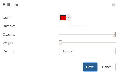
There is also a Configure button which lets you fine-tune what the vertical line itself looks like, including color, style, thickness, and opacity.
So without these expiration lines, a chart looks something like this:

But with these expiration lines, all the monthly and quarterly options expiration marks are displayed:
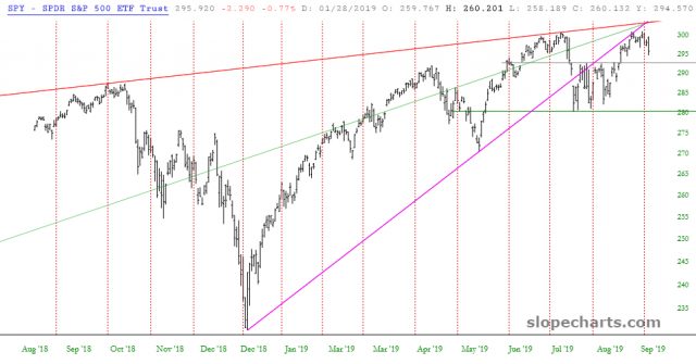
Let me be clear at the outset that these lines will be displayed on every chart, whether it has options or not. If you actually want to see options that exist with respect to strikes and expirations, you can use the OptionDots feature. These vertical lines are meant to be to simply make clear when options expirations take place.
Second, I’d love to hear any ideas for improvements to this feature. I’ll steal my thunder a bit and tell you one improvement we’ll have out on Wednesday is going to be a ‘tool tip” so that when you point at a particular line, it will display whether that expiration pertains to a Monthly or a Quarterly option and also tell you the precise date. Other than that, though, I’m all ears to hear your ideas!

