
Although the future trend feature in SlopeCharts is exclusively for the Diamond membership, I thought everyone would be interested in a few examples of how this feature can be effective (or not) depending on the symbol.
For this little experiment, I chose the bottom item from the dropdown, Show Prior Future Trend and Future Trend. As stated on the information page, ” An even more interesting aspect is to “dial back” time and see what would have been predicted in the past and compare it to what actually happened. Choosing Show Prior Future Trend allows you to use the second dropdown to choose how far back in time you want to test.“
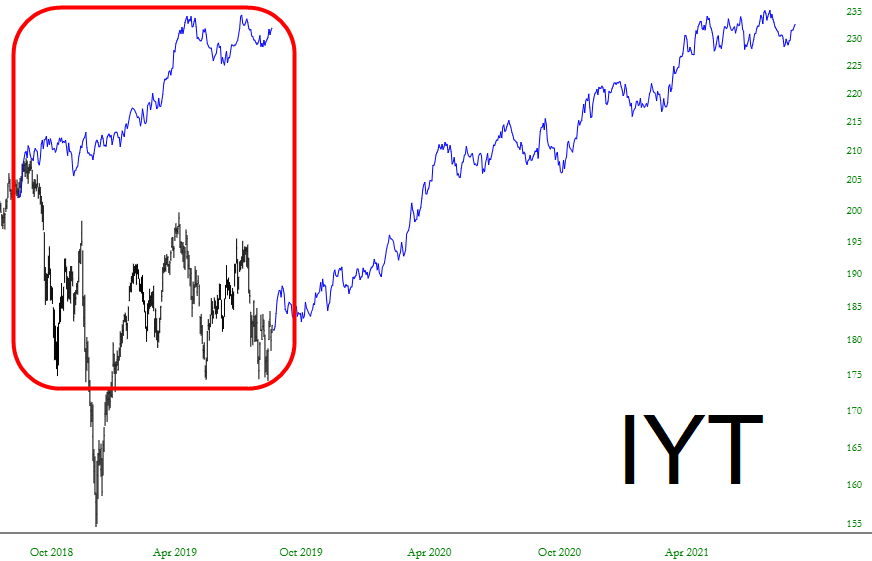
So let’s try it with the Dow Transports ETF. I have highlighted what it predicted for the past year, and the blue line to the right is the prediction for the years ahead. I think we can all agree that its past prediction stunk, so we’ll ignore it!
The same can absolutely be said for the oil & gas explorers: what was predicted wasn’t even in the same ZIP code as what really transpired.

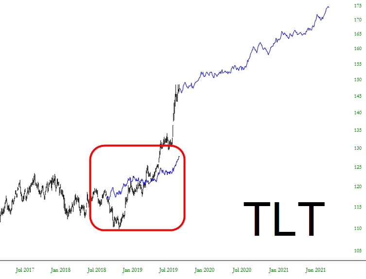
Looking at the bonds, the prediction wasn’t too bad. It got the direction right, although it didn’t show as big a move as what really happened. I think I’d give this one a “C+” as opposed to the other flops above.
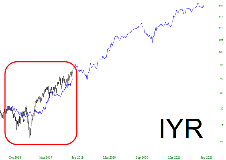
Turning to the real estate fund, symbol IYR, the results are much more interesting. The prediction was extremely close to what transpired, so I think we can give some stock (no pun intended) to what lay ahead.
Probably the best one I saw of all was the high yield corporate bond fund, symbol HYG. This prediction of what would take place over the past year was remarkable.
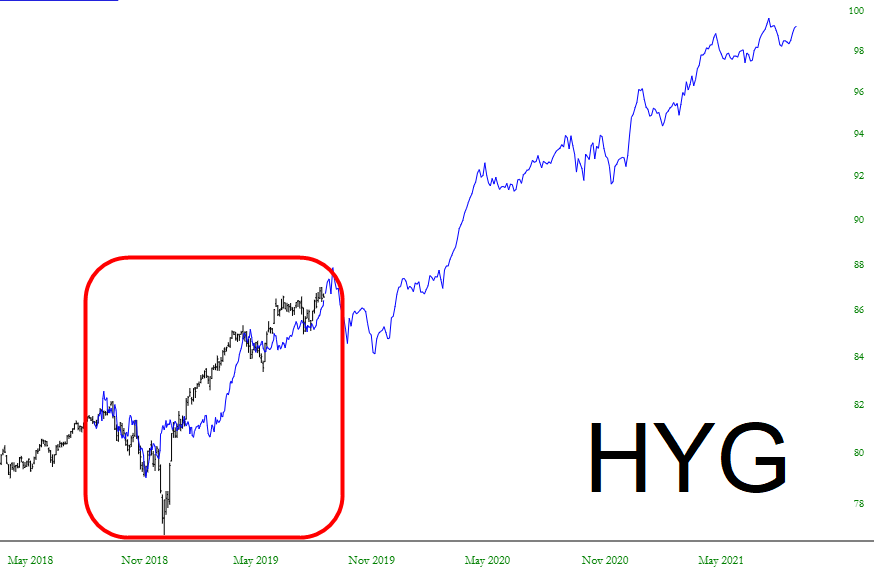
As you can see, just like with Fibonacci studies, it’s catch as catch can. My belief is that when you do find one which is “future trend friendly”, it’s worth heeding what it thinks is coming.
