
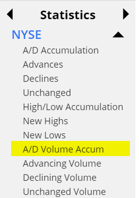
I’ve been making a lot of noise about our new Statistics data panel, and I wanted to mention another Slope invention in there: A/D Volume, which I’ve never seen anywhere else. Here is an example:
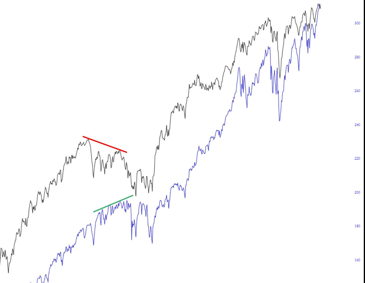
The blue line represents by SPY and the black line represents a running total of the volume of ascending stocks, eroded by the running total of the volume of descending stocks. It is accessed here:
Back in 2014-2015, as shown in the chart, there was a critical divergence in equities (green line, a higher high) versus the A/D Volume (red line, lower high). This preceded a substantial tumble in equity prices in August 2015.
The bulls will be pleased to know there is no such divergence going on right now. The blue and black lines are marching higher in virtual lockstep.
