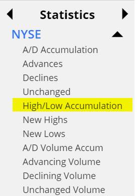
Another improvement for you, Slopers! And I think it’s something you can’t find anywhere else. Before I get into it, please look at this chart:
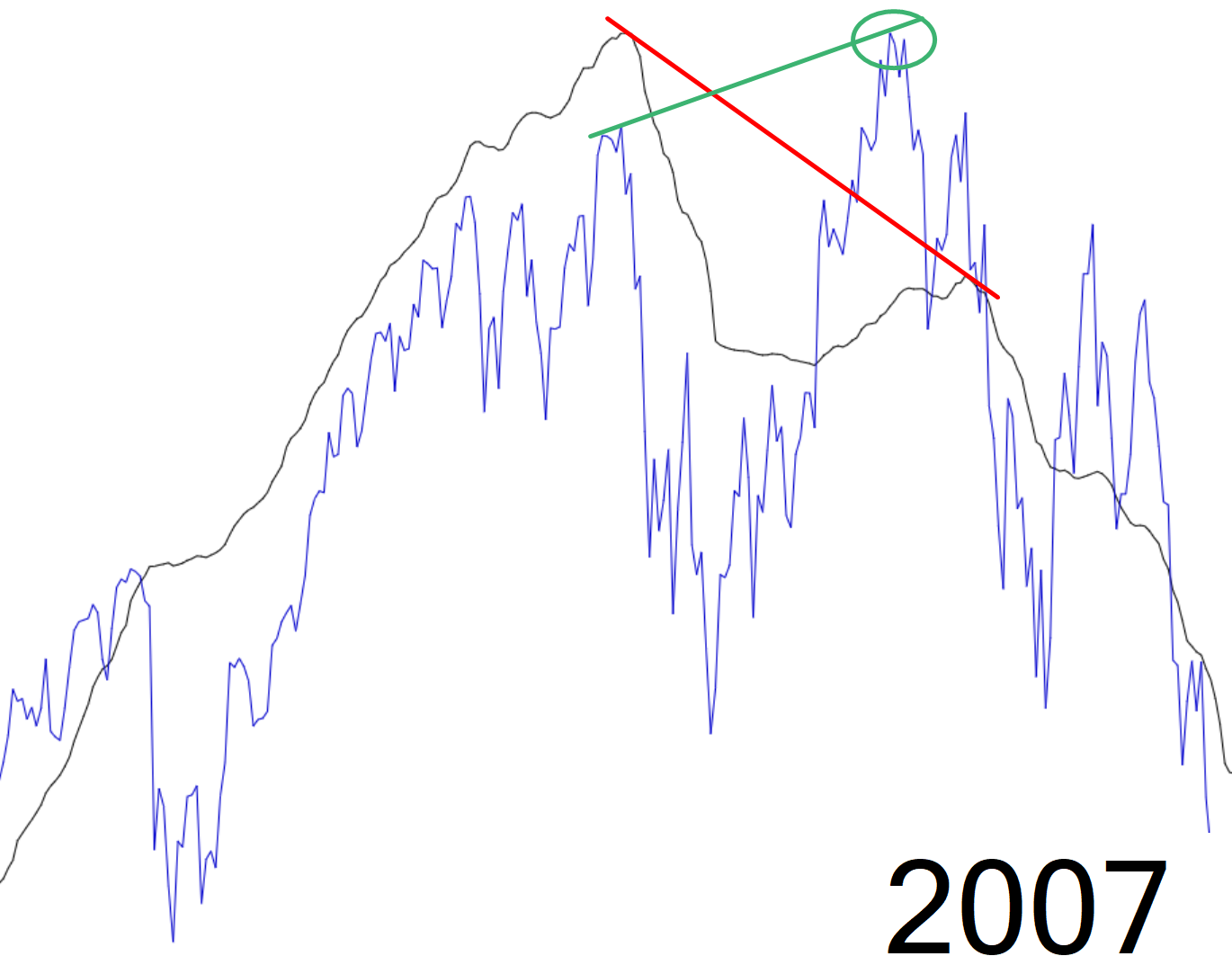
Now here’s a similar chart below.

To explain what you are looking at:
- the blue line is the SPY;
- the black line is SlopeCharts’ new High/Low Accumulation;
- the green line represents the “higher high” of the stock market;
- the black line represents the divergent “lower high” of our new H/L indicator
Now, I’ve wanted something to do with new highs and new lows for years, but frankly, I am slack-jawed at what people use. For example, the “go to” indicator at the largest stock chart site on the web is this godawful thing below, which is something like new highs minus new lows.
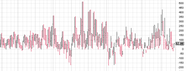
Maybe it’s just me, but I can only roll my eyes at this thing. Useless! What in the hell are you supposed to conclude from those chicken scratchings?
I’ve come up with something I think is better. It is an accumulation of new highs, eroded away by new lows. Personally, I think it’s elegant and far more useful, and it is now available by way of the new Statistics data panel.