
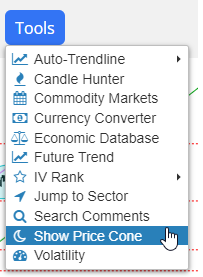
Hello from a tiny wooden table at the Whole Foods Market in San Mateo. I have yet another improvement for you on Slope: Price Cones. Here is the new menu item in SlopeCharts:
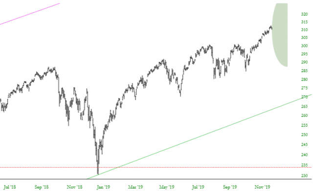
When you choose to show price cones, all of the charts for which we have volatility data will be augmented with a price cone at its terminus illustrating, based on implied volatility, the prospective price range (based on one degree of standard deviation) over the next 30 days. Here, for instance, is the SPY:
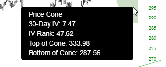
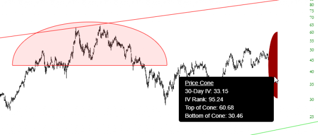
As with drawn objects in SlopeCharts, you can point to the price cone to get very specific data about what it is expressing:
Besides the placement and size of the cone, and the tool tip data, there is another element of expression, which is the color itself. The greener the cone is, the more subdued its IV Rank. The more red a cone is, the more “red hot” the IV Rank is. For example, if I look at a crazy stock like AMD, the price cone is bright red:
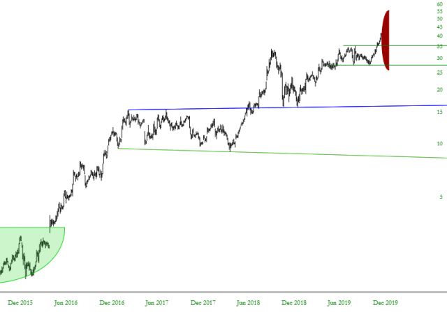
Likewise, looking at another semiconductor company (Micron), I see a red price cone. Mousing over the cone itself, I can see that the IV Rank is a sky-high 95.24.
This is precisely the kind of visually rich (and unique) kind of feature I enjoy introducing to Slopers. I’d love to hear your feedback!
