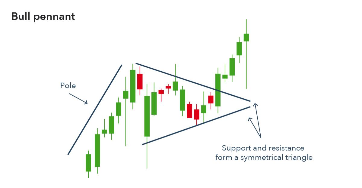
Here is an idealized representation of the pennant pattern:
Slope initially began as a blog, so this is where most of the website’s content resides. Here we have tens of thousands of posts dating back over a decade. These are listed in reverse chronological order. Click on any category icon below to see posts tagged with that particular subject, or click on a word in the category cloud on the right side of the screen for more specific choices.
Good Lord. What a bunch of dopes. Seriously.

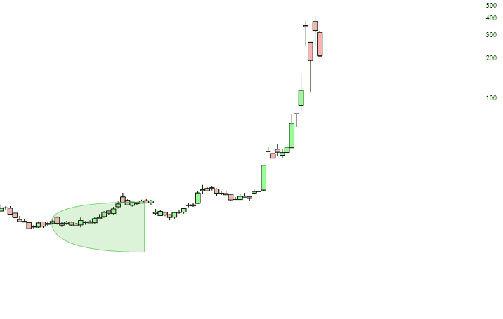
Just as a historical marker, I present to you the animated Price Cone for GME for the past 60 days. We actually had to modify the program to accommodate the data, because the implied prices went literally negative.
What was going to happen on Monday? Would the hedge funds all dump their longs to cover their losses? Surely the market would crash, right? Uh-huh. The only red seen was for a couple of hours after the open on Sunday, and then it was green, green, green. But let’s look at seven important index charts to get some broader contest.
The Dow Jones Composite has quite plainly broken its uptrend. Monday’s rally is immaterial. There’s been a change.


