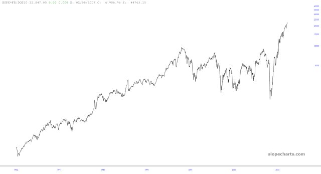
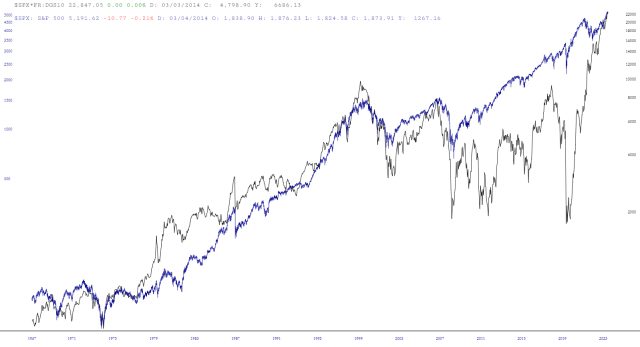
Note from Tim: I've written about my so-called M.I.C.E. chart (Most Important Chart Ever) a number of times, including this post from the summer of 2018 for premium members which preceded a 10% tumble in the S&P. The MICE chart endeavors to blend interest rate and equity data into something that is more insightful than either of them on their own; anyway, LZ has something new for us as follows):
I tried something a little different with MICE: multiplying by the 10yr yield. Bonds are going down in price as yields rise. At some point, they must be the better buy, and the market tops. I don’t know that the level matters for predictive purposes, but the spikes since 2000 have all been proximate to tops.