
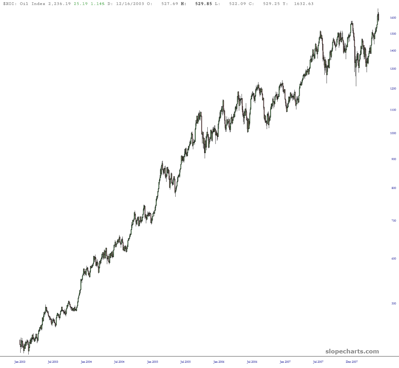
The run-up in the oil sector index ($XOI) has been amazing. This is what it looks like since October.

I was just by just how similar this action was to what we saw during the first chunk of the year 2008. Just look at the chart above and below and notice how similar they are.
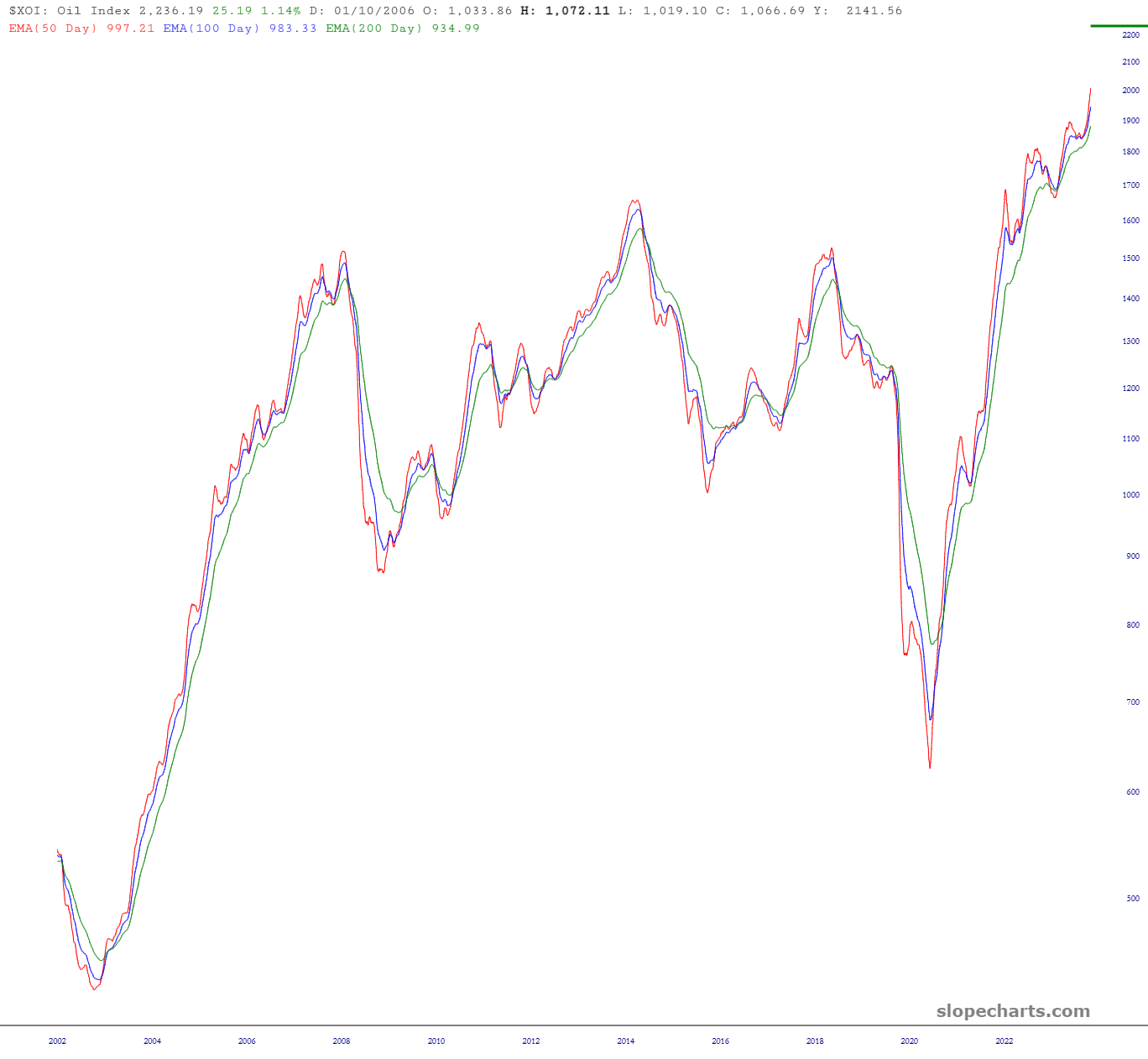
Let’s take a different perspective by observing the trio of exponential moving averages. Take note of the leftmost and rightmost portions and see how surprisingly similar – – almost identical! – – they appear.
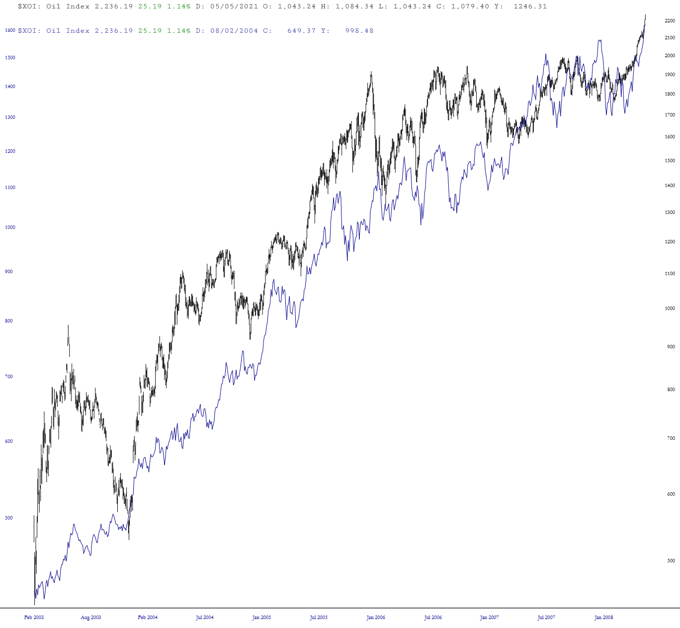
Naturally, the layered chart comes in handy here. The correlation is rough at first, but the farther along the chart goes, the closer they cling to each other.
I admit, trying to “buck the trend” by going against the sensational up-thrust in $XOI would not be for the faint of heart, but I would feel a dereliction of duty if I didn’t bring this analog to your attention!
