Slope of Hope Blog Posts

Slope initially began as a blog, so this is where most of the website’s content resides. Here we have tens of thousands of posts dating back over a decade. These are listed in reverse chronological order. Click on any category icon below to see posts tagged with that particular subject, or click on a word in the category cloud on the right side of the screen for more specific choices.

Wednesday’s CPI Report

By -

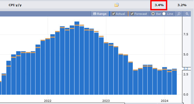
The latest everyone-has-to-stop-trading-until-the-event-happens is the CPI report on Wednesday morning, an hour before the opening bell. Anyone with a lick of sese knows these numbers are completely made up and are about 1/5th the actual rate of inflation, but everyone pretends they are real anyway. Here is the year-over-year CPI, with 3.4% being the predicted value (HA!!!!)

(more…)

A New MICE (by LZ)

By -

Note from Tim: I've written about my so-called M.I.C.E. chart (Most Important Chart Ever) a number of times, including this post from the summer of 2018 for premium members which preceded a 10% tumble in the S&P. The MICE chart endeavors to blend interest rate and equity data into something that is more insightful than either of them on their own; anyway, LZ has something new for us as follows):

I tried something a little different with MICE: multiplying by the 10yr yield. Bonds are going down in price as yields rise. At some point, they must be the better buy, and the market tops. I don’t know that the level matters for predictive purposes, but the spikes since 2000 have all been proximate to tops. 

(more…)