
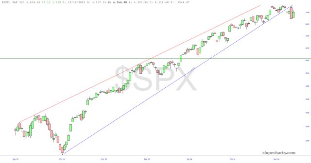
Let’s take a look at two view of the S&P 500. The first, the cash index, shows the same sensational broken wedge I”m seeing all over the place. This is the most encouraging chart I’ve seen in ages.
The chart below of the SPY itself is almost identical, except for the fact that some of the older data is a little bit different due to dividend adjustments. Still, this could be the start of something good, and I’d suggest the horizontal line below (anchored to the price gap) as an important target.

