Just a gentle Saturday reminder that in SlopeCharts one of the panels is for market Statistics.
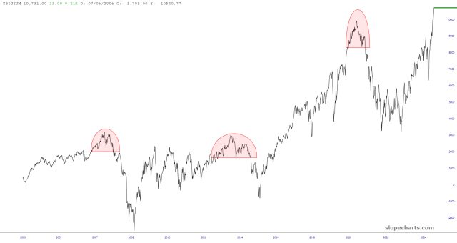
A vivid illustration of the resolute (and, for a few loonies like me, painful) market strength is the $BIGSUM, which is the cumulative advance/decline indicator for the largest stocks. In time gone past, this thing would top out and fall with some regularity. This time, it’s been an uninterrupted moonshot.
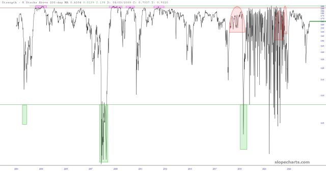
Another way to look at this is via the percentage of stocks above their respective 200-day moving averages. This plunged during the all-too-brief Liberation Day debacle, and it has since surged back to health in the 70s.
By definition, this statistic tends to be somewhat cyclic, and this kind of strength isn’t permanent. (Incidentally, the wacky portion in mid 2020 to mid 2022 seems malformed to me, so I’ve asked that it be reprocessed).