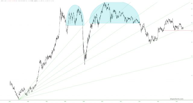
Much has been made recently about copper’s decline in value. The fabled “Doc Copper” is supposed to be a harbinger of economic direction. I’m not so sure, but I will say that the continuous contract of the metal is fascinating, particularly because it’s one of the very few instances in which a Fibonacci fanline seems to be instructive about key levels of support and resistance.

As you can see in the chart above, copper is teetering on a precipice, and its downtrend could start to get even more powerful should it break the fanline. I am betting this is a nearly forgone conclusion.
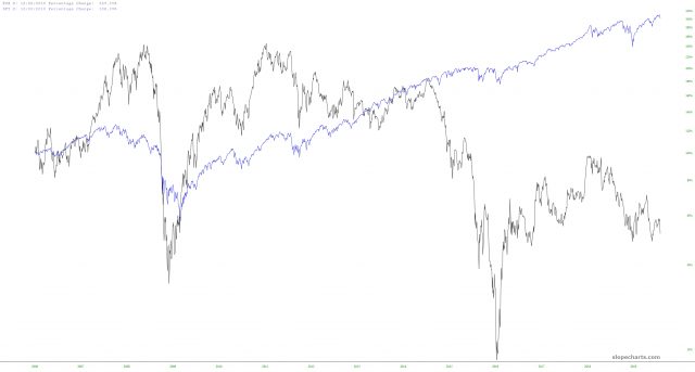
However, the correlation between copper and stocks is a bit iffy, to say the least. Comparing the SPY to FCX (Freeport McMoran) for example seems to illustrate they are in separate universes.

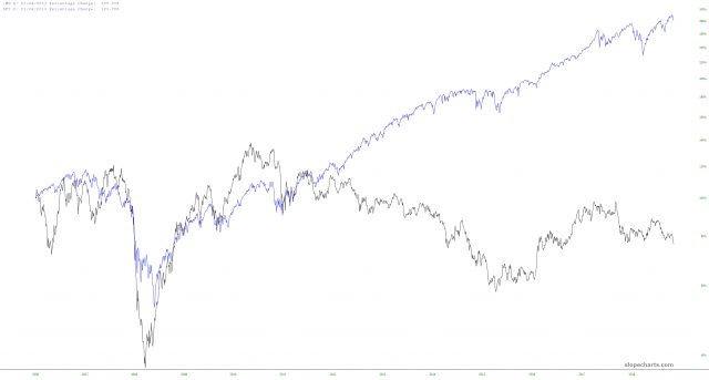
It’s a little more interesting when you compare the SPY to the continuous contract itself. The first third of the chart, on the left side, certainly suggests that copper and stocks were joined at the hip. The rest of the time, however, they drifted apart like two cruise ships heading toward utterly different ports of call.

I’m inclined to think the whole Doc Copper thing is about as useful as the SuperBowl indicator, but it was fun to experiment with a few charts anyway.

