No, this isn’t about crude oil. It’s simply an overview of quarterly charts of some big indexes, just to take in the very broad trend (which, as has been the case for almost eleven years, is permanently “up”). The amount of data on the charts below varies, and in the caption I’ve said a few words about each. Click any chart for a huge-ass view.
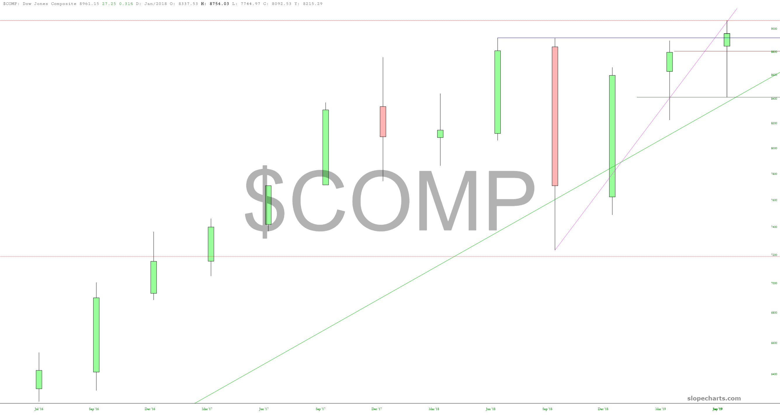
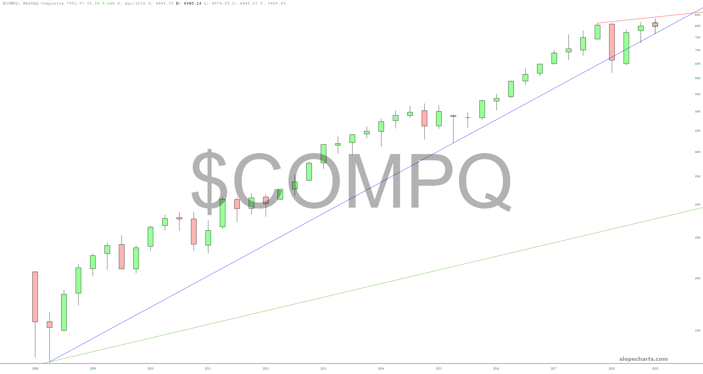
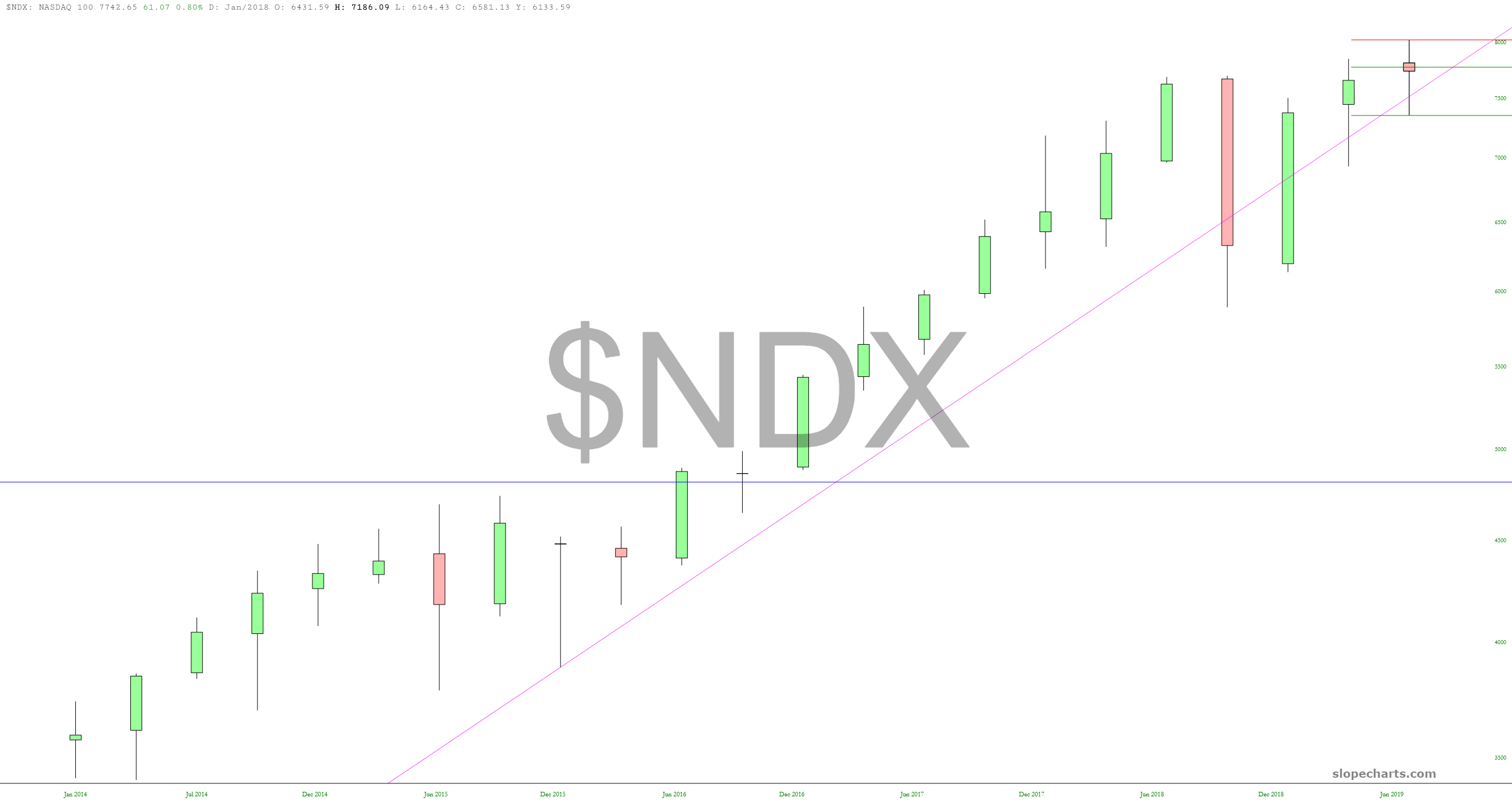
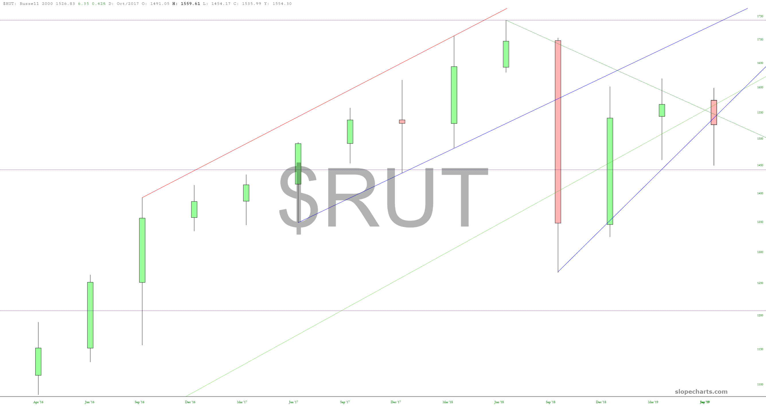
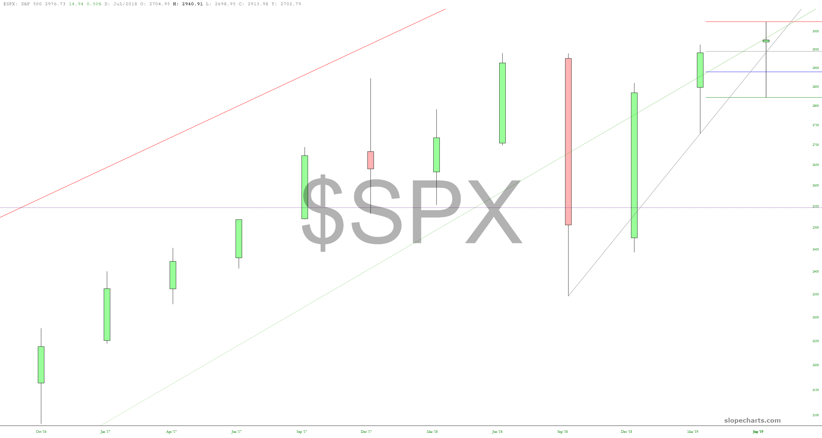
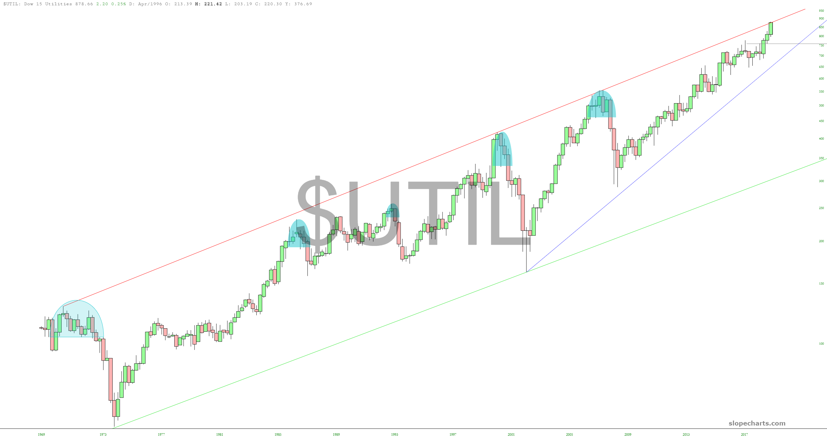
The clean uptrend ended in Q1 2018. Since then, it’s been a struggle, and the most recent quarter has an extraordinarily small “body” on the candlestick.Look high incredibly tight the range is compared to quarters past. The thrill is gone!Here, too, we see the sexy high-tech stock world has become a total bore. The upward thrusts have stopped. Now we’re simply marking time and treading water.This remains the only clearly bearish chart. It has a very interesting diamond pattern, and we even managed to paint out a bearish engulfing pattern on this quarter.s bar.Hanging man, anyone?Lastly, “the chart of the year”, the utilities, which is crammed right up against its lifelong trendline.