
Courtesy of SlopeCharts, let’s take a look at what percentage of U.S. stocks are above their respective 100-day moving averages.
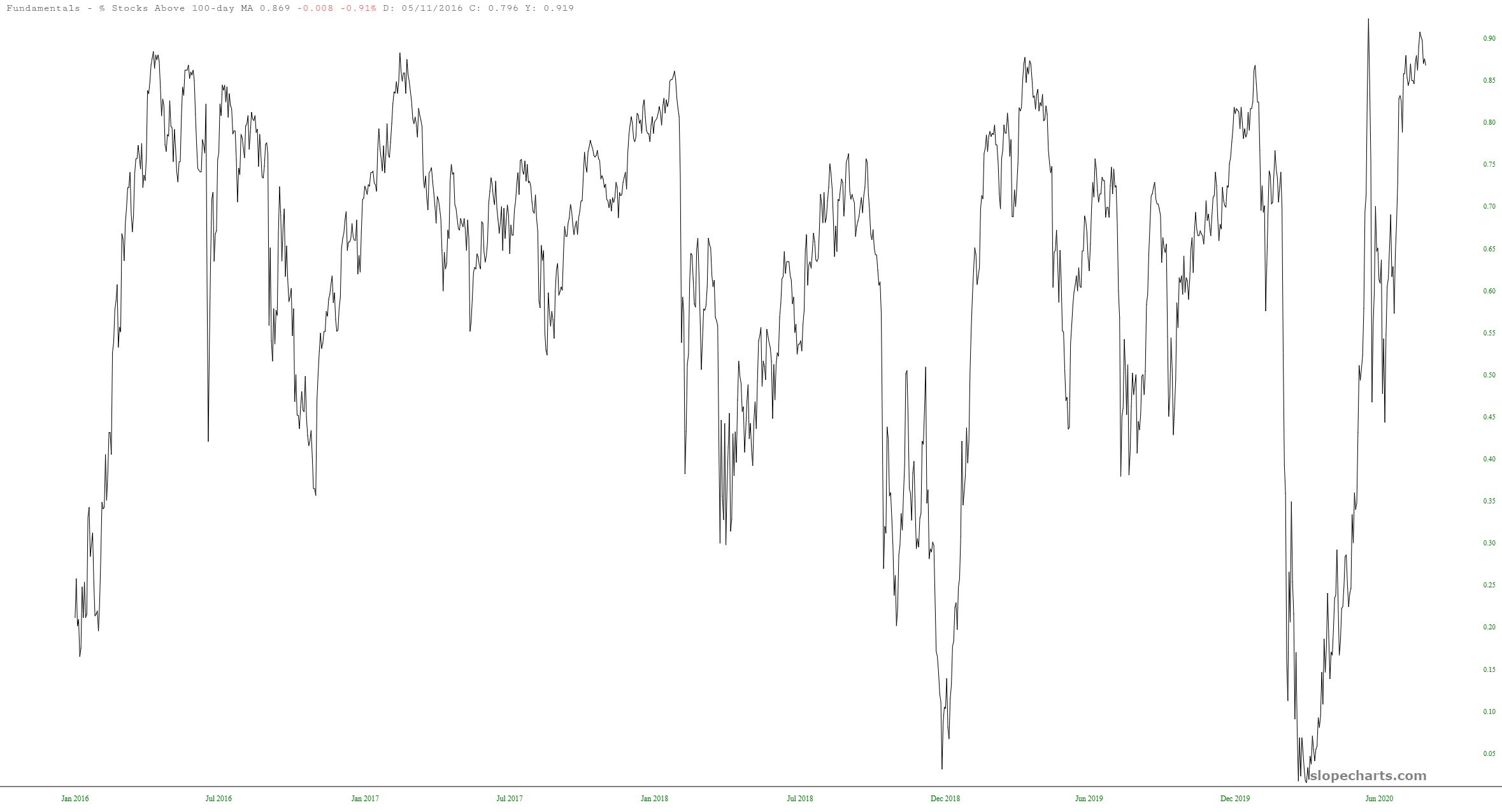
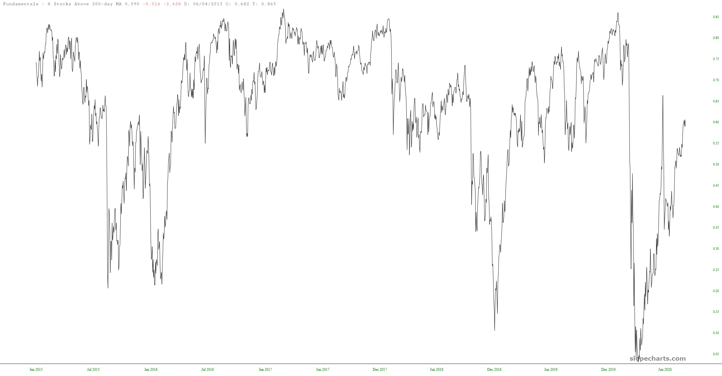
Kind of pegged at the top, isn’t it? What I find interesting is the same study done for the 200-day moving average. Take note how much of a “lower high” we’re experiencing. Interpret this as you like. To my way of thinking, it simply reflects how narrow this fake rally is.
I keep goosing up my exposure. I’m presenting at 61 shorts with 180% commitment.
