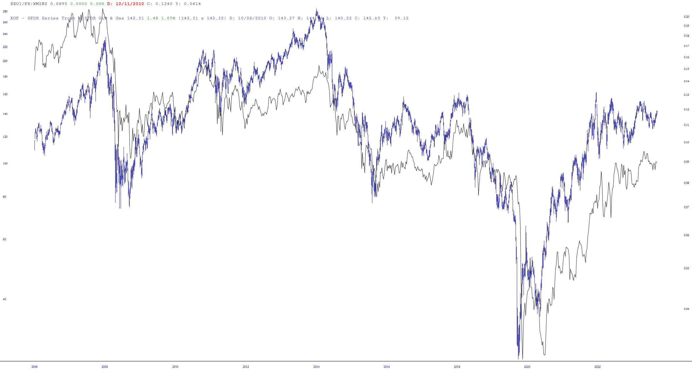
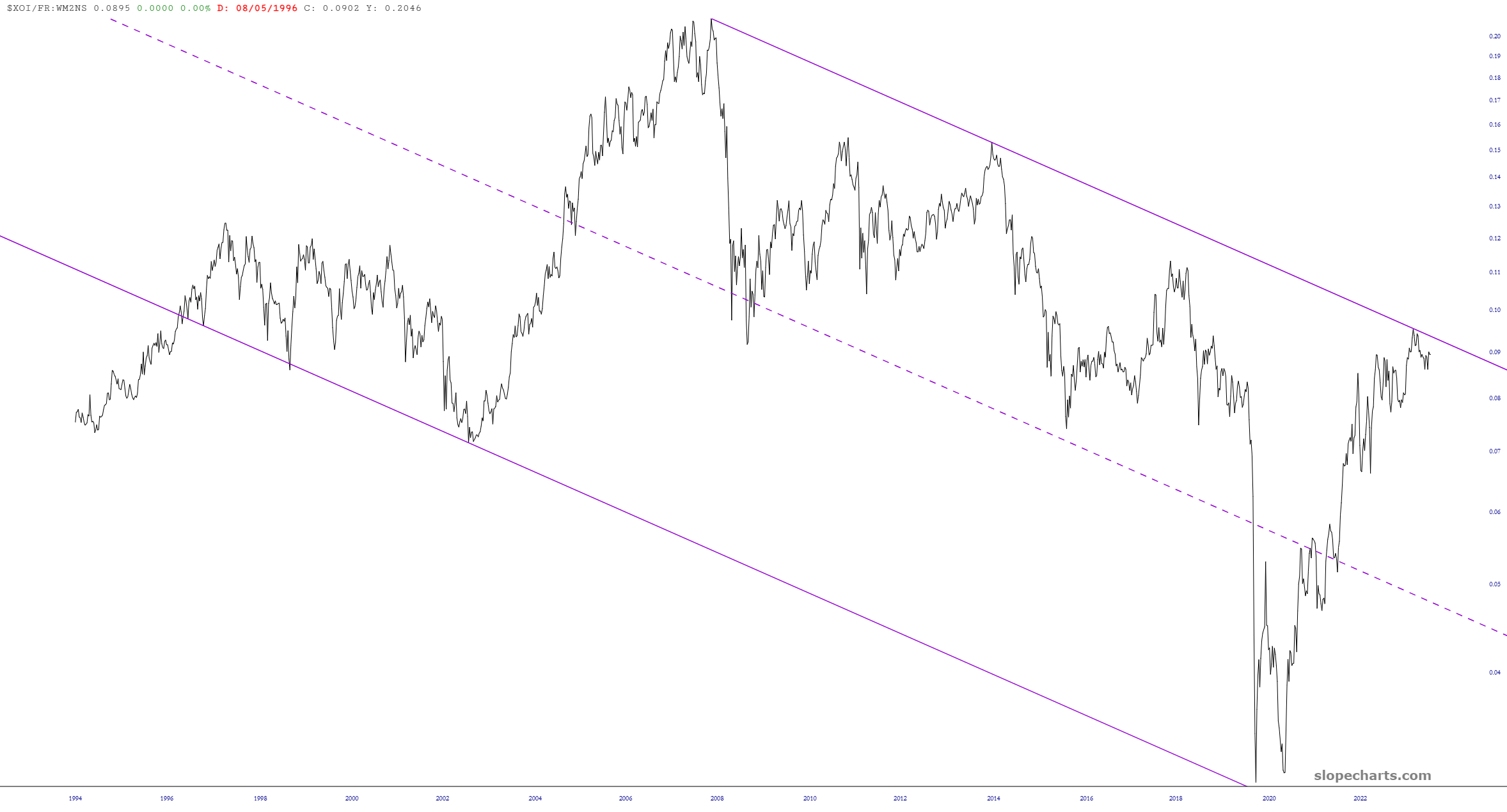
Here’s an interesting chart of the $XOI oil index divided by the money supply, illustrating the very consistent pattern of this market over a period of decades. As you can see, we rammed against resistance.
Using the Layered Mode feature, I placed the ETF symbol XOP on top of it, and I’d say the odds of energy stocks being much lower a year from now than they are right now is pretty strong.