
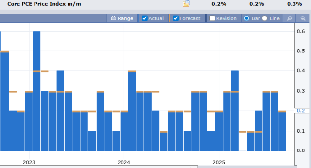
The Fed’s favorite inflation number (and most boring chart) was just updated, and the predicted 0.2% figure was nailed, as it usually is.
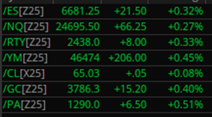
The market is celebrating this non-event with a relief rally, as every asset is green.
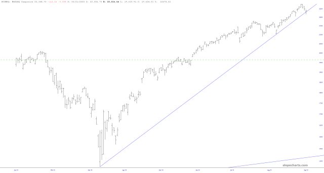
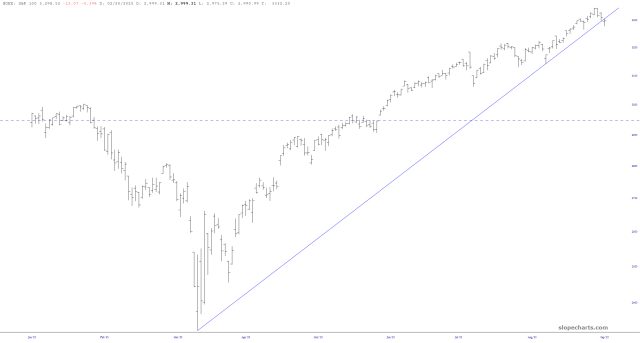
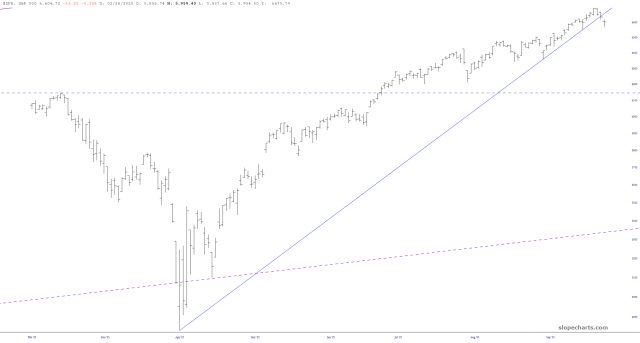
Before the bulls start distributing their Dow 50,000 hats, I wanted to point out that yesterday, for the first time it began on April 7th, the ascending trendline on virtually every important U.S. index has been breached. I offer you……….the NASDAQ Composite:
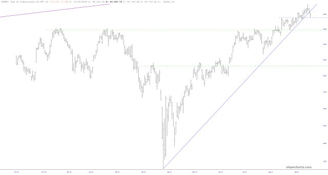
The Dow Industrials:
The S&P 100:
The S&P 500:
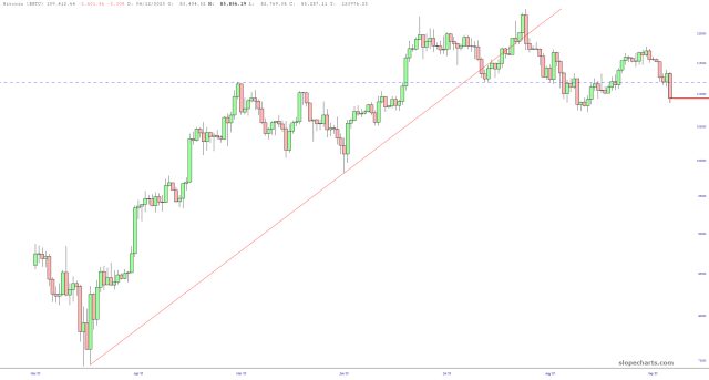
Every single chart looks pretty much the same. I would also encourage you to heed the warning of one of the ultimate risk-on/risk-off markets, which is Bitcoin. This thing peaked at about $125,000 weeks ago and has slumped about $15,000 since then. It isn’t looking healthy.
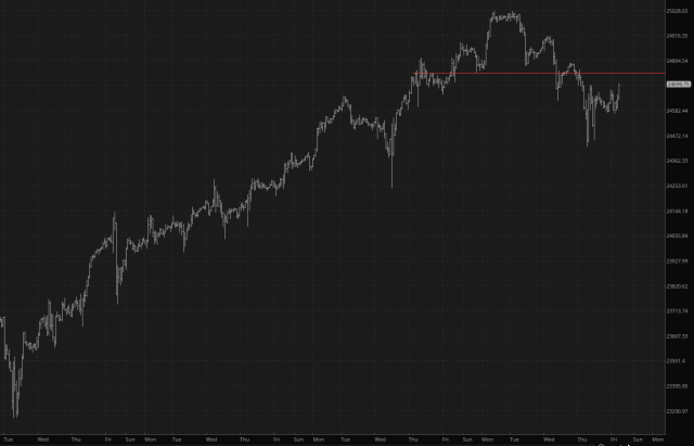
Lastly, take a look at the hourly bar chart for the /NQ futures. It seems to have hammered out a well-formed top, and as I am typing this, the /NQ is nearly 100 points higher, but all it is accomplishing is to clamor back toward its neckline.
I thus remain with my fists on my hips, positioned bearish across the board. Let’s get this Friday started!
