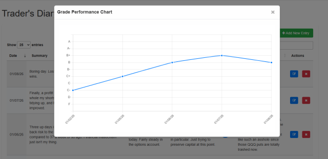
Slopers are enjoying the new Trader’s Diary feature on the site, and we’ve just added something new: a grade graph. Those of you who have used the feature know that you can give yourself a grade at the end of each day based on your own assessment of your behavior and performance. What the grade graph does is plot out, over your entire diary history, how your self-assessment looks over the long haul. Since this is such a new product, it isn’t much to look at yet, but you can imagine how helpful it would be to see your chart over, let’s say, a six-month period to see how you are tracking in your own estimation!