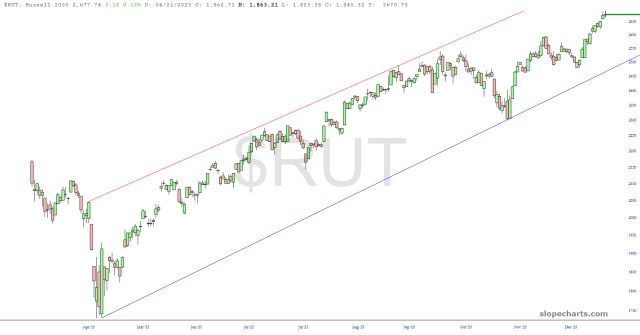
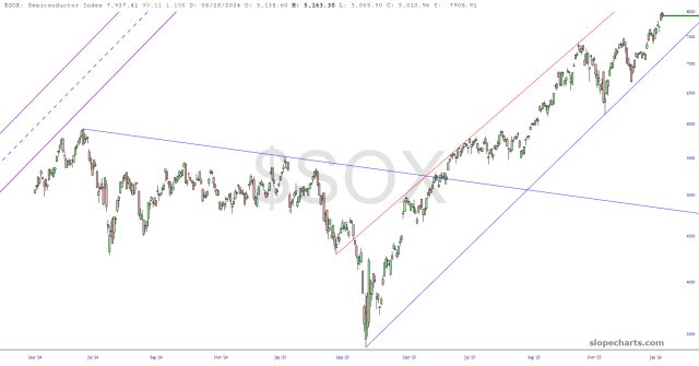
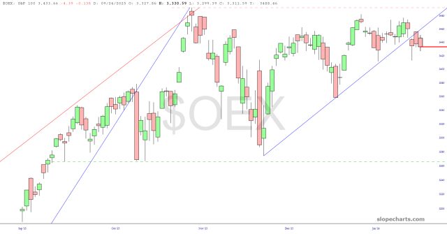
Those damaged trendlines will hopefully mean something. This is daily data ending on Friday, and I should hasten to add that these charts were created before President Stable Genius completely mucked things up with his idiotic Greenland nonsense. In any case, I submit to you that the subtle breakdown in these charts was a helpful “heads up” that the man was going to screw things up, just like he has so much else in his life. Here we go…………
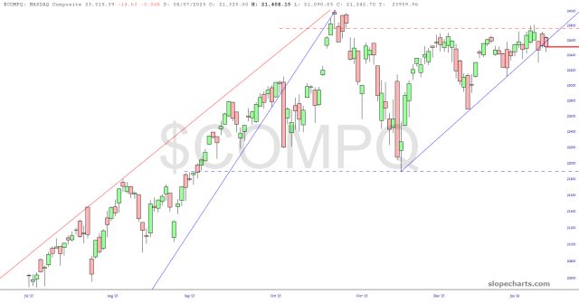
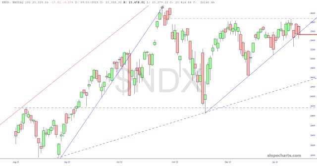
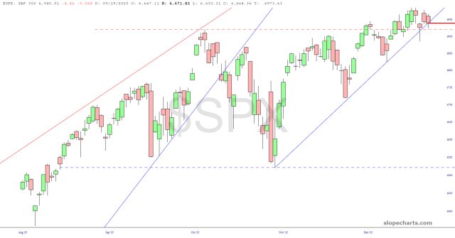
In sharp contrast to this, these indexes are cruising within their channels without a care in the world: