
Hey folks, just wanted to share an observation I made today and my hypothesis that the market is at an adjustment point and working out where it’s going to go next. I share one single chart for your viewing enjoyment (click for larger view).
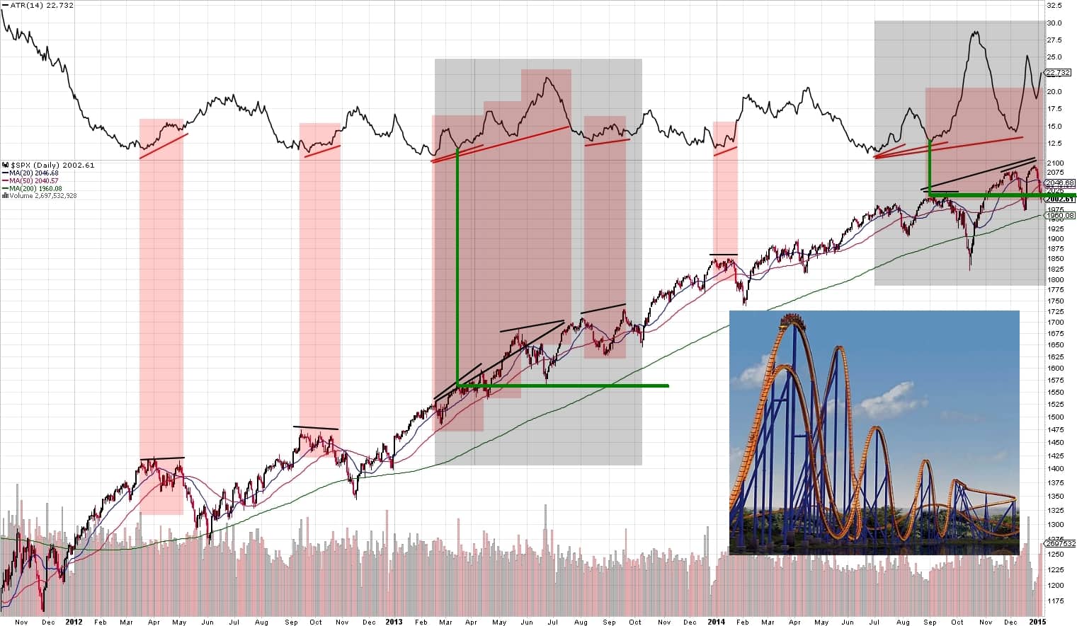
Observation 1 – When the index is getting ready to pull back, price tends to get more volatile in nature which is reflected in the positive divergence with the standard setting of Average True Range (price peaks are equal or higher with a coinciding higher low on the ATR indicator). Typically, this is simply evidence that there is selling pressure evident.
Observation 2 – Sometimes, rather than just one divergence, several in a row are printed (gray shaded areas) which accompany more swingy price action rather than smooth, trending moves. This is an important change of market behavior to take into consideration.
Observation 3 – Once a multiple divergence has occurred, that seems to mark an inflection point where the first noted divergence area becomes a magnet for price. My hypothesis is that the reason for this is that prices have hit a level where smart money begins to distribute and sell off primary holdings in a bigger way and shifting to more attractive risk reward assets.
Observation 4 – Once this distribution is well underway the level where distribution began becomes like a magnet and pulls price back down to it. In May 2013, this was the 1550 level. In the current market, 2000 marked the first divergence and since then price has visited it several times.
The S&P 500 now appears to have roughly established a trading zone between approximately 1970 to 2100. When price exits these levels, I suspect we will know where price is likely headed for months to come. Until then, I’m going to be patient and trade the range.
